Navigation drawer
Lists a product's destinations in a panel at the start edge, in sections and groups, beside the content on a large screen or over it on a compact one, and can collapse to a column of icons.
- Category
- Navigation
- Tokens
comp.navigation-drawer- Level
- Composed
- Built from
- Modal layer, Handle
- Web
tanrei-navigation-drawerschedule - SwiftUI
TanreiNavigationDrawerschedule - Jetpack Compose
TanreiNavigationDrawerschedule - Flutter
TanreiNavigationDrawerschedule - React Native
NavigationDrawerschedule
Generated from docs/status/status.json, specs/navigation-drawer.spec.json
A revised spec, not yet on every platform
This page describes the navigation drawer as the spec has it now. A collapsible drawer narrows to a column of icons, which replaces the navigation rail: the collapsed drawer is the expanded one with its labels gone, each row cut after its icon, and its menu button widens it again with every icon in place. A destination’s badge text becomes trailingText, drawn quieter, and a trailing slot holds a glyph; badge is now a badge on the icon. group items open and close nested destinations. Rows are drawn at the control height (40 in the default system), the height of a menu’s item. responsive lets the window’s width choose how the drawer is presented. A destination with an href is a link, and revealSelected and scrollOffset make the drawer a site’s sidebar. The web component already does all of this, and so do the demos. SwiftUI, Compose, Flutter and React Native are marked lagging above: until they catch up they ship the previous revision, with 44 rows, badge as text at the row’s end, no collapsed form, groups, link destinations or responsive presentation, and a separate navigation rail, and their samples show that revision. The small size, groups that are destinations (selectableGroups) and the filter field (filterable) are newer still, and on the web only.
A standard drawer with two sections
A collapsible drawer: its menu button collapses it to the column of icons, where a cell shows its name in a tooltip
Destinations that are links: the drawer's value names the current page, and reveal-selected opens the group that holds it
A drawer that filters its rows: type in the field, or press / anywhere on the page to reach it
A small drawer, for a tool used with a pointer: 36 rows and 16 glyphs, each nested icon where its group's label starts
Groups that are destinations: with selectable-groups, a group's row chooses it and its chevron opens and closes it
A navigation drawer has five kinds of item. A destination is a row with an optional icon, a label and optional trailing content at its end; with an href it is a link. A group is a row that opens and closes the destinations and groups inside it. A section groups destinations and groups under an optional title (headline on the web), with an optional divider before it; sections do not nest, and groups do not hold sections. A header-button (the first is the menu button) and a main-action sit in the header. On the web they are <tanrei-navigation-drawer-item>, <tanrei-navigation-drawer-group> and <tanrei-navigation-drawer-section> children, and icon-only <tanrei-button>s and a <tanrei-main-action-button> in the header-button and main-action slots. The lagging platforms take destinations and sections in their own idiom: TanreiNavigationDrawerItem and TanreiNavigationDrawerSection views on SwiftUI and calls on Compose, TanreiNavigationDrawerDestination and TanreiNavigationDrawerSection objects in Flutter’s children:, and destination and section entries of an items array on React Native, where a section is told apart by its own items.
The selection belongs to the drawer, by a destination’s value, wherever the destination stands. change and reselect work as for the navigation bar. Compose has no drawer-level value: you mark the current item selected, and its onClick serves as both change and reselect. Flutter selects by index, counted through the sections in reading order.
A destination with an href is a link and not a button. The browser follows it as it follows any link, and the drawer does not select it by a press: the page that arrives says which destination is current, by setting the drawer’s value to that destination’s value, or to its href as written where it has no value. change and reselect still fire for a plain activation of a link. They carry its href and can be cancelled, which is how a client-side router takes the navigation. Link destinations are on the web today.
A group’s row opens and closes it and chooses nothing. Where a group is a place of its own as well (a section’s overview page in a site, a folder that is shown when it is chosen), set the drawer’s selectableGroups and give the group a value or an href: its row then chooses it, as a destination’s row does, and its chevron becomes a control of its own that opens and closes it. A group without either still only opens and closes. Groups that are destinations are on the web today.
size is medium, the default, or small: 36 rows with 16 glyphs and a narrower column of icons, for a tool used with a pointer whose drawer lists many places. The small size is on the web today.
filterable draws a filter field above the rows. What the person types narrows the drawer to the rows whose label holds it, and the groups that hold them open for as long as the filter is there; empty the field and the drawer is back as it was. filterValue is the text, which the drawer sets as the person types before it fires filterChange; you set it too, to give a filter back when a page is drawn again. The words of the field are yours: filterLabel names it, and filterPlaceholder, filterCountText (“Matches: {count}”), filterEmptyText and filterClearLabel come from your words where you leave them empty. The filter is on the web today.
The drawer has two variants, and one product usually uses both: standard where the window is wide enough, modal where it is not.
- Standard is a layout region, not an overlay. While open it takes its width beside the content, and while closed it takes none. It draws no scrim and never keeps focus.
- Modal is an operated overlay, and a modal one. It slides over the content with a scrim, keeps focus inside until it closes, and closes itself after the person chooses a destination.
With responsive the drawer makes that choice itself, from the window’s width (see “Following the window’s width” below).
open shows or hides either variant. A modal drawer also closes when the person presses the scrim or Escape, uses the platform’s back action, or drags it toward its edge, and then emits close. On the web the drawer sets open back to false itself, as a dialog does. Elsewhere you keep it in step from the close: onClose on Flutter and React Native, the isPresented binding on SwiftUI, and the drawer state on Compose, whose confirmValueChange hears each close.
<tanrei-button variant="text" id="menu" label="Menu"><span slot="icon">menu</span></tanrei-button>

<!-- Modal: a <dialog> in the shadow root, opened with showModal(). Standard is a <nav> named by label. -->
<tanrei-navigation-drawer variant="modal" label="Mail" value="inbox">
  <tanrei-navigation-drawer-section headline="Mail">
    <tanrei-navigation-drawer-item value="inbox" label="Inbox" icon="inbox" trailing-text="24"></tanrei-navigation-drawer-item>
    <tanrei-navigation-drawer-item value="sent" label="Sent" icon="send"></tanrei-navigation-drawer-item>
  </tanrei-navigation-drawer-section>
  <tanrei-navigation-drawer-section headline="Labels" divider>
    <tanrei-navigation-drawer-item value="work" label="Work" icon="label" trailing-text="New"></tanrei-navigation-drawer-item>
  </tanrei-navigation-drawer-section>
</tanrei-navigation-drawer>

<!-- Collapsible: the first header button is the menu button. The drawer answers it itself and fires expandedchange. -->
<tanrei-navigation-drawer collapsible open label="Workspace" value="home">
  <tanrei-button slot="header-button" variant="text" label="Menu"><span slot="icon">menu</span></tanrei-button>
  <tanrei-main-action-button slot="main-action" label="New project"><span slot="icon">add</span></tanrei-main-action-button>
  <span slot="header">Workspace</span>
  <tanrei-navigation-drawer-item value="home" label="Home" icon="home"></tanrei-navigation-drawer-item>
  <!-- A group: its row opens and closes it, and fires toggle. -->
  <tanrei-navigation-drawer-group label="Projects" icon="folder">
    <tanrei-navigation-drawer-item value="atlas" label="Atlas" icon="deployed_code"></tanrei-navigation-drawer-item>
  </tanrei-navigation-drawer-group>
  <!-- A badge on the icon, in both forms; trailing content only while expanded. -->
  <tanrei-navigation-drawer-item value="inbox" label="Inbox" icon="inbox" badge badge-count="3" badge-label="3 unread"></tanrei-navigation-drawer-item>
  <!-- A link that opens a new tab: the expanded row ends with open_in_new, and target-label is read after its name. -->
  <tanrei-navigation-drawer-item label="Help center" icon="help" href="/help" target="new" target-label="opens in a new tab"></tanrei-navigation-drawer-item>
</tanrei-navigation-drawer>

<!-- A site's sidebar: every destination is a link, and each page gives the drawer its own address as value.
     responsive lets the window's width choose the presentation; reveal-selected opens the groups that hold the page. -->
<tanrei-navigation-drawer id="sidebar" label="Documentation" value="/components/tabs/" reveal-selected responsive open>
  <tanrei-navigation-drawer-item label="Getting started" href="/getting-started/"></tanrei-navigation-drawer-item>
  <tanrei-navigation-drawer-group label="Components">
    <tanrei-navigation-drawer-item label="Button" href="/components/button/"></tanrei-navigation-drawer-item>
    <tanrei-navigation-drawer-item label="Tabs" href="/components/tabs/" trailing-text="New"></tanrei-navigation-drawer-item>
  </tanrei-navigation-drawer-group>
</tanrei-navigation-drawer>

<!-- A sidebar that filters its rows: "/" anywhere on the page goes to the field. The words are yours. -->
<tanrei-navigation-drawer id="filtered" label="Documentation" value="/components/tabs/" reveal-selected open
  filterable filter-label="Filter navigation" filter-placeholder="Filter"
  filter-count-text="Matches: {count}" filter-empty-text="No matches" filter-clear-label="Clear">
  <tanrei-navigation-drawer-group label="Components">
    <tanrei-navigation-drawer-item label="Button" href="/components/button/"></tanrei-navigation-drawer-item>
    <tanrei-navigation-drawer-item label="Tabs" href="/components/tabs/"></tanrei-navigation-drawer-item>
  </tanrei-navigation-drawer-group>
</tanrei-navigation-drawer>

<script type="module">
  import '@tanrei/web/components/navigation-drawer';
  import '@tanrei/web/components/button';
  const drawer = document.querySelector('tanrei-navigation-drawer');
  document.querySelector('#menu').addEventListener('click', () => (drawer.open = true));
  // The drawer sets its own value before it fires change. A modal drawer then closes itself.
  drawer.addEventListener('change', (e) => showFolder(e.detail.value));
  // close follows every close of a modal drawer: the scrim, Escape, a drag or a destination.
  drawer.addEventListener('close', onDrawerClosed);
  // A collapsible drawer has already taken the form its menu button asked for.
  document.querySelector('[collapsible]').addEventListener('expandedchange', (e) => savePreference(e.detail.expanded));

  const sidebar = document.querySelector('#sidebar');
  // A link's change is cancelable and carries its href: a client-side router takes the navigation here.
  // A site of separate documents listens to nothing, and the next page says value.
  sidebar.addEventListener('change', (e) => {
    e.preventDefault();
    router.navigate(e.detail.href);
  });
  // A responsive drawer says what the window's width made it: standard, column or modal.
  sidebar.addEventListener('presentationchange', (e) => showMenuButton(e.detail.presentation === 'modal'));

  // The filter text the person left, kept for the next page (the drawer stores nothing).
  const filtered = document.querySelector('#filtered');
  filtered.addEventListener('filterchange', (e) => sessionStorage.setItem('filter', e.detail.value));
  filtered.filterValue = sessionStorage.getItem('filter') ?? '';
</script>
import {
NavigationDrawer,
NavigationDrawerGroup,
NavigationDrawerItem,
NavigationDrawerSection,
} from '@tanrei/react';
// A modal drawer closes itself (onClose): keep open in step there.
<NavigationDrawer
variant="modal"
label="Mail"
open={open}
value={folder}
onChange={(e) => setFolder(e.detail.value)}
onClose={() => setOpen(false)}
>
<NavigationDrawerSection headline="Mail">
<NavigationDrawerItem value="inbox" label="Inbox" icon="inbox" trailingText="24" />
<NavigationDrawerItem value="sent" label="Sent" icon="send" />
</NavigationDrawerSection>
</NavigationDrawer>
// A site's sidebar: destinations are links, and the page says which one is current.
<NavigationDrawer
label="Documentation"
open
responsive
revealSelected
value={pathname}
onChange={(e) => {
e.preventDefault(); // a client-side router takes the navigation
navigate(e.detail.href);
}}
onPresentationChange={(e) => setPresentation(e.detail.presentation)}
>
<NavigationDrawerGroup label="Components">
<NavigationDrawerItem label="Button" href="/components/button/" />
<NavigationDrawerItem label="Tabs" href="/components/tabs/" trailingText="New" />
</NavigationDrawerGroup>
<NavigationDrawerItem label="Source code" href="https://example.com/tanrei" target="new" targetLabel="opens in a new tab" />
</NavigationDrawer>
// A sidebar that filters its rows: the drawer sets filterValue itself as the person types.
<NavigationDrawer
label="Documentation"
open
filterable
filterLabel="Filter navigation"
filterPlaceholder="Filter"
filterCountText="Matches: {count}"
filterEmptyText="No matches"
filterClearLabel="Clear"
filterValue={filter}
onFilterChange={(e) => setFilter(e.detail.value)}
>
<NavigationDrawerGroup label="Components">
<NavigationDrawerItem label="Button" href="/components/button/" />
<NavigationDrawerItem label="Tabs" href="/components/tabs/" />
</NavigationDrawerGroup>
</NavigationDrawer>import Tanrei
// Standard: beside the content. isPresented shows and hides it; choosing a destination writes selection.
HStack(spacing: 0) {
TanreiNavigationDrawer(variant: .standard, isPresented: $sidebarShown, selection: $folder,
accessibilityLabel: "Mail", onReselect: { _ in scrollToTop() }) {
TanreiNavigationDrawerSection("Mail") {
TanreiNavigationDrawerItem("Inbox", icon: "inbox", value: "inbox", badge: "24")
TanreiNavigationDrawerItem("Sent", icon: "send", value: "sent")
}
TanreiNavigationDrawerSection("Labels", divider: true) {
TanreiNavigationDrawerItem("Work", icon: "label", value: "work")
}
} header: {
Text("Mail")
}
FolderView(folder)
}
// Modal: a modifier on the content it covers. Closing writes false to the binding.
FolderView(folder)
.tanreiNavigationDrawer(isPresented: $menuShown, selection: $folder, accessibilityLabel: "Mail") { … }import io.github.chnotchy.tanrei.components.TanreiNavigationDrawer
import io.github.chnotchy.tanrei.components.TanreiNavigationDrawerItem
import io.github.chnotchy.tanrei.components.TanreiNavigationDrawerSection
import io.github.chnotchy.tanrei.components.rememberTanreiDrawerState
import io.github.chnotchy.tanrei.tokens.TanreiNavigationDrawerVariant
// The drawer wraps the screen. drawerState is the spec's open; confirmValueChange hears the spec's close.
val drawerState = rememberTanreiDrawerState()
TanreiNavigationDrawer(
variant = if (wide) TanreiNavigationDrawerVariant.Standard else TanreiNavigationDrawerVariant.Modal,
drawerState = drawerState,
contentDescription = "Mail",
drawerContent = {
// You mark the current item selected. A modal drawer closes itself after onClick.
TanreiNavigationDrawerSection(heading = "Mail") {
TanreiNavigationDrawerItem(selected = folder == "inbox", onClick = { folder = "inbox" }, label = "Inbox", icon = "inbox", badge = "24")
TanreiNavigationDrawerItem(selected = folder == "sent", onClick = { folder = "sent" }, label = "Sent", icon = "send")
}
TanreiNavigationDrawerSection(heading = "Labels", divider = true) {
TanreiNavigationDrawerItem(selected = folder == "work", onClick = { folder = "work" }, label = "Work", icon = "label", badge = "New")
}
},
) {
FolderScreen(folder, onMenu = { drawerState.open() })
}import 'package:tanrei/tanrei.dart';
// Standard: a layout region, first in a Row beside the content.
Row(
children: <Widget>[
TanreiNavigationDrawer(
open: sidebarOpen,
selectedIndex: current, // counted through the sections in reading order
onDestinationSelected: (int index) => setState(() => current = index), // change and reselect
semanticLabel: 'Mail',
children: const <TanreiNavigationDrawerChild>[
TanreiNavigationDrawerSection(
heading: 'Mail',
children: <TanreiNavigationDrawerChild>[
TanreiNavigationDrawerDestination(icon: 'inbox', label: 'Inbox', badge: '24'),
TanreiNavigationDrawerDestination(icon: 'send', label: 'Sent'),
],
),
TanreiNavigationDrawerSection(
heading: 'Labels',
divider: true,
children: <TanreiNavigationDrawerChild>[
TanreiNavigationDrawerDestination(icon: 'label', label: 'Work', badge: 'New'),
],
),
],
),
const Expanded(child: Page()),
],
),
// Modal: the last child of a Stack that fills the window. Set open to false from onClose.
Stack(
children: <Widget>[
const Positioned.fill(child: Page()),
TanreiNavigationDrawer(
variant: TanreiNavigationDrawerVariant.modal,
open: menuOpen,
onClose: () => setState(() => menuOpen = false),
selectedIndex: current,
onDestinationSelected: (int index) => setState(() => current = index),
semanticLabel: 'Mail',
children: destinations,
),
],
),import { useState } from 'react';
import { NavigationDrawer } from '@tanrei/react-native';
const [open, setOpen] = useState(false);
const [folder, setFolder] = useState('inbox');
// Controlled: set open to false from onClose. A modal drawer is presented in a transparent Modal.
<NavigationDrawer
variant={wide ? 'standard' : 'modal'}
open={open}
onClose={() => setOpen(false)}
accessibilityLabel="Mail"
value={folder}
onValueChange={setFolder}
items={[
{ heading: 'Mail', items: [
{ value: 'inbox', label: 'Inbox', icon: 'inbox', badge: '24' },
{ value: 'sent', label: 'Sent', icon: 'send' },
] },
{ heading: 'Labels', divider: true, items: [{ value: 'work', label: 'Work', icon: 'label', badge: 'New' }] },
]}
/>Destinations without icons, outside any section
Anatomy
Anatomy
standard, as the web package draws it.Measurements
Measurements
| Length | Token | Value (px) |
|---|---|---|
container width | tanrei.comp.navigation-drawer.container.width | 240 |
container padding-inline | tanrei.comp.navigation-drawer.container.padding-inline | 12 |
standard, as the web package draws it.Properties
| Property | Type | Default | Description |
|---|---|---|---|
variant | standard | modal | "standard" | Standard sits beside the content and takes its width in the layout; modal lays itself over the content with a scrim and holds focus until it closes. One product uses both: standard where the window is wide enough, modal where it is not. A design system may add values. Ignored while responsive is true, when the window's width chooses. |
open | boolean | false | Whether the drawer is shown: for a standard drawer, whether it takes its place in the layout (in the form collapsible and expanded choose); for a modal one, whether it is presented over the content (while collapsible, its collapsed column stays in the layout when it is not). While responsive is true every change of presentation keeps it: open, the drawer is over the content where the window is narrow and beside it where it is wide; closed, it is not over the content, and stands beside it unless standardHidden is true (NVD-53, NVD-106). |
collapsible | boolean | false | Gives the drawer a collapsed form, the icon column. A standard drawer then shows the form expanded chooses; a modal one shows its column in the layout while closed and widens over the content while open. While false the drawer is always expanded and lays its rows out for that form alone. |
expanded | boolean | true | The form of a collapsible standard drawer: true for the full drawer, false for the icon column. Ignored while collapsible is false, and ignored by a modal drawer, whose form follows open. It is the user's choice: a change of the window's width never writes it, so a responsive drawer returns to it when the window is wide again. |
collapsedLabels | always | selected | never | "never" | Which cells draw their short label under the icon while the drawer is collapsed: none of them (the default: a collapsed drawer is the expanded one with its labels gone), only the selected one's, or all of them, for a product or a design system whose collapsed column is labelled. A label that is not drawn is still the destination's accessible name. |
size | medium | small | "medium" | How much room a row takes, in a tree view's words. medium (a row at the control height, 40 in the default system, with a 24 glyph: a menu item's row) is the drawer of a product used by touch as well as by pointer. small (the small step, 36 in the default system, with a 16 glyph: a tree view's small row) is for a tool used with a pointer whose drawer lists many places. It sets the rows, the section headings, the paddings, the glyphs, the nesting indent and the collapsed column alike — never the gap between the icon and the label — so both forms follow it; for touch a row is never lower than the touch target at either. A design system may add values. |
chevron | start | end | none | "start" | Where a group's chevron is drawn, as the tree view's: start, before its icon (every row then keeps the chevron's room, so the icons of a level stand in one column); end, at the very end of the row, after its trailing content; none, no chevron — the arrow keys still open and close a group, and with a pointer a press on the group's icon does, the icon showing openIcon while the group is open (NVD-68). A collapsible drawer draws start as end, so that every icon keeps its point in both forms. |
guides | none | shown | hover | "none" | Whether an open group draws a line down beside what it holds, as the tree view's: none; shown, always; hover, while the pointer is over the drawer or focus is in it, fading in and out (NVD-73). |
indent | number | null | How much further a level's rows begin than their group's, as the tree view's: null (auto, the default) lines a row's first part (its chevron, icon or label) up with where its group's label begins, and steps by comp.navigation-drawer.item.nest-indent where the group has neither a start chevron nor an icon; a number steps by that many units of the layout at every level, 0 none (NVD-69). On the web the attribute takes auto or a number. |
highlight | indented | full | "indented" | How far the selected fill and the hover and press layers of a nested row reach, as the tree view's: indented, from where the row begins (its indent) to the end; full, across the drawer's whole inner width at every level (NVD-70). |
iconSpace | auto | always | never | "auto" | Whether a row without an icon keeps the icon's room, as the tree view's: auto, where another row of its level has an icon, so that the labels of a level line up; always; never (NVD-71). |
expandable | boolean | true | Whether groups open and close at all, as the tree view's. While false every group is shown open, draws no chevron, has no toggle and is not exposed as expandable: its row names the list of its items (NVD-72). It is not collapsible, which narrows the drawer itself. |
labelWrap | boolean | false | Lets a row's label wrap onto more lines, as the tree view's. While false (the default) a label is one line, cut with an ellipsis, and its full text is shown in a tooltip on hover and keyboard focus wherever it is cut (NVD-75). |
supportingWrap | boolean | false | Lets a row's supporting text wrap, as labelWrap lets its label. |
responsive | boolean | false | Lets the window's width choose the drawer's presentation (NVD-53): beside the content where the window is wide, its collapsed column beside the content where it is narrower (while collapsible), and over the content alone where it is narrow. While true the drawer ignores variant, shows itself in a wide window in the form expanded gives unless a person hid it there (standardHidden), keeps open and standardHidden across every change of presentation, and moves into each new presentation by its motion (NVD-54). |
standardHidden | boolean | false | While responsive is true: whether a person put the drawer away where it stands beside the content — an app shell's menu button hides the standard presentation and shows it again (NVD-106). While it is true and open is false the standard presentation takes no width and has no presence to focus or assistive technology; the narrower presentations are open or closed as open says. A change of the window's width never writes it. Ignored while responsive is false. |
resizable | boolean | true | Lets a person change the drawer's width where it stands beside the content — by dragging its end edge, from the keyboard, or by pressing the edge — and fold a collapsible drawer to its column the same way (NVD-96 to NVD-104). On by default. Ignored where the drawer is over the content: a modal drawer, and a responsive drawer's column and modal presentations, keep their own widths. A product turns it off where its layout fixes the drawer's width. |
width | number | null | The width of the expanded drawer beside the content, in the units of the layout. Null (the default) takes comp.navigation-drawer.container.width. A drag, a key or a press on the edge changes it and emits widthChange (setting it first on the web); the product may set it, before the drawer first appears included. The drawer keeps it for its own lifetime only: a product that keeps a person's width from one visit or page to the next stores what widthChange carries and sets it here. Held between minWidth and maxWidth (NVD-97). It sizes neither the collapsed column nor the drawer over the content. |
minWidth | number | null | The least width a person can give the expanded drawer beside the content. Null takes comp.navigation-drawer.container.min-width. A drawer whose rows need more room (a filter field, long names in a tool) sets more. It wins over maxWidth, but the room the drawer's parent gives it wins over both: in a narrower room the drawer is as wide as the room (NVD-97). |
maxWidth | number | null | The greatest width a person can give the expanded drawer beside the content. Null takes comp.navigation-drawer.container.max-width. The room the drawer's parent gives it holds it narrower still (in an app shell, the window less the main region's least width and an aside beside it, APS-5). |
resizeLabel | string | "" | Names the resize handle for assistive technology, in the product's language, where the drawer's label is not the name wanted ("Resize navigation"). Empty (the default) names it by label, as a window splitter is named by the pane it resizes. It names this one handle, so it is not one of the product's words set once. |
value | string | "" | The value of the selected destination (selection is the drawer's, by a destination's value), wherever it stands, in a section, in a group or neither. Empty selects none. The selected destination is the place the product is showing, and it is exposed as the current page: in a product whose pages are separate documents nothing is selected by a press, and each page sets value to the destination that is that page (a link's href stands as its value while it has none, NVD-59). |
revealSelected | boolean | false | Opens the groups that hold the selected destination when the drawer first appears and whenever value changes, so that the place the product is showing is drawn and not only the closed group that holds it (NVD-58). A site's sidebar sets it; while false a closed group stays closed and its row shows the selection (NVD-47). The user may still close such a group afterwards. |
selectableGroups | boolean | false | Lets a group be a destination as well as a row that opens and closes: a setting of the product's, off by default. While true a group that has a value or an href is a place of its own (NVD-66) — a section's overview page in a site, a folder that is shown when it is chosen — which the drawer's value selects, whose activation emits change or reselect and which an href makes a link; its chevron becomes a control of its own that opens and closes it, and the rest of its row chooses it (NVD-67). A group without either still only opens and closes. While false every group only opens and closes, whatever value or href it has. |
scrollOffset | number | 0 | How far the drawer's items are scrolled from their start, in the units of the layout. The product may set it, before the drawer first appears included, and the drawer scrolls there at once; reading it gives the present distance. It is the handle by which a product keeps a long drawer where the user left it from one page to the next (NVD-61, NVD-62); the drawer stores nothing itself. |
stickyParents | boolean | false | Keeps the rows of the open groups that the rows at the top of the drawer belong to pinned there while their items scroll under them, as the tree view's (on by default there, off here) and as VS Code's sticky scroll (NVD-77). Not applied while the drawer is collapsed. |
stickyMax | number | 2 | At most how many group rows are pinned, one per level, the innermost winning, as VS Code keeps its innermost scopes (NVD-77). |
loadingLabel | string | "" | What the loading row under a group that is fetching its items says ("Loading…"), and its accessible name, as the tree view's: Tanrei ships no words of its own. |
filterable | boolean | false | Draws a filter field above the items: what a person types there narrows the drawer to the rows whose label holds it, opening for the time being the groups that hold them, and the drawer comes back as it was when the field is emptied. Off by default: a product that filters on a server, ranks, or matches in another way leaves it off and gives the drawer the items that match, as before. |
filterValue | string | "" | The filter text: what the filter field holds. The drawer sets it when the person types and emits filterChange; the product may set it too (a filter given back when a page is rendered again). Empty, or only white space, applies no filter. |
filterLabel | string | "" | Names the filter field for assistive technology, in the product's language: what it narrows ("Filter navigation", "Filter files"). Required while filterable is true. It names this one field, so it is not one of the product's words set once. |
filterPlaceholder | string | "" | The hint the filter field shows while it is empty ("Filter"), in the product's language. Never a replacement for filterLabel. The product's: Tanrei has no words for it. Empty reads the product's words; with neither, the field shows no hint. |
filterEmptyText | string | "" | What the drawer draws at the top of the results and says while a filter is applied and no row matches ("No matches"), in the product's language. The product's: Tanrei has no words for it. Empty reads the product's words; with neither, nothing is drawn in its place and it is reported. |
filterCountText | string | "" | What the drawer draws quietly at the top of the results (NVD-90) and says to assistive technology once the result of a filter has settled (NVD-91), with {count} where the number of rows that match goes ("Matches: {count}"), in the product's language. filterCountHidden leaves it undrawn and still said. The product's: Tanrei has no words for it. Empty reads the product's words; with neither, no count is drawn or said and it is reported. |
filterCountHidden | boolean | false | Does not draw the count at the top of the results (NVD-90); it is still said to assistive technology (NVD-91). The words for a filter that matches nothing are drawn either way. A drawer whose results are counted elsewhere on the screen, or where the rows left say enough, turns it on. |
filterClearLabel | string | "" | The accessible name of the filter field's clear button ("Clear"), in the product's language. Required while the field can hold text. Empty reads the product's words. |
filterShortcut | strings | / | The key that moves focus to the filter field from anywhere in the window, in the keyboard shortcut component's key names, one chord (["/"], the default). While filterable is true the drawer draws it as a hint in the empty field, exposes it as the field's keyboard shortcut and answers it itself while it is shown (NVD-87); an app shell answers it for a drawer it has closed over its content (APS-33). Pressed while focus is in a field, or with a key held down, it does nothing. An empty list draws no hint and binds nothing: a product that already gives "/" another meaning sets its own chord or none. |
label | string | "" | Names the drawer for assistive technology ("Mail"): the navigation landmark on the web, and the modal drawer as a whole on every platform. |
Slots
| Slot | Description |
|---|---|
header | Content the product puts in the header beside the first header button (a title, an account switcher); the drawer does not restyle it. Drawn only while the drawer is expanded; collapsed, its row keeps its height. |
Events
| Event | Description |
|---|---|
change | The user activated a destination that is not the selected one, or a group that is one (NVD-66); carries its value and, for a link, its href. For a link it comes before the link is followed, only for an activation that follows it in place (NVD-60), and a product that cancels it follows the link itself. |
reselect | The user activated the destination that is already selected; carries its value and, for a link, its href, as change does. |
close | A modal drawer closed, or asks its controlled owner to close it: by the scrim, Escape, the platform's back action, a drag toward its edge, its menu button, or after a destination was activated. |
expandedChange | The user asked a collapsible drawer for its other form — with its menu button, with its resize handle (a press, or a drag past its fold point, NVD-99 and NVD-101) or with a group's cell in the collapsed drawer; carries true to expand and false to collapse. For a collapsible modal drawer, true asks it to open. |
standardHiddenChange | A person hid a responsive drawer's standard presentation with an app shell's menu button, or showed it again (NVD-106); carries true where it was hidden. Not emitted when the product sets standardHidden, nor by a change of the window's width. |
presentationChange | A responsive drawer decided its presentation for the first time, or the window's width changed it; carries standard (beside the content), column (its collapsed column beside the content, widening over it) or modal (over the content alone). A product shows its own menu button while the presentation is modal. |
filterChange | The person changed the filter text — typing, deleting, pasting, dictating, an input method committing text, the clear button or Escape; carries the new text. Not emitted when the product sets filterValue. It is the product's cue to keep the text where it keeps a page's state. |
widthChange | A person changed the width of the expanded drawer beside the content: once when a drag ends at a new width, once for each key that changed it, and once for a press on the edge that changed it. Carries the new width in the units of the layout. Not emitted when the product sets width, nor for a drag that only folds or unfolds the drawer at the width it began with (expandedChange tells that). |
Items
The kinds of item the component repeats. A fixture lists its items in order; each platform names each kind in its own idiom.
destination
One destination of the drawer: an icon, a label, optional trailing content at the end of its row and an optional badge on its icon. Collapsed, its icon alone. With an href it is a link to that address and not a button.
| Property | Type | Default | Description |
|---|---|---|---|
value | string | "" | What identifies the destination. The drawer's value selects the destination whose value equals it; change and reselect carry it. Unique within the drawer. Empty on a link, its href stands as its value. |
href | string | "" | The address the destination leads to. Not empty, the destination is a link and not a button (NVD-59): it is followed as the platform follows a link, and the drawer does not select it by itself (NVD-60). Empty, the destination is a button and the product moves on change. As the Button's href (a control with a destination is a link). |
target | same | new | "same" | Where a link opens, as the Button's target. same: where the person is. new: a new context — a new tab or window on the web, outside the current screen elsewhere — which the expanded row marks with the glyph open_in_new at its end unless the product put trailing content there, and says through targetLabel (NVD-63). A link that opens elsewhere is never selected by a press (NVD-60). Ignored without href. |
targetLabel | string | "" | What assistive technology reads after the link's name while target is new ("opens in a new tab"), as the Button's targetLabel: Tanrei ships no words of its own. Required while target is new; ignored otherwise. |
label | string | "" | Its name, drawn beside the icon while the drawer is expanded and always its accessible name. Required. |
supportingText | string | "" | A few words about the row ("3 new", "shared with the team"), under its label or after it (supportingPosition), quieter than the label, read as its description after its name. Empty draws none (NVD-74). |
supportingPosition | below | inline | "below" | Where the supporting text stands, as the tree view's: below, on a line of its own under the label; inline, after the label on its line (NVD-74). |
shortLabel | string | "" | What the collapsed drawer draws under the icon, on one line ("Files" for "My files"), where collapsedLabels asks for labels. Empty draws the label, truncated if it does not fit. It should be a part of the label, which stays the accessible name. |
icon | string | "" | The name of its glyph in the system's icon set, drawn in the destination's own icon style: outlined while unselected, filled while selected. Empty draws no icon; give every destination of a drawer an icon, or none, and every top-level one an icon in a collapsible drawer. |
disabled | boolean | false | Makes it unavailable. It keeps its place, draws its disabled look, cannot be activated and leaves the focus order. |
trailingText | string | "" | Short text at the end of the expanded row, a count or a word ("24", "New"), quieter than the label. Empty draws none; the trailing slot's content, when there is any, is drawn instead. |
badge | boolean | false | Draws a Tanrei badge (the badge component) on the icon, in both forms, from badgeCount and badgeLabel. |
badgeCount | number | null | The badge's count, as the badge component's count: null draws the dot, 0 draws nothing, above 0 the number (above 999 as 999+). Ignored while badge is false. |
badgeLabel | string | "" | The badge's label, as the badge component's: what assistive technology reads after the destination's name and state ("3 unread"). A dot needs one. Ignored while badge is false. |
| Slot | Description |
|---|---|
trailing | Content at the end of the expanded row, in place of trailingText: a glyph (open_in_new for a destination that opens elsewhere), a short text. Not interactive. A count belongs in trailingText, and a badge on the icon (badge): a Badge needs an anchor, and the end of the row has none. A fixture item's content is a glyph drawn here. |
| Spec | Web | SwiftUI | Jetpack Compose | Flutter | React Native |
|---|---|---|---|---|---|
| Item | tanrei-navigation-drawer-item | TanreiNavigationDrawerItem | TanreiNavigationDrawerItem | TanreiNavigationDrawerDestination | NavigationDrawerDestination |
value · Property | value | value | selected | children | value |
href · Property | href | destination | href | href | href |
target · Property | target | target | target | target | target |
targetLabel · Property | targetLabel | targetLabel | targetLabel | targetSemanticLabel | targetLabel |
label · Property | label | title | label | label | label |
supportingText · Property | supportingText | supportingText | supportingText | supportingText | supportingText |
supportingPosition · Property | supportingPosition | supportingPosition | supportingPosition | supportingPosition | supportingPosition |
shortLabel · Property | shortLabel | shortTitle | shortLabel | shortLabel | shortLabel |
icon · Property | icon | icon | icon | icon | icon |
disabled · Property | disabled | disabled | enabled | enabled | disabled |
trailingText · Property | trailingText | trailingText | trailingText | trailingText | trailingText |
badge · Property | badge | badge | badge | badge | badge |
badgeCount · Property | badgeCount | count | count | count | count |
badgeLabel · Property | badgeLabel | label | contentDescription | semanticLabel | label |
| Notes | icon is the glyph's name; none, no icon. data-mirror (auto, the default; always; never) on a destination or a group is the product's word on mirroring the glyph it names — its icon, and a group's openIcon (NVD-51) — as on a glyph the product places itself. short-label, trailing-text, badge-count and badge-label are attributes; the trailing slot is trailing. badge is the boolean of the icon badge; a destination's trailing text is trailing-text. href makes the destination a link: the cell is an <a href> in the item's shadow root. target is the target attribute with the values same and new (the HTML spellings _self and _blank are read as those two), targetLabel the target-label attribute, and rel (to which new adds noopener) and download are web-only and forwarded to the anchor, all as <tanrei-button>'s. Space is not handled on it. With no value attribute the item's value property reads its href attribute as written (not the resolved URL). | TanreiNavigationDrawerItem(_ title: String, shortTitle: String = "", icon: String? = nil, value: Value, trailingText: String = "", badge: TanreiNavigationBadge? = nil) { trailing }, with the bar's TanreiNavigationBadge(count:, label:). disabled follows .disabled(_:). destination: URL? = nil makes it a SwiftUI Link (the link trait), opened by the environment's openURL after the selection callback, which an app that routes addresses itself answers with its own OpenURLAction; target: TanreiLinkTarget = .same and targetLabel (the accessibility hint), as the Button's. | TanreiNavigationDrawerItem(selected, onClick, label, shortLabel = "", icon = null, trailingText = "", badge = null, enabled = true, trailing = null); icon is the glyph's name, null for none; badge is the bar's TanreiNavigationBadge(count, contentDescription); trailing is a composable slot. enabled is the inverse flag. href: String? = null makes it a link: opened through LocalUriHandler.current after onClick (an app that routes addresses itself provides its own UriHandler); Compose has no link role for a clickable element, so the node drops Role.Button and carries no role; target: TanreiLinkTarget = TanreiLinkTarget.Same, and targetLabel is appended to the state description, as the Button's. | TanreiNavigationDrawerDestination(icon:, label:, shortLabel: '', trailingText: '', trailing: null, badge: null, enabled: true); icon is the glyph's name, null for none; badge: TanreiNavigationBadge(count:, semanticLabel:), as the bar's; trailing is a widget. Its value is its index among the destinations of children. href: Uri? = null makes it a link (Semantics(link: true) with the address as its linkUrl), opened by the nearest TanreiLinkOpener after onDestinationSelected; target is a TanreiLinkTarget and targetSemanticLabel the semantics hint, as the Button's. | An entry of items: { value, label, shortLabel?, icon?, trailingText?, trailing?, badge?: { count?, label? }, disabled? }, where icon is the glyph's name and trailing a React node; the badge has the navigation bar's shape. href?: string makes it a link (accessibilityRole="link"); onValueChange receives the value and the href, and Linking.openURL(href) follows it unless the product handles it; target is "same" | "new" and targetLabel the accessibilityHint, as the Button's. |
group · group — holds items
A group of destinations under a row that opens and closes it: an icon, a label and a chevron. It holds destinations and groups, not sections, and their rows start further in than its own. While the drawer's selectableGroups is true and it has a value or an href, it is a destination as well (NVD-66): its row chooses it and its chevron opens and closes it.
| Property | Type | Default | Description |
|---|---|---|---|
label | string | "" | Its name, drawn in its row and used as the accessible name of its row and of the list of its items. Required. |
shortLabel | string | "" | What the collapsed drawer draws under its icon where collapsedLabels asks for labels; empty draws the label, as a destination's. |
icon | string | "" | The name of its glyph in the system's icon set, drawn as a destination's icon. |
openIcon | string | "" | A second glyph, drawn in the icon's place while the group is open (folder_open beside folder), as the tree view's. Ignored while icon is empty. |
supportingText | string | "" | A few words about the group ("3 new", "shared with the team"), under its label or after it (supportingPosition), quieter than the label, read as its description after its name. Empty draws none (NVD-74). |
supportingPosition | below | inline | "below" | Where the supporting text stands, as the tree view's: below, on a line of its own under the label; inline, after the label on its line (NVD-74). |
trailingText | string | "" | Short text at the end of the group's expanded row (a count), before an end chevron, as a destination's; the trailing slot's content, when there is any, is drawn instead. |
disabled | boolean | false | Makes its row unavailable: it keeps its place and its open state, draws its disabled look, cannot be toggled and leaves the focus order. Its items keep their own disabled. |
open | boolean | false | Whether its items are shown under its row while the drawer is expanded. |
loading | boolean | false | Says that the product is fetching the group's items: while the group is open a loading row is drawn under it, after any items it already holds, and the list of its items is exposed as busy (NVD-76). |
value | string | "" | What identifies the group as a destination, read only while the drawer's selectableGroups is true (NVD-66): the drawer's value selects the group whose value equals it, as it selects a destination, and change and reselect carry it. Unique among the drawer's destinations and groups. Empty on a link, its href stands as its value; empty with no href, the group is not a destination and only opens and closes. |
href | string | "" | The address the group leads to as a destination, read only while the drawer's selectableGroups is true: not empty, its row is a link and not a button (NVD-59, NVD-60), opened where the person is. Ignored while selectableGroups is false. |
| Slot | Description |
|---|---|
trailing | Content at the end of the group's expanded row, before an end chevron, in place of trailingText: a glyph of the icon set, as a destination's trailing slot. Not interactive. A count belongs in trailingText. |
| Event | Description |
|---|---|
toggle | The user opened or closed the group from its row, or from its cell in the collapsed drawer, or the drawer opened it to show the selected destination (NVD-58); carries its new open state. |
| Spec | Web | SwiftUI | Jetpack Compose | Flutter | React Native |
|---|---|---|---|---|---|
| Item | tanrei-navigation-drawer-group | TanreiNavigationDrawerGroup | TanreiNavigationDrawerGroup | TanreiNavigationDrawerGroup | NavigationDrawerGroup |
label · Property | label | title | label | label | label |
shortLabel · Property | shortLabel | shortTitle | shortLabel | shortLabel | shortLabel |
icon · Property | icon | icon | icon | icon | icon |
openIcon · Property | openIcon | openIcon | openIcon | openIcon | openIcon |
supportingText · Property | supportingText | supportingText | supportingText | supportingText | supportingText |
supportingPosition · Property | supportingPosition | supportingPosition | supportingPosition | supportingPosition | supportingPosition |
trailingText · Property | trailingText | trailingText | trailingText | trailingText | trailingText |
disabled · Property | disabled | disabled | enabled | enabled | disabled |
open · Property | open | isExpanded | expanded | expanded | open |
loading · Property | loading | loading | loading | loading | loading |
value · Property | value | value | selected | value | value |
href · Property | href | destination | href | href | href |
toggle · Event | toggle | isExpanded | onExpandedChange | onExpansionChanged | onToggle |
| Notes | Holds <tanrei-navigation-drawer-item> and <tanrei-navigation-drawer-group> children. Its row is a <button aria-expanded aria-controls> and its items a nested list labelled by it; open is reflected. toggle bubbles, with detail.open; the drawer's own expandedchange is a different event. While the drawer's selectable-groups is set and the group has a value or an href, its row is the destination — an <a href> or a <button> with aria-current="page" while selected — and its chevron a second <button aria-expanded aria-controls> after it, named by the group's label; a group without either keeps the one row button. The group's value property reads its href attribute while it has no value, as an item's does. | TanreiNavigationDrawerGroup(_ title: String, shortTitle: String = "", icon: String? = nil, isExpanded: Binding<Bool>) { items }, as SwiftUI's DisclosureGroup binds its state; toggling writes the binding. disabled follows .disabled(_:). | TanreiNavigationDrawerGroup(label, expanded, onExpandedChange, shortLabel = "", icon = null, enabled = true) { … }; the row has Modifier.semantics { expand() / collapse() } and the expanded state. enabled is the inverse flag. | TanreiNavigationDrawerGroup(label:, icon:, shortLabel: '', expanded:, onExpansionChanged:, enabled: true, children: [...]), controlled, with ExpansionTile's callback name; its row carries Semantics(expanded:). | An entry { label, shortLabel?, icon?, disabled?, open, onToggle, groupItems: (NavigationDrawerDestination | NavigationDrawerGroup)[] }; its groupItems array tells it from a section's items. |
section · group — holds items
A group of destinations and groups under an optional heading, with an optional divider before it. It is not interactive and does not nest.
| Property | Type | Default | Description |
|---|---|---|---|
title | string | "" | The text that names the items under it, exposed as a heading. Empty draws no heading row. |
divider | boolean | false | Draws a divider (the divider component) before the section, to set it apart from what is above it. |
| Spec | Web | SwiftUI | Jetpack Compose | Flutter | React Native |
|---|---|---|---|---|---|
| Item | tanrei-navigation-drawer-section | TanreiNavigationDrawerSection | TanreiNavigationDrawerSection | TanreiNavigationDrawerSection | NavigationDrawerSection |
title · Property | headline | heading | heading | heading | heading |
divider · Property | divider | divider | divider | divider | divider |
| Notes | Holds <tanrei-navigation-drawer-item> and <tanrei-navigation-drawer-group> children. It draws a <tanrei-divider> before itself while divider is set, and its heading as a heading element (role="heading", level 2 unless a web-only heading-level says otherwise). | TanreiNavigationDrawerSection(_ heading: String = "", divider: Bool = false) { items }, as SwiftUI's Section; the heading carries the header trait. | TanreiNavigationDrawerSection(heading = "", divider = false) { … }, a composable whose content lambda holds its items; the heading has Modifier.semantics { heading() } and the divider is a TanreiDivider. | TanreiNavigationDrawerSection(heading: '', divider: false, children: [...]); the heading is wrapped in Semantics(header: true) and the divider is a TanreiDivider. | An entry { heading?, divider?, items: (NavigationDrawerDestination | NavigationDrawerGroup)[] }; its items array tells it from a destination. |
header-button
An icon-only Button in the header, on the icon column (a menu button): a Button of the text variant and the medium size with an icon and no label, unless the product sets otherwise, which the drawer lays out and does not restyle, resize or reshape in either form. While the drawer is collapsible the first one is its menu button.
| Property | Type | Default | Description |
|---|---|---|---|
label | string | "" | Its accessible name, as the Button's label. Required. |
| Slot | Description |
|---|---|
icon | Its glyph, as the Button's icon slot. A fixture item's content is this glyph. |
| Event | Description |
|---|---|
click | The button was activated, as the Button's click. |
| Spec | Web | SwiftUI | Jetpack Compose | Flutter | React Native |
|---|---|---|---|---|---|
| Item | tanrei-button | TanreiButton | TanreiButton | TanreiButton | Button |
label · Property | label | label | contentDescription | semanticLabel | accessibilityLabel |
click · Event | click | action | onClick | onPressed | onPress |
| Notes | An icon-only <tanrei-button> child with slot="header-button"; the glyph is its content. | An icon-only TanreiButton in the headerButtons view builder; the drawer adds the expanded value to the first. | An icon-only TanreiButton in the headerButtons lambda; the drawer adds the expanded state to the first one's semantics. | An icon-only TanreiButton in headerButtons:; the drawer wraps the first in Semantics(expanded:). | An icon-only Button element in headerButtons; the drawer adds accessibilityState.expanded to the first. |
main-action
The screen's main action, below the header buttons: the Main Action Button component, whose extended the drawer sets from its own form (collapsed to its icon while the drawer is collapsed). The drawer lays it out and does not restyle it.
| Property | Type | Default | Description |
|---|---|---|---|
label | string | "" | Its label, drawn while the drawer is expanded and always its accessible name, as the Main Action Button's. Required. |
| Slot | Description |
|---|---|
icon | Its glyph, as the Main Action Button's icon slot. A fixture item's content is this glyph. |
| Event | Description |
|---|---|
click | The button was activated, as the Main Action Button's click. |
| Spec | Web | SwiftUI | Jetpack Compose | Flutter | React Native |
|---|---|---|---|---|---|
| Item | tanrei-main-action-button | TanreiMainActionButton | TanreiMainActionButton | TanreiMainActionButton | MainActionButton |
label · Property | label | title | text | label | label |
click · Event | click | action | onClick | onPressed | onPress |
| Notes | A <tanrei-main-action-button> child with slot="main-action"; the glyph is its icon slot. The drawer sets its extended (the inverse collapsed attribute). | A TanreiMainActionButton in the mainAction view builder; the drawer sets its isExtended from its own form. | A TanreiMainActionButton in the mainAction lambda; the drawer passes its form as expanded. | A TanreiMainActionButton as mainAction:; the drawer sets its isExtended from its own form. | A MainActionButton element as mainAction; the drawer sets its extended. |
States
Behavior
Requirements in EARS form. Every platform implementation is tested against these ids.
| ID | Requirement |
|---|---|
NVD-1 | WHEN the user activates a destination by pointer, touch, Enter or Space (Enter only for a destination that is a link, and for a link only an activation that NVD-60 counts) THE navigation drawer SHALL emit change exactly once with the destination's value WHILE it is not the selected destination, and reselect exactly once with its value WHILE it is. |
NVD-2 | WHILE a destination's disabled is true THE navigation drawer SHALL NOT emit change or reselect for it, SHALL NOT make it focusable and SHALL expose it as disabled to assistive technology. |
NVD-3 | THE navigation drawer SHALL draw the destination whose value equals the drawer's value, in a section, in a group or neither, from the selected parts and every other destination from the unselected parts: WHILE the drawer is expanded, from selected (comp.navigation-drawer.selected.item.container.color, comp.navigation-drawer.selected.item.icon-indicator.color, comp.navigation-drawer.selected.item.icon.color, comp.navigation-drawer.selected.item.label.color, comp.navigation-drawer.selected.item.trailing-text.color, comp.navigation-drawer.selected.item.trailing-icon.color) and unselected; WHILE it is collapsed, from collapsed-selected (comp.navigation-drawer.collapsed-selected.item.container.color, comp.navigation-drawer.collapsed-selected.item.icon-indicator.color, comp.navigation-drawer.collapsed-selected.item.icon.color, comp.navigation-drawer.collapsed-selected.item.label.color) and collapsed-unselected. IF no destination's value equals a value that is not empty THE navigation drawer SHALL draw every destination unselected, and in debug builds report the value. |
NVD-4 | WHILE a destination or a group's row is hovered, keyboard-focused or pressed THE navigation drawer SHALL render its item container, icon indicator, icon, label, trailing content and opacity from the component tokens of its condition in the highest-precedence active state, with precedence pressed over focused over hovered; focus gained by pointer or touch SHALL NOT select the focused state. |
NVD-5 | WHEN a destination or a group's row receives keyboard focus THE navigation drawer SHALL show the focus ring around its item container without animation; focus gained by pointer or touch SHALL NOT show it. |
NVD-6 | THE navigation drawer SHALL make each cell (a destination's or a group's row) its hit area, across the drawer's full width inside its insets, however deep it is nested (NVD-13), and the cell's height with half of comp.navigation-drawer.container.gap.medium above and below it, in both forms, and SHALL NOT let it fall below sys.target.pointer high for a fine pointer WHILE size is medium, nor below sys.target.touch for touch; WHERE a system's cell and gap give less, THE navigation drawer SHALL draw the cell higher, at least that target less the gap, and SHALL NOT extend its hit area over a neighbouring cell's, because cells laid out a gap apart cannot extend their hit areas over each other (BTN-5). WHILE size is small, for a fine pointer the hit area SHALL be the cell and half of the gap above and below it, the one place where a cell of the drawer is lower than the pointer target (still above the 24 of WCAG 2.5.8); WHERE input is touch, or the platform cannot tell the input type, a small cell SHALL be drawn at least sys.target.touch high, because cells whose hit areas touch cannot extend them over each other. Hover and press over any part of the hit area SHALL answer on the item container. |
NVD-7 | WHILE a destination's or a group's disabled is true THE navigation drawer SHALL render its item container, icon indicator, icon, label, trailing content and opacity from the disabled component tokens of its condition. |
NVD-8 | WHEN a destination or a group's row is pressed by pointer, touch, Enter or Space THE navigation drawer SHALL show its pressed state without delay and SHALL keep it visible for at least sys.motion.duration.press-hold, even when the press ends sooner. |
NVD-9 | WHILE a destination or a group's row is pressed THE navigation drawer SHALL answer as sys.behavior.pressed-feedback names: overlay applies the pressed tokens to the whole item container at once; ripple grows the pressed state layer, clipped to the item container, from the point of contact (from the center for keyboard activation); dim applies the pressed opacity to the whole destination and draws no state layer; none draws no answer to the press. Under ripple and dim only the item container color stays with the state under the press; icon indicator, icon, label, trailing content and opacity still come from the pressed tokens. Under none every part stays with the state under the press. The ripple grows over comp.navigation-drawer.motion.feedback-duration with comp.navigation-drawer.motion.state-easing, fades over comp.navigation-drawer.motion.state-duration with comp.navigation-drawer.motion.state-easing once the press has ended and press-hold has passed, and appears whole where motion is reduced. |
NVD-10 | THE navigation drawer SHALL ease its item container and icon indicator corners and a modal drawer's end corners by sys.shape.corner-smoothing (0 is a quarter circle, 0.6 the iOS continuous corner; a platform with only the OS curve draws it for any amount above 0) and show its keyboard focus as sys.behavior.focus-style names (ring or glow); a platform that cannot draw a choice SHALL fall back to the first value and state that in its README. |
NVD-11 | THE navigation drawer SHALL be its expanded width wide while expanded — beside the content, its width as NVD-97 holds it; over the content (NVD-19, NVD-40), comp.navigation-drawer.container.width, held to the window as NVD-97 says — and comp.navigation-drawer.collapsed.container.width.medium wide while collapsed (narrower only where its parent gives it less room, NVD-97), beside the start inset, and the full height of its parent, filled with its variant's container color (comp.navigation-drawer.container.color.standard or comp.navigation-drawer.container.color.modal), raised by its variant's elevation (comp.navigation-drawer.container.elevation.standard, comp.navigation-drawer.container.elevation.modal), with its end corners rounded by its variant's shape (comp.navigation-drawer.container.shape.standard, comp.navigation-drawer.container.shape.modal) and square start corners, and edged at its end by comp.navigation-drawer.outline.width of its variant's outline color (comp.navigation-drawer.outline.color.standard, comp.navigation-drawer.outline.color.modal); right-to-left layouts SHALL put it at the right edge, mirrored. |
NVD-12 | THE navigation drawer SHALL lay out, comp.navigation-drawer.container.padding-inline from its start and end and comp.navigation-drawer.container.padding-block from its top and bottom (measured to the first and last cell, not to their hit areas), its header (NVD-38) and then, comp.navigation-drawer.header.gap below it (at the padding WHILE the header is empty), its items in reading order: destinations, groups and sections, a section laying out its divider, its heading and its items in that order, and an open group its row and then its items; it SHALL put comp.navigation-drawer.container.gap.medium between two cells, and WHILE the items are taller than the space below the header it SHALL scroll them and keep the header in place, in both forms. |
NVD-13 | WHILE the drawer is expanded THE navigation drawer SHALL draw each destination as an item container that ends comp.navigation-drawer.container.padding-inline inside the drawer's end edge and starts comp.navigation-drawer.container.padding-inline inside its start edge, further in by the row's indent (NVD-69) WHILE highlight is indented and at that same place at every level WHILE highlight is full (NVD-70), its content starting the row's indent further in either way; comp.navigation-drawer.item.container.height.medium high unless its label's lines need more, with corners comp.navigation-drawer.item.container.shape, holding in reading order: its icon, centered on the icon column's center line (half of comp.navigation-drawer.collapsed.container.width.medium from the drawer's start edge, the row's indent further, and a chevron's room and comp.navigation-drawer.item.gap further WHILE chevron is start) and on the cell's icon line (NVD-31), with its icon indicator centered behind it and taking no space; a group's start chevron before it WHILE chevron is start (NVD-68); its label in comp.navigation-drawer.item.label.typescale.medium, comp.navigation-drawer.item.gap after the icon or the icon's room (NVD-71), or comp.navigation-drawer.item.padding-inline.medium from where the row's content starts WHILE it has neither, on one line unless labelWrap is true (NVD-75), and its supporting text (NVD-74); and its trailing content (NVD-43) at the end, before an end chevron, comp.navigation-drawer.item.gap after the label and comp.navigation-drawer.item.padding-inline.medium from the item container's end. Right-to-left layouts SHALL mirror it. |
NVD-14 | THE navigation drawer SHALL draw each icon at comp.navigation-drawer.item.icon.size.medium with the family and fill of its condition (selected for the selected destination, unselected for every other), sys.icon.weight, and an optical size clamped between sys.icon.optical-size.min and sys.icon.optical-size.max. |
NVD-15 | WHILE a destination has trailing content (its trailingText, or its trailing slot's content) THE navigation drawer SHALL expose it as part of the destination's description, after its name, its state and its badge's description, and not as an element of its own, and SHALL keep drawing it WHILE the destination is disabled. |
NVD-16 | WHILE a section's title is not empty THE navigation drawer SHALL draw it as the section's heading in comp.navigation-drawer.heading.typescale and comp.navigation-drawer.heading.color, in a row at least comp.navigation-drawer.heading.height.medium high with the text vertically centered and starting where the destinations' labels start WHILE they have no icon (comp.navigation-drawer.item.padding-inline.medium inside the drawer's inner edge), and SHALL expose it as a heading that is not focusable; WHILE the drawer is collapsed it SHALL keep the row at its height, draw no text in it and hide it from assistive technology; WHILE the title is empty the section SHALL draw no heading row. THE navigation drawer SHALL set the heading's letter-spacing by the script of its text, as every title is set (PRS-20): no negative letter-spacing WHERE its language is Chinese, Japanese or Korean, and none WHERE its script joins its letters or stacks marks on them. |
NVD-17 | WHILE a section's divider is true THE navigation drawer SHALL draw a divider component before the section, across the drawer's inner width in either form, and leave it as the divider component draws it; IF a section holds a section, or a group holds a section, THE navigation drawer SHALL render the inner section's items in its place, and in debug builds report that sections do not nest and do not go inside a group. |
NVD-18 | WHILE variant is standard THE navigation drawer SHALL take its width in the layout, in its current form (NVD-30), WHILE open is true and no width and no presence to assistive technology or focus WHILE open is false; WHEN open changes it SHALL slide in or out while the content beside it resizes, over comp.navigation-drawer.motion.enter-duration with comp.navigation-drawer.motion.enter-easing when opening and comp.navigation-drawer.motion.exit-duration with comp.navigation-drawer.motion.exit-easing when closing, and at once where motion is reduced. A standard drawer SHALL draw no scrim, SHALL NOT keep focus inside it and SHALL NOT emit close. |
NVD-19 | WHEN open becomes true WHILE variant is modal THE navigation drawer SHALL, WHILE collapsible is false, slide in from its start edge over the content and fade its modal layer's scrim in comp.navigation-drawer.scrim.color and comp.navigation-drawer.scrim.blur in step (MDL-1, MDL-7), over comp.navigation-drawer.motion.enter-duration with comp.navigation-drawer.motion.enter-easing (at once where motion is reduced), and WHILE collapsible is true widen from its column as NVD-40 says; in both cases it SHALL move focus to the selected destination (or the group row that shows it, NVD-47) or else to its first focusable element. WHERE an app shell that has a header holds the drawer (APS-4, APS-7) the drawer and its scrim SHALL be drawn below the header, over the rest of the frame only, and the drawer SHALL NOT keep focus inside it or make anything inert itself: the app shell makes the regions under the scrim inert and leaves the header usable. Elsewhere the scrim SHALL cover the rest of the window, and the drawer SHALL keep focus inside it while it is open and make everything behind it inert to pointer, touch, keyboard and assistive technology, as its modal layer does (MDL-2, MDL-3, MDL-4). WHEN a modal drawer that is not collapsible is mounted with open true — a responsive one in its modal presentation too (NVD-53) — it SHALL slide in without its motion while the document has not yet been first painted, and with it when it is mounted after that. |
NVD-20 | WHEN the user presses the scrim, presses Escape, uses the platform's back action (as its modal layer answers them, MDL-6), activates the menu button (NVD-37) or the app shell's menu button that controls the drawer (APS-7), or drags the drawer toward its start edge past half its width or flings it that way, WHILE variant is modal and open is true, THE navigation drawer SHALL close and emit close exactly once; WHERE an app shell that has a header holds it, its scrim covers only what lies below the header, so a press on the header SHALL NOT close it, and Escape SHALL close it WHILE focus is in the drawer or on that menu button; on the web it SHALL set open to false itself, as a dialog does, and a controlled platform SHALL leave open to the caller, who sets it from close. A fling is a release faster than the platform's minimum fling velocity (Android's ViewConfiguration.getScaledMinimumFlingVelocity, Flutter's kMinFlingVelocity) or, where the platform names none (the web, SwiftUI, React Native), 0.5 points per millisecond, and the drawer follows a drag only beyond the platform's touch slop (Android's ViewConfiguration.getScaledTouchSlop, Flutter's kTouchSlop) or, where the platform names none, 8 points, as BSH-9 says for the bottom sheet. A release's velocity is the pointer's over its last moves: WHERE the pointer has not moved for longer than the time after which the platform's velocity tracker takes a pointer as stopped (40 milliseconds in Android's VelocityTracker, Jetpack Compose's VelocityTracker and Flutter's VelocityTracker) or, where the platform names none (the web, SwiftUI, React Native), 40 milliseconds before the release THE navigation drawer SHALL take the release as having no velocity, so that a drag that stops where it is wanted and is let go there is no fling, however fast it moved before it stopped. |
NVD-21 | WHEN the user activates a destination WHILE variant is modal THE navigation drawer SHALL emit change or reselect as NVD-1 says, and then close and emit close as NVD-20 says; an activation of a link that NVD-60 does not count, which opens the link somewhere else, SHALL leave the drawer open. |
NVD-22 | WHEN a modal drawer closes THE navigation drawer SHALL, WHILE collapsible is false, slide out over comp.navigation-drawer.motion.exit-duration with comp.navigation-drawer.motion.exit-easing, and WHILE collapsible is true narrow back to its column as NVD-40 says (at once where motion is reduced), its scrim taken away at once in either case (MOT-8). From the moment it begins to close it SHALL take no input, its scrim SHALL let presses through to what lies under it, and what it or the app shell made inert SHALL stop being inert (MOT-7); and WHILE focus is in the drawer it SHALL return focus at once — not when its motion ends — to the element that had it when the drawer opened, or, WHERE that element is gone, to where the platform puts focus by default, as its modal layer does (MDL-5). Its last frame closing SHALL be the first frame of the closed drawer (MOT-2): WHEN the motion ends THE navigation drawer SHALL take away nothing that is still drawn, put no other element in its place, change no color, corner, elevation or outline and move nothing in the layout — its scrim was taken away as it began to close, and the drawer has left the window or become its column at rest — so that nothing is seen to happen at the end of closing. |
NVD-23 | THE navigation drawer SHALL expose each destination as one element named by its label in both forms, with its selected state and its position among the items of its level, and its icon hidden: a link WHILE its href is not empty (NVD-59) and a button otherwise. On the web it is an anchor or a button inside a navigation landmark named by the drawer's label, the selected destination carrying aria-current="page"; on Apple platforms, Android, Flutter and React Native a button, or a link, with the selected state. The selected destination is the place the product is showing, in a product of one screen and in a site of many pages alike: THE navigation drawer SHALL have no second state and no second mark for a current page, and SHALL expose exactly one destination, or none, as current. It SHALL expose groups as NVD-46 says. WHILE variant is modal and open is true THE navigation drawer SHALL also be a modal dialog named by the drawer's label (the web's dialog element; the modal trait or pane title elsewhere), except WHERE an app shell that has a header holds it (NVD-19): there it SHALL stay the navigation landmark named by its label, and the app shell's menu button, exposed as expanded and controlling it (APS-7), is what tells that it is open. |
NVD-24 | WHILE a destination's label is not empty THE navigation drawer SHALL expose it as the destination's accessible name, over a name the product gives the destination on the element (aria-label or aria-labelledby); WHILE a destination's label is empty and the product gives the destination a name of its own on the element — aria-label, or aria-labelledby naming an element — THE navigation drawer SHALL expose that name as its accessible name; WHILE a destination's label is empty and the product gives it none THE navigation drawer SHALL still render it, and in debug builds report that it has no accessible name; WHILE the drawer's label is empty, variant is modal and the product gives the drawer no name of its own on the element — aria-label, or aria-labelledby naming an element — it SHALL report that the dialog has no name. |
NVD-25 | THE navigation drawer SHALL extend its container under the system insets at its start, top and bottom and SHALL place its header, destinations and sections inside them. |
NVD-26 | WHEN variant or size names a value that the active design system does not have THE navigation drawer SHALL render with that axis's default value's tokens, and in debug builds report the unknown value. |
NVD-27 | WHILE the text size is enlarged THE navigation drawer SHALL keep both its widths, grow each cell and section heading with its text in both forms alike (their heights are minimums, NVD-31), keep one-line labels, one-line supporting text and short labels on one line and cut them (NVD-75), and SHALL NOT scale its icons, icon indicators or trailing glyphs; WHERE the platform offers a large-content viewer for bar items (iOS) a long press on a collapsed destination SHALL show its icon and label enlarged. |
NVD-28 | WHEN open changes from false to true WHILE variant is standard THE navigation drawer SHALL move focus to the selected destination or else to its first focusable element, and WHEN open then changes to false while focus is inside it SHALL return focus to the element that had it when the drawer opened — or, WHERE the drawer opened under a modal surface it is not inside, to the element that had focus before that surface opened — or, WHERE that element is gone, to where the platform puts focus by default; Tab and Shift+Tab SHALL move focus out of an open standard drawer without closing it (a standard drawer is a layout region, not an overlay). |
NVD-29 | IF two destinations have the same value THE navigation drawer SHALL treat the first of them in reading order as the one the drawer's value selects, and in debug builds report the repeated value. |
NVD-30 | WHILE collapsible is false THE navigation drawer SHALL be expanded and ignore expanded; WHILE collapsible is true and variant is standard it SHALL be expanded WHILE expanded is true and collapsed WHILE expanded is false; WHILE collapsible is true and variant is modal it SHALL be collapsed, in the layout, WHILE open is false, and expanded over the content WHILE open is true (NVD-40), ignoring expanded. |
NVD-31 | WHILE collapsible is true THE navigation drawer SHALL give every cell the same height and the same place in both forms, so that each icon, each header button and the main action's glyph is drawn at exactly the same point expanded, collapsed and while moving between them: a cell's icon line SHALL lie below its top by the larger of half the expanded row's height (NVD-13) and comp.navigation-drawer.collapsed.item.container.padding-block.medium plus half of comp.navigation-drawer.item.icon-indicator.height.medium, and the cell SHALL reach below that line by the larger of half the expanded row's height and half of comp.navigation-drawer.item.icon-indicator.height.medium plus comp.navigation-drawer.collapsed.item.container.padding-block.medium (the item container's lower half) plus, WHILE collapsedLabels is not never, comp.navigation-drawer.collapsed.item.gap, one line of comp.navigation-drawer.collapsed.item.label.typescale and comp.navigation-drawer.collapsed.item.container.padding-block.medium again (the short label under the item container, NVD-32); both forms SHALL center the icon on that line. A section heading's row, and the header slot's row, SHALL keep their heights in both forms. The one exception is an open group, whose items the collapsed drawer does not draw (NVD-47): the cells after it move up while the drawer collapses and back while it expands. WHILE collapsible is false a cell SHALL be the expanded row alone. |
NVD-32 | WHILE the drawer is collapsed THE navigation drawer SHALL draw only the cells that are not inside a group (top-level destinations and groups, in a section or not), each as an item container comp.navigation-drawer.collapsed.item.container.width.medium wide, centered in the icon column, with corners comp.navigation-drawer.collapsed.item.container.shape, each at most half its height, holding, comp.navigation-drawer.collapsed.item.container.padding-block.medium below its top, the icon indicator, comp.navigation-drawer.item.icon-indicator.width.medium wide and comp.navigation-drawer.item.icon-indicator.height.medium high with corners comp.navigation-drawer.item.icon-indicator.shape, its icon centered in it on the cell's icon line, and comp.navigation-drawer.collapsed.item.container.padding-block.medium below the icon indicator, where the item container ends whether or not a short label is drawn: the item container, and with it the state layer and the focus indicator, lies behind the icon alone, as Material's navigation rail draws its active indicator. WHILE its short label is drawn (NVD-33) THE navigation drawer SHALL draw it outside the item container, comp.navigation-drawer.collapsed.item.gap below it, centered on the icon column on one line in comp.navigation-drawer.collapsed.item.label.typescale, across nearly the column's width (comp.navigation-drawer.collapsed.container.width.medium less comp.navigation-drawer.collapsed.item.label.padding-inline on each side) and not the item container's, as Material's navigation rail lets its label span the item, truncated at its end with an ellipsis where it is wider, with comp.navigation-drawer.collapsed.item.container.padding-block.medium below it; the cell's hit area (NVD-6) still covers the icon and the short label. It SHALL draw no trailing content. Every part is laid out in every system; a transparent color hides a part without changing the layout. |
NVD-33 | WHILE the drawer is collapsed and collapsedLabels is never THE navigation drawer SHALL draw no short label, so that a collapsed cell is its expanded row with the label and trailing content gone; WHILE it is selected it SHALL draw only the short label of the cell drawn selected (the selected destination, or the group that shows it, NVD-47); WHILE it is always it SHALL draw every cell's short label. Every destination's label SHALL remain its accessible name. |
NVD-34 | THE navigation drawer SHALL draw a collapsed cell's shortLabel, or its label WHILE shortLabel is empty, and SHALL keep its label as its accessible name in both forms; IF shortLabel is not empty and is not a part of label (ignoring case) THE navigation drawer SHALL still draw it, and in debug builds report that the visible name is not part of the accessible name. |
NVD-35 | WHEN the drawer changes form (NVD-30) THE navigation drawer SHALL, over comp.navigation-drawer.motion.expand-duration with comp.navigation-drawer.motion.expand-easing: move its end edge between comp.navigation-drawer.collapsed.container.width.medium and its expanded width (NVD-11, NVD-97), a standard drawer's content beside it resizing with it; keep every icon, header button and the main action's glyph in place (NVD-31); change each item container between its two sizes and corners as one shape around the same icon line (WHERE the two forms give it the same height and corners, as the default system does, its end edge alone moves), and cross-fade its color and those of its icon indicator, icon and label from one form's condition to the other's; clip the expanded labels, trailing content, headings' text and the header slot at the moving edge and fade them out over the first half of the change when collapsing, and in over the second half when expanding; and fade the short labels in over the second half when collapsing, and out over the first half when expanding. It SHALL NOT stretch, reshape or recolor a header button on the way (NVD-38). WHERE motion is reduced it SHALL change form at once. |
NVD-36 | WHEN the drawer changes form THE navigation drawer SHALL keep focus where it is, and SHALL take what the collapsed form does not draw (the header slot's content, the headings' text, trailing content, the chevron of a group that is a destination, the items inside groups) out of the focus order and away from assistive technology WHILE it is collapsed; IF focus is on such content when the drawer collapses THE navigation drawer SHALL move it to the menu button (NVD-37), or else to the first focusable element of the drawer. A destination's role, name and state SHALL be the same in both forms. |
NVD-37 | WHILE collapsible is true THE navigation drawer SHALL treat its first header button as its menu button and expose it as expanded or collapsed, controlling the drawer (aria-expanded and aria-controls on the web; the expanded state elsewhere) — except WHILE the drawer is open as its own modal dialog, which keeps the drawer's host out of the accessibility tree: THE navigation drawer SHALL then name nothing as what the menu button controls (no aria-controls on the web), so that the button never names an element that is not exposed; WHEN the user activates it, after the button's own click, THE navigation drawer SHALL emit expandedChange exactly once with the form asked for (true to expand, false to collapse) WHILE variant is standard or the drawer is not open, and on the web apply it itself (expanded for a standard drawer, open for a modal one); WHILE a modal drawer is open it SHALL close as NVD-20 says instead. WHEN an app shell's menu button that controls the drawer is activated (APS-7) THE navigation drawer SHALL do exactly what it does for its own menu button, whether or not collapsible is true and whether or not it has a header button, except WHILE a responsive drawer's presentation is standard: it SHALL then hide or show that presentation as NVD-106 says, whatever collapsible and expanded are, and leave its form to its own menu button and its resize handle. WHILE collapsible is true and the drawer has no header button and no app shell's menu button controls it, it SHALL report in debug builds that its user cannot change its form. |
NVD-38 | THE navigation drawer SHALL lay out its header from the top: its header buttons stacked in the icon column, each centered on its center line, comp.navigation-drawer.header.item-gap apart, and each drawn as the Button it is in both forms and while the drawer moves between them: the Button's own size, shape (a circle in the default system) and colors, never stretched to a row's width, never given an item container's shape and never filled as an active indicator; WHILE expanded, the header slot's content in the first header button's row, comp.navigation-drawer.item.gap after it (from comp.navigation-drawer.container.padding-inline WHILE there is no header button), vertically centered, the row as tall as the taller of the two, the slot's box giving what it holds comp.navigation-drawer.header.typescale and comp.navigation-drawer.header.color as an inherited text style, so that plain text placed there is drawn in the system's title style and an element that sets its own style keeps it; and then the main action (NVD-39), comp.navigation-drawer.header.item-gap below. A header-button or main-action item SHALL go to the header wherever it stands among the items, and the header's content SHALL come first in reading and focus order and keep its own semantics. |
NVD-39 | WHILE the drawer holds a main-action item THE navigation drawer SHALL draw it as the Main Action Button it is, collapsed to its icon (extended false) WHILE the drawer is collapsed and extended with its label WHILE the drawer is expanded, changing with the drawer over comp.navigation-drawer.motion.expand-duration; it SHALL place the button so that the center of its glyph lies on the icon column's center line, the line the destinations' icons are centered on (NVD-13, NVD-31), in both forms, at every size of the button, at every size and design system and in either layout direction: the icon column's center line lying a chevron's room and comp.navigation-drawer.item.gap further from the start WHILE chevron is start (NVD-68): WHILE the drawer is collapsed the button's start SHALL lie half the column's width less half the button's height (the side of its collapsed square, comp.main-action-button.container.height.medium for medium, and so on) from the drawer's start edge, and WHILE it is expanded half the column's width less the button's padding before a leading glyph and half that glyph (comp.main-action-button.container.padding-inline-start-with-icon.medium and comp.main-action-button.icon.size.medium for medium, and so on), each read from the button's own tokens for its size and never measured or written as a number; WHEN the drawer changes form the button's start SHALL move between the two over comp.main-action-button.motion.resize-duration with comp.main-action-button.motion.resize-easing, the motion with which the button moves its glyph between the middle and its side (MAB-14), at once where motion is reduced. A button whose collapsed square is wider than the icon column (a large one in the default system's columns) SHALL still be placed so, reaching past the column's start edge, and in debug builds THE navigation drawer SHALL report it; a button whose glyph is trailing SHALL be placed so while collapsed and, while expanded, start where it starts collapsed, and in debug builds THE navigation drawer SHALL report that its glyph leaves the column while expanded. Its label SHALL remain its accessible name in both forms. IF the drawer holds more than one main-action item THE navigation drawer SHALL draw the first, and in debug builds report the rest. |
NVD-40 | WHILE variant is modal and collapsible is true THE navigation drawer SHALL take its column's width in the layout and draw the column as a standard drawer's (comp.navigation-drawer.container.color.standard, comp.navigation-drawer.container.elevation.standard, comp.navigation-drawer.outline.color.standard) WHILE open is false; WHEN open becomes true it SHALL widen over the content, without resizing it, from the column to comp.navigation-drawer.container.width in the modal variant's container, elevation, shape and outline, and fade its modal layer's scrim in comp.navigation-drawer.scrim.color and comp.navigation-drawer.scrim.blur in over the rest of the window (MDL-1), both over comp.navigation-drawer.motion.expand-duration with comp.navigation-drawer.motion.expand-easing, changing its parts as NVD-35 says; WHEN it closes it SHALL narrow back to the column over the same time, its scrim taken away at once (MOT-8); WHERE motion is reduced it SHALL do both at once. While it widens and while it narrows its container color, elevation, end corners and outline SHALL change between the column's and the modal variant's over the same motion, in step with its width, so that no frame changes its look at once: its first frame opening is drawn as the column at rest, and its last frame closing as the column at rest, which then stays where it is. WHEN it first appears with open true it SHALL appear as MOT-4 says: WHILE the document has not yet been first painted, open in its first frame at comp.navigation-drawer.container.width over its full scrim, without widening from a column it never showed; WHEN it is added after that, by widening from its column as above. NVD-19 to NVD-22 apply to it while it is open. |
NVD-41 | WHEN the selected destination changes THE navigation drawer SHALL change the new destination's item container to its selected color and the previous one's to its unselected color in place, each at its full size and shape throughout, and change icon, label and trailing content colors and icon fill, over comp.navigation-drawer.motion.state-duration with comp.navigation-drawer.motion.state-easing, in either form; it SHALL NOT grow, shrink, slide or otherwise resize an item container to show a selection. THE icon indicator, which the default system leaves transparent, SHALL grow in width from its center to its full width, at its full height throughout, on the new destination and fade out on the previous one, over comp.navigation-drawer.motion.selection-duration with comp.navigation-drawer.motion.selection-easing; WHILE the drawer is collapsed and collapsedLabels is selected the short labels SHALL appear and disappear over the same time without moving any cell (NVD-31); WHERE motion is reduced it SHALL show the new selection at once. |
NVD-42 | WHILE a destination's badge is true THE navigation drawer SHALL draw a Tanrei badge anchored to its icon in both forms, above the icon indicator, as the badge component draws one whose count is the destination's badgeCount and whose label is its badgeLabel, SHALL keep it while the destination is disabled, and SHALL expose the badge's description (badgeLabel, or the displayed count when it is empty) as part of the destination's own description, after its name and state. |
NVD-43 | WHILE a destination's trailing slot holds content THE navigation drawer SHALL draw it at the end of the expanded row: a glyph at comp.navigation-drawer.item.trailing-icon.size.medium in its condition's trailing icon color (comp.navigation-drawer.unselected.item.trailing-icon.color, comp.navigation-drawer.selected.item.trailing-icon.color), anything else as it draws itself; WHILE the slot is empty and trailingText is not empty it SHALL draw trailingText there, on one line and never truncated, in comp.navigation-drawer.item.trailing-text.typescale and its condition's trailing text color (comp.navigation-drawer.unselected.item.trailing-text.color, comp.navigation-drawer.selected.item.trailing-text.color); IF both are given it SHALL draw the slot's content and in debug builds report trailingText. IF the slot holds a focusable element THE navigation drawer SHALL keep it out of the focus order, and in debug builds report that trailing content is not interactive. |
NVD-44 | THE navigation drawer SHALL draw a group's row as a destination's in either form (NVD-13, NVD-32), with its icon, label and short label, its trailing content (NVD-43, a group's trailing slot and trailingText as a destination's), and its chevron where chevron puts it (NVD-68), at comp.navigation-drawer.item.trailing-icon.size.medium in its condition's trailing icon color: WHILE it stands at the end of the row, the icon set's expand_more, turned half a turn WHILE the group is open, and WHILE it stands at the start, the icon set's chevron_right, turned a quarter turn WHILE the group is open (NVD-68); WHILE the group is open and the drawer expanded it SHALL draw the group's items below its row, each one's row starting one step of indent further in (NVD-69, NVD-70); WHEN open changes it SHALL reveal or hide those items, moving the cells below, and turn the chevron, over comp.navigation-drawer.motion.disclosure-duration with comp.navigation-drawer.motion.disclosure-easing, at once where motion is reduced. A group's row SHALL answer hover, focus and press, show its focus ring, and follow press-hold, pressed-feedback, corner smoothing and focus style exactly as a destination does (NVD-4 to NVD-10), from the unselected condition unless NVD-47 says otherwise. |
NVD-45 | WHEN the user activates, WHILE expandable is true and the drawer is expanded, a group's row by pointer, touch, Enter or Space and the group is not a destination (NVD-66), or activates the chevron of a group that is one (NVD-67), or the icon of a group while chevron is none (NVD-68), THE navigation drawer SHALL emit the group's toggle exactly once with its new open state, SHALL NOT emit change, reselect or close, and on the web SHALL set the group's open itself (a controlled platform leaves it to the caller); WHEN focus is on a closed group's row and the user presses the arrow key toward the end of the line (Right in a left-to-right layout) it SHALL open the group, and on an open group's row the arrow key toward the start SHALL close it; WHEN focus is on an item inside an open group and the user presses the arrow key toward the start, it SHALL move focus to that group's row. WHILE a group's disabled is true THE navigation drawer SHALL NOT emit toggle, change or reselect for it, SHALL NOT make its row or its chevron focusable and SHALL expose it as disabled. |
NVD-46 | THE navigation drawer SHALL expose a group's row as one button named by its label, with its expanded or collapsed state and its icon and chevron hidden, controlling its items, and its items as a list named by the group's label inside the drawer's list: on the web a button with aria-expanded and aria-controls and a nested list labelled by it; on Apple platforms a button whose value is expanded or collapsed, as a disclosure group reads; on Android the expanded state with the expand and collapse actions; in Flutter the expanded semantics flag; in React Native accessibilityState.expanded. WHILE a group is a destination (NVD-66) THE navigation drawer SHALL instead expose its row as that destination, as NVD-23 says (a link while it has an href and a button otherwise, named by its label, with its selected state), and its chevron as one more button, named by the group's label, with the group's expanded or collapsed state and controlling its items, which stay a list named by the group's label: on the web the row is the link or button with aria-current and the chevron a button with aria-expanded and aria-controls, each its own Tab stop, as the disclosure navigation menu with top-level links of the WAI-ARIA Authoring Practices is; on the other platforms the row carries the selected state and the chevron the expanded state with the expand and collapse actions. WHILE expandable is false, NVD-72 says instead what a group's row is. WHILE a group is closed, or the drawer collapsed, its items SHALL be neither exposed nor focusable, and its row and its chevron SHALL NOT name them as what they control (no aria-controls on the web), so that neither names an element that is not exposed. WHILE a group's label is not empty THE navigation drawer SHALL expose it as its row's accessible name, over a name the product gives the group on the element (aria-label or aria-labelledby); WHILE a group's label is empty and the product gives the group a name of its own on the element — aria-label, or aria-labelledby naming an element — THE navigation drawer SHALL expose that name as its row's accessible name; WHILE a group's label is empty and the product gives it none THE navigation drawer SHALL still render it, and in debug builds report that it has no accessible name. |
NVD-47 | WHILE the selected destination is inside a closed group, or inside a group WHILE the drawer is collapsed, THE navigation drawer SHALL draw the row that shows it (the outermost closed group that holds it; collapsed, its top-level group) from its form's selected condition; WHILE the drawer is collapsed it SHALL draw each top-level group as one cell and none of its items; WHEN the user activates the cell of a group that is not a destination (NVD-66) WHILE the drawer is collapsed THE navigation drawer SHALL emit expandedChange with true, and the group's toggle with true WHILE it is closed, SHALL on the web apply both itself, and SHALL move focus to the group's row once the drawer is expanded. |
NVD-48 | IF groups nest more than three levels deep THE navigation drawer SHALL still render them, indenting each level's content by comp.navigation-drawer.item.nest-indent.medium, and in debug builds report the depth. |
NVD-49 | WHILE the drawer is collapsed and a top-level destination or group has no icon THE navigation drawer SHALL still draw its cell, with an empty icon indicator and, WHERE NVD-33 draws one, its short label, and in debug builds report that a collapsible drawer needs an icon on every top-level destination and group. |
NVD-50 | THE navigation drawer SHALL take its layout direction from where it is used — the direction of the nearest ancestor that sets one, and the platform's own where none does — and SHALL have no direction setting of its own; WHEN that direction changes while the navigation drawer is shown THE navigation drawer SHALL draw itself for the new direction at once, without a motion of its own, keeping its expanded or collapsed form, its open state, the selected destination and its focus. |
NVD-51 | WHERE the layout direction is right-to-left THE navigation drawer SHALL draw a destination's and a group's icon mirrored left to right exactly when the system's icon set marks that glyph's name as mirrored or the product forces mirroring for that use, and unmirrored when the product forbids it: the icon helper mirrors the glyph inside its own box, about the box's vertical centre line, changing neither its place, size, color and fill nor the order NVD-13 gives. THE navigation drawer SHALL NOT mirror a glyph itself, and SHALL NOT mirror content the product gives as an image or a view of its own rather than by a glyph's name. A group's chevron at the end of its row (expand_more, NVD-44) is not marked and is never mirrored; one at the start is chevron_right (NVD-68), which the icon helper mirrors as above, where the icon set marks it; the product's own content in a trailing slot is the product's to mirror, and a header button's and the main action's glyphs are mirrored by those components (BTN-19, MAB-22). |
NVD-52 | THE navigation drawer SHALL lay out a destination's and a group's label and short label, a section's heading, a destination's trailing text and the header's text as text of its own direction, isolated from the text around it: each takes the base direction of its first strong character, or the layout direction where it has none, so that a left-to-right word, a number with its sign or unit, a telephone number and an address keep their own order in a right-to-left layout and reorder nothing beside them; THE navigation drawer SHALL still place each and align its lines by the layout direction, not by the text's own, and SHALL cut a short label that does not fit (NVD-32) at the end of its own direction, so that a left-to-right label in a right-to-left layout loses its right end and never its beginning. |
NVD-53 | WHILE responsive is true THE navigation drawer SHALL choose its presentation from the width of the window it is in, and SHALL ignore variant: WHILE the window is at least comp.navigation-drawer.breakpoint.expanded wide it SHALL be a standard drawer (the standard presentation: NVD-18's place in the layout), shown WHILE open is true or standardHidden is false — in its full form WHILE expanded is true or collapsible is false, and as its column (NVD-30) WHILE expanded is false and collapsible is true — and hidden WHILE standardHidden is true and open is false: no width in the layout and no presence to focus or assistive technology, as a standard drawer whose open is false (NVD-106); WHILE the window is narrower than that, at least comp.navigation-drawer.breakpoint.collapsed wide, and collapsible is true, it SHALL be a collapsible modal drawer (the column presentation: its column in the layout, widening over the content WHILE open is true, NVD-40); and otherwise it SHALL be a modal drawer that is not collapsible (the modal presentation: nothing in the layout, shown over the content WHILE open is true, NVD-19 to NVD-22). In each presentation THE navigation drawer SHALL draw and behave exactly as the drawer whose variant and collapsible it stands for, from that variant's tokens. WHILE responsive is false THE navigation drawer SHALL NOT read the window's width. |
NVD-54 | WHEN the window's width takes a responsive drawer from one presentation to another THE navigation drawer SHALL move from its place and form in the old presentation to those of the new one over comp.navigation-drawer.motion.expand-duration with comp.navigation-drawer.motion.expand-easing — its width and its position, and its container color, elevation, end corners and outline as NVD-40 changes them — as one surface that is never replaced by another element or redrawn at once, as MOT-6 says where motion is reduced; SHALL keep open, standardHidden, value and every group's open across every change of presentation and SHALL emit no close for it: WHILE open is true a presentation over the content shows the drawer open, and the standard presentation shows it beside the content in the form expanded gives it; WHILE open is false a presentation over the content shows it closed, and the standard presentation shows it unless standardHidden is true (NVD-53, NVD-106) — so that a drawer the person opened in a narrow window, or brought out beside the content, is open over the content WHEN the window becomes narrow, and one the person hid beside the content is closed in a narrow window and hidden again WHEN the window becomes wide again. WHEN the new presentation is standard WHILE open is true THE navigation drawer SHALL take its scrim away at once (MOT-8), leave nothing inert and keep focus where it is WHILE the drawer still shows it. WHEN the new presentation is one over the content WHILE open is true THE navigation drawer SHALL draw its scrim at once, without its fade (MOT-8: nothing is opening), make what lies behind it inert as an opening does (NVD-19), and IF keyboard focus is in what becomes inert SHALL move it to the menu button that controls the drawer — the app shell's (APS-7), which stays usable — or, where none is shown, to the selected destination or else the first focusable element of the drawer. It SHALL keep expanded and standardHidden, which only the user's request (NVD-37, NVD-106) and the product change, so that the standard presentation returns in the form it was left in; and SHALL emit presentationChange exactly once with the new presentation (standard, column or modal). It SHALL also emit presentationChange exactly once WHEN the presentation is first decided. IF keyboard focus is on something the new presentation does not show THE navigation drawer SHALL move it to the menu button that controls the drawer — its own (NVD-37) or the app shell's (APS-7) — or else to the first focusable element it still shows, and WHERE it shows nothing SHALL leave focus to the platform; focus that an open presentation over the content kept inside the drawer SHALL be free to leave once the drawer is standard. |
NVD-55 | THE navigation drawer SHALL hold four things apart WHILE responsive is true: the presentation, which it derives from the window's width alone, never stores, never writes into variant, open, standardHidden or expanded, and exposes read-only; open, which is transient — false until the product or a menu button opens the drawer (an app shell's that shows it beside the content included, NVD-106), false again after every close (NVD-20, NVD-21) and when a person hides the standard presentation (NVD-106), and kept by every change of presentation (NVD-54); standardHidden, the user's choice to put the standard presentation away, which only an app shell's menu button (NVD-106) and the product write; and expanded, the user's choice of form for the standard presentation. No change of presentation writes standardHidden or expanded, and THE navigation drawer SHALL NOT persist either beyond its own lifetime — a product that wants a choice remembered stores what standardHiddenChange and expandedChange carry and sets standardHidden and expanded from them. expanded follows neither of the others: collapsing the standard presentation does not close the drawer in a narrower window, and opening it there does not change expanded; and a drawer the person closed over the content is not hidden by that beside the content. WHEN a responsive drawer first appears THE navigation drawer SHALL draw the presentation of the current width in its first frame, without motion and without emitting close (MOT-3); WHERE it first appears with open true in a presentation over the content it SHALL appear as MOT-4 says — open in its first frame, without its enter motion, WHILE the document has not yet been first painted, and by its enter motion (NVD-19, NVD-40) WHEN it is added after that; WHERE it is rendered before the width is known (a page rendered on a server) it SHALL render no modal presentation open, SHALL make nothing inert, and SHALL decide both only once the width is known. |
NVD-56 | WHILE the drawer is collapsed and a cell draws no short label (NVD-33), and WHILE it is expanded and a row's label or supporting text is cut (NVD-75), THE navigation drawer SHALL show that cell's label (and, where its supporting text is cut, its supporting text after it), WHEN the cell is hovered with a fine pointer or receives keyboard focus, as the platform shows the name of a control that is an icon alone (a plain tooltip beside the cell, toward the content, on the web and on desktop; nothing more than the large-content viewer of NVD-27 on a touch platform), and SHALL NOT add it to the cell's accessible name or description, which already hold it. |
NVD-57 | WHEN the navigation drawer first appears in the layout with a selected destination, and WHEN value changes while it is shown, THE navigation drawer SHALL bring the row that shows the selection (the selected destination, or the group's row NVD-47 names) into view: IF that row is not wholly inside the space its items scroll in THE navigation drawer SHALL scroll them so that the row is centered in that space, as far as the scroll range allows, and otherwise it SHALL NOT scroll at all, so that a drawer whose selection is already in view stays where it is from one page to the next. It SHALL do so at once, without motion, WHEN the drawer first appears in its first frame (in the order NVD-62 gives), and SHALL NOT move keyboard focus. A modal presentation is brought there WHEN it opens, by the focus NVD-19 gives. |
NVD-58 | WHILE revealSelected is true THE navigation drawer SHALL, WHEN it first appears with a selected destination and WHEN value changes to a destination, draw every closed group that holds that destination open — and, WHERE the selected destination is a group (NVD-66), that group as well, so that a site's sidebar shows the pages of the section whose page is shown — whatever its open said (a state the product gave back included, NVD-62), and SHALL emit each such group's toggle exactly once with true, the web setting the group's open itself and a controlled platform leaving its open to the caller, as NVD-45 says; WHEN the drawer first appears it SHALL draw them open in its first frame, without the motion of NVD-44, and afterwards with it. It SHALL NOT emit change, reselect or close for it, and SHALL NOT open again a group the user closes afterwards until value changes: that group's row then shows the selection (NVD-47). WHILE the drawer is collapsed it SHALL open them all the same, for the form in which they are drawn. WHILE revealSelected is false THE navigation drawer SHALL leave every group as its open says. |
NVD-59 | WHILE a destination's href is not empty THE navigation drawer SHALL make it a link to that address and not a button. On the web it SHALL be an anchor element with that address, whose behaviours are the browser's own — following it on a plain click, a touch or Enter; opening it in another tab or window by a modified click or a middle click; the link's context menu; dragging it; copying its address; showing its address on hover — and THE navigation drawer SHALL NOT prevent, replace or imitate any of them; Space SHALL NOT activate a link. On other platforms it SHALL be the platform's own link (SwiftUI's Link; on Compose, Flutter and React Native an element with the platform's link semantics whose address is opened by the platform's opener), as BTN-22 says for a link button. THE navigation drawer SHALL draw a link exactly as it draws a button destination, from the same tokens in every state and both forms (NVD-3, NVD-4, NVD-7 to NVD-9, NVD-13, NVD-32), SHALL draw no look of its own for a link the user has visited, and SHALL give its hit area (NVD-6) to the link. WHILE a link's value is empty THE navigation drawer SHALL take its href as its value, for value, change, reselect and NVD-29. WHILE a link's disabled is true it SHALL keep the link role with the disabled state and no destination, and SHALL open nothing by any means the platform gives a link (NVD-2; on the web the anchor carries no address). |
NVD-60 | WHEN the user activates a link destination THE navigation drawer SHALL count it as an activation (NVD-1, NVD-21) only WHILE it follows the link in the place where the product is shown: a click with the primary button and no modifier key, a touch, Enter, or the default action of assistive technology, on a link whose target is same and that asks for no download. It SHALL then emit change or reselect exactly once, carrying the destination's value and its href, before the link is followed, and SHALL NOT hold the link back for sys.motion.duration.press-hold; SHALL NOT write value itself on any platform, because where the product is, is the product's to say, and the page or the route shown next sets value; and SHALL let the link be followed unless the product cancels the event (preventDefault on the web), as a product does that moves between its pages without loading a document. For every other activation of a link — a modified or a middle click, a link whose target is new, a download — THE navigation drawer SHALL emit neither change nor reselect, SHALL NOT close, and SHALL keep value and the drawn selection as they are. |
NVD-61 | THE navigation drawer SHALL hold how far its items are scrolled from their start as scrollOffset, in the units of its layout: it SHALL give the present distance whenever the product reads it, and WHEN the product sets it, before the drawer first appears included, SHALL scroll there at once and without motion, held inside the scroll range, the header staying in place (NVD-12). Scrolling by the user SHALL emit no event. WHILE the items can scroll, a scroll that reaches either end of them SHALL NOT go on to scroll what is beside or behind the drawer. WHEN a group opens or closes (NVD-44) THE navigation drawer SHALL keep that group's row where it is in view and move only the cells after it; WHEN keyboard focus moves to a cell that is not wholly in view it SHALL scroll that cell into view by the least distance that shows it whole. |
NVD-62 | THE navigation drawer SHALL treat scrollOffset and every group's open as the state of one view, as NVD-55 treats expanded: it SHALL keep neither beyond its own lifetime and SHALL write neither to any storage. A product whose pages are separate documents keeps what each group's toggle carries, and what scrollOffset reads when a page is left, and gives them back as the groups' open and the drawer's scrollOffset when the next page is rendered. WHEN the drawer first appears THE navigation drawer SHALL build its first frame in this order — every group as its open says; then the groups NVD-58 opens; then the items at scrollOffset; then the selection brought into view (NVD-57) — and SHALL draw it without the motions of NVD-41 and NVD-44 and without emitting change, reselect or close. |
NVD-63 | WHILE a destination is a link and its target is new THE navigation drawer SHALL open its href in a new context, as BTN-24 says for a link button (on the web a new tab or window that is given no handle to the page that opened it), and, WHILE the drawer is expanded and the destination has neither trailing slot content nor trailingText, SHALL draw the glyph open_in_new of the system's icon set as its trailing content, as NVD-43 draws a glyph: at comp.navigation-drawer.item.trailing-icon.size.medium, in its condition's trailing icon color (comp.navigation-drawer.unselected.item.trailing-icon.color, comp.navigation-drawer.selected.item.trailing-icon.color), through the icon helper, which mirrors it in a right-to-left layout because the icon set marks its name, and hidden from assistive technology; WHILE the product has put trailing content there THE navigation drawer SHALL draw no mark of its own. Whether a mark is drawn or not, and in both forms, it SHALL expose targetLabel as part of the destination's description, after its badge's description and its trailing content (NVD-15), and WHILE targetLabel is empty SHALL still render and in debug builds report that a link that opens a new context does not say so. WHILE target is same THE navigation drawer SHALL draw no mark and SHALL ignore targetLabel. |
NVD-64 | WHEN a destination's target names a value the navigation drawer does not define THE navigation drawer SHALL treat it as same, and in debug builds report the unknown value. IF a destination's href is only white space, or names a script to run rather than a place to go (the web's javascript: scheme), or cannot be read as an address by the platform, THE navigation drawer SHALL make the destination a button without a destination, and in the last two cases report it in debug builds, as BTN-26 says for a button. WHILE a destination's href is empty THE navigation drawer SHALL ignore its target and targetLabel. |
NVD-65 | THE navigation drawer SHALL draw its cells, its section headings, the gaps between its cells, its nesting indent and its collapsed column from the tokens of its size: WHILE size is medium from comp.navigation-drawer.container.gap.medium, comp.navigation-drawer.item.container.height.medium, comp.navigation-drawer.item.padding-inline.medium, comp.navigation-drawer.item.padding-block.medium, comp.navigation-drawer.item.nest-indent.medium, comp.navigation-drawer.item.icon.size.medium, comp.navigation-drawer.item.icon-indicator.width.medium, comp.navigation-drawer.item.icon-indicator.height.medium, comp.navigation-drawer.item.label.typescale.medium, comp.navigation-drawer.item.trailing-icon.size.medium, comp.navigation-drawer.collapsed.container.width.medium, comp.navigation-drawer.collapsed.item.container.width.medium, comp.navigation-drawer.collapsed.item.container.padding-block.medium and comp.navigation-drawer.heading.height.medium, and WHILE size is small from comp.navigation-drawer.container.gap.small, comp.navigation-drawer.item.container.height.small, comp.navigation-drawer.item.padding-inline.small, comp.navigation-drawer.item.padding-block.small, comp.navigation-drawer.item.nest-indent.small, comp.navigation-drawer.item.icon.size.small, comp.navigation-drawer.item.icon-indicator.width.small, comp.navigation-drawer.item.icon-indicator.height.small, comp.navigation-drawer.item.label.typescale.small, comp.navigation-drawer.item.trailing-icon.size.small, comp.navigation-drawer.collapsed.container.width.small, comp.navigation-drawer.collapsed.item.container.width.small, comp.navigation-drawer.collapsed.item.container.padding-block.small and comp.navigation-drawer.heading.height.small. No size SHALL change comp.navigation-drawer.item.gap, the room between the icon (or its room), the label and the trailing content, as no size changes the tree view's. Wherever another behaviour names one of these tokens by its medium value, THE navigation drawer SHALL read the value of its size instead, in both forms and while moving between them, so that every icon keeps one point in both forms (NVD-31) at each size and a nested destination's icon stands where its group's label starts in each. WHEN size changes while the drawer is shown THE navigation drawer SHALL draw the new size at once, without the motions of NVD-35, NVD-41 and NVD-44, keeping its form, its selection, every group's open, its scroll offset where the range allows, and focus, and SHALL emit nothing for it. |
NVD-66 | WHILE selectableGroups is true THE navigation drawer SHALL treat each group whose value or href is not empty as a destination as well as a group: the drawer's value SHALL select it as it selects a destination, its href standing as its value while its value is empty (NVD-59), and NVD-29 SHALL count it among the destinations in reading order, before the items it holds; its row SHALL be drawn from the selected parts in its form while it is selected (NVD-3, NVD-41) and from the parts NVD-47 names while it is not and a destination it holds is shown by it; its activation SHALL emit change or reselect as NVD-1 says and close a modal drawer as NVD-21 says; and WHILE its href is not empty its row SHALL be a link as NVD-59, NVD-60 and NVD-64 say, opened where the person is. WHILE selectableGroups is false, and for a group whose value and href are both empty, THE navigation drawer SHALL ignore the group's value and href, the group SHALL only open and close (NVD-45), and in debug builds it SHALL report once a group that has a value or an href while selectableGroups is false. WHEN selectableGroups changes while the drawer is shown THE navigation drawer SHALL draw the new form of each group at once, keeping value, every group's open and focus where the element that had it is still drawn, and SHALL emit nothing for it. |
NVD-67 | WHILE a group is a destination (NVD-66) and the drawer is expanded THE navigation drawer SHALL split its row in two: its chevron SHALL be a control of its own, which opens and closes the group as NVD-45 says and SHALL NOT change the selection, and the rest of the row SHALL be the destination, which a press, Enter or Space (Enter alone for a link) activates as NVD-1 says and which SHALL NOT open or close the group: the chevron opens and the row chooses, and one press never does both. The chevron's hit area SHALL be the part of the cell's hit area from the middle of the gap before the chevron's box to the cell's end edge, at least sys.target.pointer wide for a fine pointer and sys.target.touch wide for touch, reaching over the end of the label where the row gives less; the rest of the cell's hit area SHALL be the row's. A hover anywhere on the cell SHALL show on the item container, a press on the chevron SHALL show the pressed state on the item container as a press on the row does (NVD-8, NVD-9), and keyboard focus on the chevron SHALL show the focus ring around the chevron's own box, at the corners of the item container, and not around the row. With focus on the row the arrow keys SHALL open, close and leave the group as NVD-45 says. WHILE the drawer is collapsed the group's cell SHALL be the destination alone: its activation SHALL emit change or reselect, and SHALL NOT expand the drawer or open the group; its items are reached by expanding the drawer. |
NVD-68 | THE navigation drawer SHALL draw a group's chevron where chevron says, as the tree view does. WHILE chevron is start THE navigation drawer SHALL keep a box of comp.navigation-drawer.item.trailing-icon.size.medium at the start of every expanded row's content, comp.navigation-drawer.item.gap before its icon, the icon's room or its label, draw the chevron in it on a group's row and nothing on a destination's, so that the icons and labels of a level each stand in one column, and turn it a quarter turn from pointing toward the end of the line WHILE the group is closed to pointing down WHILE it is open: the chevron there is the icon set's chevron_right as the icon helper draws it, which points toward the end of the line in a right-to-left layout where the icon set marks chevron_right (NVD-51); THE navigation drawer SHALL NOT mirror it itself. WHILE chevron is end it SHALL draw expand_more at the very end of the row, after its trailing content, turned half a turn WHILE open, and keep the chevron's room and comp.navigation-drawer.item.gap, empty, after the trailing content of a destination's row that has any, so that the trailing content of a level stands in one column; a destination's row without trailing content SHALL keep no room for a chevron it does not have, its label reaching to comp.navigation-drawer.item.padding-inline.medium from the item container's end. WHILE chevron is none it SHALL draw no chevron and keep no room for one: the arrow keys SHALL still open and close a group (NVD-45); a press on a group's icon SHALL open and close it and choose nothing; WHILE the group is open its icon SHALL be drawn as its openIcon where it has one; a group without an icon SHALL open and close by a press anywhere on its row, unless it is a destination (NVD-66), whose row then chooses it and which the pointer cannot open or close. WHILE the drawer is collapsible THE navigation drawer SHALL draw start as end, so that every icon keeps one point in both forms (NVD-31). WHEN chevron names a value it does not define it SHALL draw start, and in debug builds report the value. |
NVD-69 | THE navigation drawer SHALL begin each row's content, and WHILE highlight is indented its item container, one step of indent further from the start than its group's row for each group that holds it, as the tree view does. WHILE indent is null (auto) a step SHALL be what the group's row draws before its label — its start chevron's room and comp.navigation-drawer.item.gap WHILE chevron is start, and its icon (or the icon's room, NVD-71) and comp.navigation-drawer.item.gap — so that a row's first part (its start chevron, its icon or its label) lines up with where its group's label begins, and comp.navigation-drawer.item.nest-indent.medium WHERE the group's row draws neither. WHILE indent is a number a step SHALL be that many units of the layout, and 0 SHALL begin every row where its group's row begins. WHILE the steps of a row's levels would begin its label past half of the drawer's width THE navigation drawer SHALL begin the row so that its label begins there, as the tree view does, so that a deep row keeps room for its name, at 200 % text too. A step SHALL NOT change a row's height, its hit area (NVD-6), which stays the drawer's width, or the collapsed form, which draws no nested row (NVD-32). WHEN indent is negative or not a number THE navigation drawer SHALL draw auto, and in debug builds report the value. |
NVD-70 | WHILE highlight is indented THE navigation drawer SHALL draw a nested row's item container — its selected fill, its hover and press layers and its focus indicator — from where the row begins (NVD-69) to the drawer's padding at its end, and WHILE highlight is full from the drawer's padding at its start to its padding at its end at every level, the content starting where the row begins either way; WHEN highlight names a value it does not define it SHALL draw indented, and in debug builds report the value. |
NVD-71 | WHILE iconSpace is auto THE navigation drawer SHALL keep an icon's room, empty, on a row without an icon WHERE another row of its level (the same group's rows, or the drawer's top-level rows) has an icon, so that the labels of the level start on one line; WHILE it is always on every row without an icon; and WHILE it is never on none, the label then starting comp.navigation-drawer.item.padding-inline.medium from where the row's content starts. The room is the icon's box and and counts toward the next level's step (NVD-69). |
NVD-72 | WHILE expandable is false THE navigation drawer SHALL draw every group open whatever its open says, draw no chevron and keep no room for one, emit no toggle, and SHALL expose no group as expandable: a group that is a destination (NVD-66) SHALL be that destination alone, and every other group's row SHALL be drawn, take no focus, answer no pointer and be hidden from assistive technology, its label naming the list of its items, which stays a list inside the drawer's list. WHILE the drawer is collapsed it SHALL still draw each top-level group as one cell, whose activation expands the drawer (NVD-47). |
NVD-73 | WHILE guides is shown THE navigation drawer SHALL draw, for each open group that shows at least one row under it while the drawer is expanded, one line comp.navigation-drawer.guide.width wide in comp.navigation-drawer.guide.color from the lower edge of the group's row to the lower edge of the last row shown under it, centred under the group's first part — its start chevron, else its icon or the icon's room, else at the start of its label — as the tree view does; WHILE guides is hover it SHALL draw the same lines only while the pointer is over the drawer or focus is in it, fading them in and out over comp.navigation-drawer.motion.state-duration with comp.navigation-drawer.motion.state-easing (at once where motion is reduced); WHILE guides is none it SHALL draw none. The lines SHALL take no space, keep their color and full opacity in every state of the rows beside them, be hidden from assistive technology, and continue under a pinned group row (NVD-77); WHILE indent is 0 no line SHALL be drawn. In forced colors they SHALL be drawn in the system's line color. |
NVD-74 | WHILE a destination's or a group's supportingText is not empty THE navigation drawer SHALL draw it in comp.navigation-drawer.item.supporting-text.typescale and its condition's supporting-text color (comp.navigation-drawer.unselected.item.supporting-text.color, comp.navigation-drawer.selected.item.supporting-text.color): WHILE supportingPosition is below on a line of its own under the label, the row growing to hold it with comp.navigation-drawer.item.padding-block.medium above and below its text, and WHILE it is inline after the label on its line, comp.navigation-drawer.item.gap after it; it SHALL be one line unless supportingWrap is true (NVD-75), SHALL be read as the row's description after its name and state, and SHALL NOT be drawn while the drawer is collapsed. |
NVD-75 | WHILE labelWrap is false THE navigation drawer SHALL draw each row's label on one line, cut with an ellipsis at the end of its own direction where it does not fit, and WHILE supportingWrap is false the same for its supporting text, below or inline; WHILE either is true that text SHALL wrap and the row grow with it. THE row's accessible name SHALL be its full label, and its description its full supporting text, whatever is drawn. WHEN a row whose label or supporting text is cut is hovered with a fine pointer, after the tooltip's show delay, or receives keyboard focus, THE navigation drawer SHALL show the full text in a plain tooltip beside the row, toward the content (NVD-56), which Escape dismisses, which stays while the pointer is over the row or focus is on it, and which SHALL NOT be shown for a row whose text is drawn whole. |
NVD-76 | WHILE an open group's loading is true THE navigation drawer SHALL draw one loading row under it, after the rows of any items it already holds, one step of indent further in (NVD-69): a Loading indicator component of the small size in the place of a row's icon, and after it loadingLabel in comp.navigation-drawer.item.supporting-text.typescale and comp.navigation-drawer.unselected.item.supporting-text.color, in a row of comp.navigation-drawer.item.container.height.medium. It is not a destination: it SHALL take no focus and answer no pointer, SHALL be counted among no items, and SHALL be named by loadingLabel; THE navigation drawer SHALL expose the list of the group's items as busy WHILE loading is true, and announce nothing itself. WHILE loadingLabel is empty it SHALL draw the indicator alone and in debug builds report that the loading row has no name. |
NVD-77 | WHILE stickyParents is true and the drawer is expanded THE navigation drawer SHALL keep pinned at the top of the space its items scroll in the rows of the open groups that hold the first row shown below the pinned rows, at most stickyMax of them, the innermost winning as VS Code keeps its innermost scopes, one per level and each the gap between two cells (NVD-12) under the one above, as the rows stand in the list: each pinned row SHALL be the row itself (no copy is drawn or exposed), keep its own fill, state and focus ring, stay interactive as its row is, be drawn over the rows scrolling under it on comp.navigation-drawer.sticky.container.color (a modal drawer's on its own container color), the gap under it on the same color, and leave as its group's last row scrolls past, as the platform's sticky position does; the last pinned row SHALL draw an edge comp.navigation-drawer.sticky.divider.width wide in comp.navigation-drawer.sticky.divider.color at its lower side. Each pinned row's hit area SHALL be its row's (NVD-6), half of the gap above and below it included, which the gap between pinned rows keeps from reaching over the next; below the last one it SHALL reach no further than half the room between its lower side and the first row shown under it, which the rows scrolling under it make anything from none to more than the gap, so that a press in that room goes to the nearer row (BTN-5). WHEN keyboard focus moves to a row hidden under the pinned rows THE navigation drawer SHALL scroll it into view below them (NVD-61's least distance, measured from their lower edge), and bring the selection into view below them (NVD-57). Nothing is animated beyond the scroll itself. WHILE the drawer is collapsed, or stickyParents is false, no row SHALL be pinned. WHEN stickyMax is not a positive whole number it SHALL pin 2, and in debug builds report the value. |
NVD-78 | WHERE the platform has ARIA attributes (the web), WHEN the product sets an aria- attribute on the drawer's own host, by the attribute or by the ARIA property that reflects it, THE navigation drawer SHALL move it to the data-aria- attribute of the same name, so that the host is no second node with its name, description or state, and SHALL expose it on the element that carries the drawer's role — its dialog WHILE it is shown as a modal dialog (NVD-23), its navigation landmark otherwise — an id reference by the elements it names in the host's tree or a tree around it, a description after its own; WHILE label is not empty, label is the drawer's name, over a name given so; WHILE label is empty, a name given so is the drawer's name. WHEN the product sets an aria- attribute on an item's host — a destination's or a group's — THE navigation drawer SHALL move it to the data-aria- attribute of the same name, so that the host is no second node with its name, description or state, and SHALL expose it on the element that carries the row's role (its link or its button), in both forms of the drawer — an id reference by the elements it names in the host's tree or a tree around it, an error message as part of the description while the item is invalid — except those an item owns (aria-current, aria-disabled, and for a group aria-expanded and aria-controls), which it SHALL move and not expose. WHEN the product removes the aria- attribute or its data-aria- twin, or sets the ARIA property that reflects it (ariaLabel, ariaDescribedByElements…) to null, THE navigation drawer SHALL take it off that element. WHEN the product sets an aria- attribute an item owns THE navigation drawer SHALL report it in debug builds. |
NVD-79 | WHILE filterable is true and the drawer is expanded THE navigation drawer SHALL draw a filter field after its header (NVD-38: its header buttons, its header slot and its main action) and comp.navigation-drawer.header.gap below it (at the padding WHILE the header is empty), across the drawer's width inside comp.navigation-drawer.container.padding-inline, and SHALL lay out what stands under the field — the status line of NVD-90 while there is one, then the items — comp.navigation-drawer.filter.gap below it; the field SHALL stay in place while the items scroll, as the header does (NVD-12). The field SHALL be a Text input component of type search in its default variant, of the medium size WHILE size is medium and the small size WHILE size is small, showing the glyph search of the system's icon set in its leading-icon slot, filterPlaceholder as its placeholder and filterValue as its value, drawn and answering as that text input draws and answers (its own sentences hold, its tokens are its own). WHILE the drawer is collapsed it SHALL draw no field, SHALL keep filterValue, and SHALL draw its cells as though no filter were applied; WHEN it is expanded again the filter SHALL apply again. |
NVD-80 | WHEN the person changes the filter field's text — by typing, deleting, pasting, cutting, dictating, an input method committing text, the clear button (NVD-89) or Escape (NVD-86) — THE navigation drawer SHALL emit filterChange exactly once per change with the new text, setting filterValue itself first on the web (a controlled platform leaves filterValue to the caller), and SHALL apply the filter to the new text at once. WHEN the product sets filterValue THE navigation drawer SHALL show that text in the field and apply it, and SHALL NOT emit filterChange. WHILE an input method is composing THE navigation drawer SHALL filter by the text the field reports, and SHALL leave the composition, Enter, Escape and the arrow keys to the input method (TXI-4). |
NVD-81 | THE navigation drawer SHALL apply a filter WHILE filterable is true and filterValue holds a character that is not white space, and SHALL read the filter text as words: the runs of characters between white space. A destination or a group SHALL match WHILE its label contains every word, each anywhere in it and in any order, compared without regard to case, to the width of a character or to the marks on a letter, as the label's language compares (as the combobox compares, CMB-25). THE navigation drawer SHALL compare nothing else of a row — not its short label, its supporting text, its trailing text, its badge, its value or its href — and not a section's title. A disabled row SHALL match as any other row and stay disabled. It SHALL match only the items it holds: the items of a group that loads them when it opens (NVD-76) are not searched until they are given. THE navigation drawer SHALL NOT fetch, wait, debounce, rank or reorder anything for a filter. |
NVD-82 | WHILE a filter is applied THE navigation drawer SHALL show, in the order given: each row that matches; each group's row that holds a row that matches, at any depth; and every item inside a group whose own row matches, so that a group found by its name is shown whole. Every other row SHALL be hidden — not drawn, taking no space, not focusable and not exposed to assistive technology — together with what it holds. A section with no row shown SHALL be hidden with its heading and its divider; a section with a row shown SHALL keep both. A hidden row SHALL keep its open, its disabled state and its selection, and WHEN no filter is applied any more every row SHALL be shown as it was. |
NVD-84 | WHILE a filter is applied THE navigation drawer SHALL draw open, for the filter, each closed group that holds a row that matches and is shown, at any depth, so that every match is in view without the person opening anything, and SHALL draw every other group as its open says. Opening a group for the filter SHALL write nothing to the group's open, SHALL emit no toggle, and SHALL be drawn at once, without the motion of NVD-44; the group's row SHALL be exposed as expanded while it is drawn open. WHEN the person opens or closes a group while a filter is applied THE navigation drawer SHALL answer as NVD-45 says — setting open itself on the web and emitting toggle exactly once where open changes — and SHALL stop opening that group for the filter until the filter text changes. WHEN no filter is applied any more THE navigation drawer SHALL draw every group as its open says: the groups the filter opened close again, at once, and a group the person opened or closed stays as the person left it. |
NVD-85 | WHILE a filter is applied THE navigation drawer SHALL draw each row it shows as it draws that row without a filter, and SHALL NOT mark, in a label, the characters that a word of the filter text matched: no color, weight, fill or element of their own. What the filter leaves is the answer, as in a file tree's filter and a site's sidebar filter; a row SHALL be told from the others only by its own states — selected, disabled, hovered, pressed and focused — and as the active match (NVD-86). THE navigation drawer SHALL expose each label to assistive technology as the one text it is without a filter. |
NVD-86 | WHILE keyboard focus is in the filter field, a filter is applied and a row shown matches and is not disabled, THE navigation drawer SHALL make the first such row, in reading order, the active match — as soon as there is one, and the new first one whenever the result changes — and SHALL draw it as it draws that row while the row has keyboard focus, its focused tokens and its focus ring (NVD-10), without animation, while focus stays in the field, so that typing goes on editing the filter text; a pointer over a row SHALL NOT make it the active match, and WHILE focus is not in the field no row SHALL be drawn as one. WHILE no input method is composing, WHEN the person presses Enter THE navigation drawer SHALL take the active match as Enter on that row takes it — a destination activated (NVD-1, NVD-60), a group's row opened or closed (NVD-45) — and SHALL keep focus in the field unless the activation moves it (a link followed, a modal drawer closed, NVD-21); WHEN the person presses Down Arrow THE navigation drawer SHALL move focus to the active match and do nothing more. WHILE there is no active match the two keys SHALL do nothing of the drawer's own. WHEN the person presses Escape WHILE the field holds text THE navigation drawer SHALL empty it, emit filterChange once with the empty text, and keep focus in the field, as a native search field does; WHEN the person presses Escape WHILE the field is empty THE navigation drawer SHALL return focus to the element that had it before the filter shortcut moved it to the field (NVD-87), and otherwise SHALL do nothing of its own and let the key pass on, so that a modal drawer closes (NVD-20). Up Arrow, Home, End and the arrow keys along the line SHALL stay the field's. |
NVD-87 | WHILE filterable is true and filterShortcut holds exactly one chord THE navigation drawer SHALL draw that chord at the end of the filter field with the keyboard shortcut component, hosted as KBS-13 says — in its plain form, at size small, with convention auto, its legends and separators in comp.navigation-drawer.filter.shortcut.typescale and comp.navigation-drawer.filter.shortcut.color, and no cap, fill or edge (KBS-7) — only while the field is empty and does not have focus, SHALL expose it as the field's keyboard shortcut (KBS-12: aria-keyshortcuts on the web) with the drawn keys hidden from assistive technology, and SHALL give the hint no press of its own. WHEN the person presses that chord anywhere in the window, read as SRC-38 reads a chord and with its exceptions (a press something else has taken, a key repeating while held, an input-method composition and, for a chord without mod, ctrl or alt, focus in an element that takes text), THE navigation drawer SHALL keep the press from doing anything else and SHALL: WHILE it is expanded and shown, move focus to the field with its text selected; WHILE it is collapsed (a collapsible standard drawer, or the column of a collapsible modal drawer), emit expandedChange with true, apply it itself on the web as NVD-37 does, and move focus to the field once it is expanded. WHILE it is not shown (a standard drawer whose open is false, the standard presentation a person hid (NVD-106), or a modal drawer that is closed and not collapsible) it SHALL NOT take the press: what opens it is the product's, or the app shell's (APS-33). THE navigation drawer SHALL listen only while it is part of what is shown and filterable is true, and SHALL stop when it is removed. IF another shown navigation drawer, tree view or search binds the same chord, the one shown first SHALL keep it and the others SHALL bind nothing and report it in debug builds, as SRC-39 says. WHILE filterShortcut is empty or holds more than one chord THE navigation drawer SHALL draw no hint and bind nothing, reporting more than one chord in debug builds. |
NVD-88 | WHEN the product asks the navigation drawer to focus its filter (the platform's method for it) WHILE filterable is true THE navigation drawer SHALL do what its chord does (NVD-87), whether or not filterShortcut is empty; WHILE it is a modal drawer that is closed it SHALL instead move focus to the field the next time it opens, in place of the destination NVD-19 would give focus to — so that an app shell, or a key of the product's own, can open the drawer and land in its field. |
NVD-89 | WHILE the filter field holds text THE navigation drawer SHALL draw, in the field's trailing-icon slot, an icon-only Tanrei Button of the text variant and the small size showing the glyph close of the system's icon set, not mirrored, named by filterClearLabel. WHEN it is activated THE navigation drawer SHALL empty the field, emit filterChange once with the empty text, and move focus to the field. WHILE filterClearLabel is empty and the product's words give none THE navigation drawer SHALL still draw the button, and in debug builds report that it has no accessible name. The hint of NVD-87 and the clear button SHALL never be drawn together. |
NVD-90 | WHILE a filter is applied THE navigation drawer SHALL draw a status line at the top of the results, where its first item would stand, the items following it: filterCountText with its place {count} filled by the number of rows that match WHILE a row matches and filterCountHidden is false, and filterEmptyText WHILE no row matches, in place of the items, all of them hidden. It SHALL draw the line in comp.navigation-drawer.filter.status.typescale and comp.navigation-drawer.filter.status.color, inset as a row's content is (comp.navigation-drawer.item.padding-inline.medium at medium and comp.navigation-drawer.item.padding-inline.small at small), wrapping and growing with enlarged text, as text of its own direction (NVD-52), taking no focus and no state, and hidden from assistive technology, which NVD-91 tells the same words. WHILE a row matches and filterCountHidden is true it SHALL draw no line. WHILE the words it would draw are empty and the product's words give none THE navigation drawer SHALL draw nothing in their place and in debug builds report it. |
NVD-91 | WHEN the result of a filter changes — the filter text or the items change while a filter is applied — and has then stayed as it is for one second (the pause that ends a type-ahead run, TRV-23), THE navigation drawer SHALL tell assistive technology once, politely and without moving focus, filterCountText with its place {count} filled by the number of rows that match, or filterEmptyText WHILE no row matches; WHEN no filter is applied any more it SHALL say nothing. It SHALL say them whether or not filterCountHidden is true, through one status of its own that is not drawn (the line of NVD-90 is what is drawn) — on the web an element with the status role and aria-atomic true, inside the drawer — and never through the field's name or description. WHILE filterCountText is empty and the product's words give none THE navigation drawer SHALL say no count and in debug builds report it. |
NVD-92 | THE navigation drawer SHALL change nothing but what it draws for a filter: value, expanded, open, every group's open (except where the person opens or closes one, NVD-84) and the distance scrollOffset measures SHALL stay as they were, and it SHALL keep filterValue no longer than its own lifetime and write it to no storage, as NVD-62 says of a group's open. WHEN a filter begins to be applied THE navigation drawer SHALL remember how far its items are scrolled, and WHEN the filter text changes while a filter is applied it SHALL scroll its items to their start; WHEN no filter is applied any more it SHALL, WHILE keyboard focus is on a row, keep that row where it is in the view as far as the scrolling allows, and otherwise scroll back to where the items stood when the filter began. A selected destination that the filter hides SHALL stay selected and SHALL be brought into view (NVD-57) only once it is shown again. |
NVD-93 | WHEN a filter comes to hide the row that has keyboard focus (the product sets filterValue, or changes the items) THE navigation drawer SHALL move focus to the filter field. WHILE a filter is applied and keyboard focus is on a destination, a group's row or a group's chevron, WHEN the person presses Escape THE navigation drawer SHALL, WHILE variant is standard, open, as the person would (open set and toggle emitted for each, NVD-45), the groups the filter had opened around that row, so that it stays shown, then empty the filter as NVD-86 does and keep focus on that row, which NVD-92 keeps in view, so that a person who found a place by the filter sees it among its neighbours; WHILE the drawer is modal, Escape SHALL close it as NVD-20 says and leave the filter as it is. |
NVD-94 | THE navigation drawer SHALL draw every change a filter makes — rows hidden and shown, groups opened for the filter and closed again — at once, without the motions of NVD-41 and NVD-44, whether or not motion is reduced; a group the person opens or closes during a filter moves as NVD-44 says. |
NVD-95 | THE navigation drawer SHALL expose the filter field as a search field — on the web an input of type search, which has the searchbox role — named by filterLabel, with filterPlaceholder as its placeholder, controlling the drawer's list of items (aria-controls on the web), after the header and before the items in reading and focus order; each shown destination and group with its position among the shown items of its level and their number, so that a person is told the size of what the filter left; and the rows the filter hides not at all. WHILE filterable is true and filterLabel is empty THE navigation drawer SHALL still draw the field, and in debug builds report that it has no accessible name. |
NVD-96 | WHILE resizable is true and the drawer stands beside the content — a standard drawer that is open (NVD-18), or a responsive drawer in its standard presentation that is shown (NVD-53) — in its expanded form, and WHILE collapsible is true in its collapsed form as well, THE navigation drawer SHALL place a Handle with axis horizontal, size medium and reach edge beside its end edge, its target taking a press along the edge's whole height (HDL-27) and lying wholly beside the drawer, from its end edge over the content as far as HDL-5 makes it, with its container at the target's middle across the edge and halfway down the drawer's height, and SHALL leave it out of sight until it is used, as the Handle does (HDL-23 to HDL-25). The target SHALL NOT reach over the drawer, so that a row's hit area keeps the drawer's full width (NVD-6), a group's chevron keeps its whole target (NVD-67) and a scrollbar at the drawer's end edge is still taken (WCAG 2.5.8: targets that overlap lose the part they share). WHILE resizable is false, and wherever the drawer does not stand beside the content — a modal drawer, the column and the modal presentations of a responsive drawer, open or not, and a drawer that is hidden — THE navigation drawer SHALL draw no Handle and give its edge no target, so that nothing of it is in the focus order or exposed to assistive technology. |
NVD-97 | THE navigation drawer SHALL draw its expanded form beside the content at its width — width WHILE it is not null and comp.navigation-drawer.container.width otherwise — held between its least width (minWidth WHILE it is not null, else comp.navigation-drawer.container.min-width) and its greatest width (the lesser of maxWidth WHILE it is not null, else comp.navigation-drawer.container.max-width, and the room its parent gives it, which an app shell makes the window less the main region's least width and an aside beside it, APS-5); WHERE minWidth or container.min-width is above maxWidth or container.max-width the least SHALL win, as a least size wins over a greatest one in CSS. WHERE the room its parent gives it is narrower than minWidth or container.min-width THE navigation drawer SHALL take that room as its least width as well as its greatest, so that the room wins over both: the drawer SHALL never reach past its parent, or past the room an app shell's row leaves it (APS-5), and no row, no end edge and no Handle of it SHALL be cut off or need a sideways scroll to be reached (WCAG 1.4.10). WHEN the room its parent gives it becomes narrower than its width THE navigation drawer SHALL be as wide as that room at once, below its least width included, lay its rows out at that width as NVD-98 does (a label that no longer fits is cut as NVD-75 says, and no row reaches past the drawer's end edge), and keep its width for when there is room again, and SHALL emit nothing for it. Its collapsed form and the drawer over the content (NVD-19, NVD-40) SHALL keep their own widths (comp.navigation-drawer.collapsed.container.width.medium, comp.navigation-drawer.container.width), whatever width says: the width a person gives is the width of the drawer beside the content. The room wins over these widths too. WHERE the room its parent gives it is narrower than its column THE navigation drawer SHALL draw its collapsed form — beside the content, and a collapsible modal drawer's column while it is closed — as wide as that room, laid out from its start edge so that every icon keeps its place (NVD-31), and cut at its end edge, where its end edge is drawn, never at its start, so that nothing of it reaches past its parent; opened from there, it SHALL widen from the column as it is drawn (NVD-40). WHILE the drawer is over the content (NVD-19, NVD-40) THE navigation drawer SHALL be no wider, its start inset included, than the room from where it starts to the window's end edge less sys.target.touch, however narrow the window, so that a strip of its scrim at least a touch target wide always stays beside its end edge for a press that closes it (NVD-20, MDL-6; WCAG 2.5.8), as a modal side sheet leaves one (SSH-7) and an app shell leaves the main region beside its navigation (APS-5); held to that room it SHALL lay its rows out at that width as above, follow the window's width in every frame it is drawn, slide in and out from wholly outside the window (NVD-19, NVD-22), and widen from its column to that width and narrow back from it (NVD-40). This holds whether or not resizable is true. |
NVD-98 | WHILE a drag holds the Handle (HDL-6) THE navigation drawer SHALL take as its width the width drawn when the drag began (its column's WHILE it is collapsed, NVD-99) plus the inline distance the Handle reports, positive toward its end edge (HDL-17), held between its least width and its greatest width (NVD-97), following the press at every frame without a motion of its own while the content beside it resizes with it (APS-5); its rows SHALL lay themselves out at each width drawn (a label that no longer fits is cut as NVD-75 says), and SHALL show no hover, no press and no tooltip for a pointer that passes over them while the drag lasts. WHEN the drag ends with the drawer expanded at a width other than its width when the drag began THE navigation drawer SHALL emit widthChange exactly once with the new width, setting width itself first on the web, and otherwise none — a drag that ends with the drawer collapsed keeps its width (NVD-99); a controlled platform draws the drag's width while it lasts and leaves width to the caller, who sets it from widthChange. WHEN the platform cancels the press, or the drawer's presentation changes while the drag lasts, THE navigation drawer SHALL end the drag as though it were released at the last width drawn. |
NVD-99 | WHILE collapsible is true and a drag holds the Handle THE navigation drawer SHALL take its collapsed form WHEN, while it is expanded, the press asks for a width below its fold point — halfway between the width of its column (comp.navigation-drawer.collapsed.container.width.medium, read for its size, NVD-65) and its least width — and its expanded form, at its least width or the width the press asks for where that is more, WHEN, while it is collapsed, the press asks for a width beyond its fold point, following the press from there; each change of form SHALL move as NVD-35 says, over comp.navigation-drawer.motion.expand-duration with comp.navigation-drawer.motion.expand-easing and at once where motion is reduced, while the drag goes on. A drag that leaves the drawer collapsed SHALL keep as its width the width it had when the drag began, to come back at. WHEN the drag ends in the other form than it began in THE navigation drawer SHALL emit expandedChange exactly once with that form, setting expanded itself first on the web, and widthChange as NVD-98 says WHERE it ends expanded at another width. WHILE collapsible is false a drag SHALL stop at the least width: no drag hides the drawer. |
NVD-100 | WHEN the Handle emits step (HDL-9, HDL-10) THE navigation drawer SHALL change its width at once, without a motion — wider for direction 1, toward its end edge, and narrower for direction −1, by 10 units of the layout for amount one and by 100 for amount large; to its least width for amount limit with direction −1 (Home) and to its greatest for amount limit with direction 1 (End) — held between its least width and its greatest width (NVD-97), and SHALL emit widthChange exactly once WHERE the width changed. A step SHALL NOT fold the drawer. WHILE the drawer is collapsed, a step that would widen it and Home SHALL expand it at its least width and End at its greatest width, by the motion of NVD-35, emitting expandedChange and widthChange once each, and a step that would narrow it SHALL change nothing. |
NVD-101 | WHEN the Handle emits activate (HDL-7: a press without a drag, Enter or Space) THE navigation drawer SHALL, WHILE collapsible is true, change its form as its menu button does (NVD-37) — to its collapsed form WHILE it is expanded, and to its expanded form at its width WHILE it is collapsed — and emit expandedChange exactly once, setting expanded itself first on the web; and WHILE collapsible is false, make its width comp.navigation-drawer.container.width (held between its least and its greatest width) WHILE it is another width, give it back the width it had before WHEN it is activated again before its width changed in another way, and change nothing WHILE its width is that width with no width before to go back to, emitting widthChange exactly once for each change. Each change SHALL move over comp.navigation-drawer.motion.expand-duration with comp.navigation-drawer.motion.expand-easing, at once where motion is reduced, and focus SHALL stay on the Handle, so that every width the edge offers is reached without a drag (WCAG 2.5.7). |
NVD-102 | THE navigation drawer SHALL expose its Handle as the window splitter of its navigation (HDL-8): a focusable separator named by resizeLabel, or by label WHILE resizeLabel is empty, whose value is the drawer's drawn width in whole units of the layout, whose least is the width of its column WHILE collapsible is true and its least width otherwise, and whose greatest is its greatest width, controlling the drawer's navigation landmark where the platform has that relation (aria-controls on the web, by the means HDL-26 gives); the Handle SHALL be one stop in the focus order, after the drawer's own content and before what follows the drawer. WHILE resizeLabel and label are both empty THE navigation drawer SHALL still draw the Handle, and in debug builds report that it has no accessible name. |
NVD-103 | WHEN the drawer first appears THE navigation drawer SHALL draw its width in its first frame, without a motion and without emitting widthChange (MOT-3), and WHERE it is rendered before its code runs (a page rendered on a server) SHALL draw that width as well. WHEN the product sets width, minWidth or maxWidth after that THE navigation drawer SHALL move to the width they give over comp.navigation-drawer.motion.expand-duration with comp.navigation-drawer.motion.expand-easing — going on from the width then drawn WHEN it changes again during the motion (MOT-2), and at once where motion is reduced — and SHALL NOT emit widthChange. THE navigation drawer SHALL treat its width as NVD-55 treats expanded: the person's choice, which no change of presentation writes, and which it SHALL NOT keep beyond its own lifetime or write to any storage; a product that keeps a person's width from one visit or page to the next stores what widthChange carries and sets width from it. |
NVD-104 | WHERE the layout direction is right-to-left THE navigation drawer SHALL stand its Handle on its left edge, which is its end edge (NVD-11), and SHALL widen for a press that moves to the left and for Left Arrow, as the Handle counts the end edge (HDL-17), so that a press or an arrow key that points away from the drawer always widens it; it SHALL take the direction from where it is used and have no direction setting of its own for this. |
NVD-105 | WHEN the control height (dial.control.height) is N THE navigation drawer's default row SHALL be N tall: WHILE size is medium a destination's and a group's row SHALL be drawn at comp.navigation-drawer.item.container.height.medium, which is sys.control.height.medium held at sys.target.minimum, a menu item's height, and its collapsed cell SHALL be comp.navigation-drawer.collapsed.item.container.width.medium wide, the same, centred in the column, its padding-block giving up half of what the cell loses below the control height's reference so that the icon stays centred in it; WHILE size is small the row and the cell are the small step. The pointer and touch targets SHALL still hold a row up where they are taller (NVD-6). |
NVD-106 | WHEN an app shell's menu button that controls a responsive drawer (APS-7) is activated WHILE the drawer's presentation is standard THE navigation drawer SHALL, WHILE it is shown there, hide it — standardHidden becoming true and open false — and, WHILE it is hidden there, show it again — standardHidden becoming false and open true, so that the drawer a person brought out is open over the content WHEN the window becomes narrow (NVD-54); in either case it SHALL emit standardHiddenChange exactly once WHEN standardHidden changes, apply both itself on the web, and emit no close and no expandedChange. It SHALL hide and show in the form expanded gives it, collapsible or not, as a standard drawer closes and opens (NVD-18): sliding out of the layout toward its start edge over comp.navigation-drawer.motion.exit-duration with comp.navigation-drawer.motion.exit-easing, and into it over comp.navigation-drawer.motion.enter-duration with comp.navigation-drawer.motion.enter-easing, while the content beside it resizes to take the room it leaves or gives back, and at once where motion is reduced (MOT-6). Hidden, it SHALL take no width in the layout and have no presence to focus or assistive technology (NVD-53). IF keyboard focus is in the drawer as it begins to hide THE navigation drawer SHALL move focus to that menu button; otherwise neither hiding nor showing SHALL move focus, which stays on the menu button (APS-6). WHEN the product sets standardHidden the drawer SHALL hide or show the same way and emit nothing. |
Platform name mapping
Parity does not mean identical APIs. Each platform uses its own idiom for the same contract.
| Spec | Web | SwiftUI | Jetpack Compose | Flutter | React Native |
|---|---|---|---|---|---|
| Component | tanrei-navigation-drawer | TanreiNavigationDrawer | TanreiNavigationDrawer | TanreiNavigationDrawer | NavigationDrawer |
variant · Property | variant | variant | variant | variant | variant |
open · Property | open | isPresented | drawerState | open | open |
collapsible · Property | collapsible | isCollapsible | collapsible | collapsible | collapsible |
expanded · Property | expanded | isExpanded | expanded | extended | expanded |
collapsedLabels · Property | collapsedLabels | collapsedLabelVisibility | collapsedLabelVisibility | labelType | collapsedLabelVisibility |
size · Property | size | size | size | size | size |
chevron · Property | chevron | chevron | chevron | chevron | chevron |
guides · Property | guides | guides | guides | guides | guides |
indent · Property | indent | indent | indent | indent | indent |
highlight · Property | highlight | highlight | highlight | highlight | highlight |
iconSpace · Property | iconSpace | iconSpace | iconSpace | iconSpace | iconSpace |
expandable · Property | expandable | expandable | expandable | expandable | expandable |
labelWrap · Property | labelWrap | labelWrap | labelWrap | labelWrap | labelWrap |
supportingWrap · Property | supportingWrap | supportingWrap | supportingWrap | supportingWrap | supportingWrap |
responsive · Property | responsive | isResponsive | responsive | responsive | responsive |
standardHidden · Property | standardHidden | isStandardHidden | standardHidden | standardHidden | standardHidden |
resizable · Property | resizable | isResizable | resizable | resizable | resizable |
width · Property | width | width | width | width | width |
minWidth · Property | minWidth | minWidth | minWidth | minWidth | minWidth |
maxWidth · Property | maxWidth | maxWidth | maxWidth | maxWidth | maxWidth |
resizeLabel · Property | resizeLabel | resizeLabel | resizeLabel | resizeLabel | resizeLabel |
value · Property | value | selection | selected | selectedIndex | value |
revealSelected · Property | revealSelected | revealsSelection | revealSelected | revealSelected | revealSelected |
selectableGroups · Property | selectableGroups | selectableGroups | selectableGroups | selectableGroups | selectableGroups |
scrollOffset · Property | scrollOffset | scrollOffset | scrollState | scrollController | scrollOffset |
stickyParents · Property | stickyParents | stickyParents | stickyParents | stickyParents | stickyParents |
stickyMax · Property | stickyMax | stickyMax | stickyMax | stickyMax | stickyMax |
loadingLabel · Property | loadingLabel | loadingLabel | loadingLabel | loadingLabel | loadingLabel |
filterable · Property | filterable | isFilterable | filterable | filterable | filterable |
filterValue · Property | filterValue | filterText | filterValue | filterValue | filterValue |
filterLabel · Property | filterLabel | filterLabel | filterLabel | filterLabel | filterLabel |
filterPlaceholder · Property | filterPlaceholder | filterPrompt | filterPlaceholder | filterPlaceholder | filterPlaceholder |
filterEmptyText · Property | filterEmptyText | filterEmptyText | filterEmptyText | filterEmptyText | filterEmptyText |
filterCountText · Property | filterCountText | filterCountText | filterCountText | filterCountText | filterCountText |
filterCountHidden · Property | filterCountHidden | isFilterCountHidden | filterCountHidden | filterCountHidden | filterCountHidden |
filterClearLabel · Property | filterClearLabel | filterClearLabel | filterClearLabel | filterClearLabel | filterClearLabel |
filterShortcut · Property | filterShortcut | filterShortcut | filterShortcut | filterShortcut | filterShortcut |
label · Property | label | accessibilityLabel | contentDescription | semanticLabel | accessibilityLabel |
change · Event | change | selection | onClick | onDestinationSelected | onValueChange |
reselect · Event | reselect | onReselect | onClick | onDestinationSelected | onReselect |
close · Event | close | isPresented | drawerState | onClose | onClose |
expandedChange · Event | expandedchange | isExpanded | onExpandedChange | onExtendedChanged | onExpandedChange |
standardHiddenChange · Event | standardhiddenchange | isStandardHidden | onStandardHiddenChange | onStandardHiddenChanged | onStandardHiddenChange |
presentationChange · Event | presentationchange | onPresentationChange | onPresentationChange | onPresentationChanged | onPresentationChange |
filterChange · Event | filterchange | filterText | onFilterValueChange | onFilterChanged | onFilterChange |
widthChange · Event | widthchange | width | onWidthChange | onWidthChanged | onWidthChange |
| Notes | Children are <tanrei-navigation-drawer-item>, <tanrei-navigation-drawer-group> and <tanrei-navigation-drawer-section> elements, in order; header buttons (icon-only <tanrei-button>s) and the main action (<tanrei-main-action-button>) are children with slot="header-button" and slot="main-action", and the header slot is header. collapsedLabels is the collapsed-labels attribute; expanded is reflected, and so is a read-only collapsed state attribute for styling. Modal: a <dialog> in the shadow root opened with showModal(), its ::backdrop the scrim; Escape and a press on the backdrop close it, the host sets open to false and fires close; a collapsible modal drawer keeps its column in the host's layout box and widens the dialog from it. Standard: a <nav> named by label. The drawer selects the activated destination itself (sets value) before firing change, sets expanded (or open) before firing expandedchange, and sets a group's open before the group fires toggle. It sets aria-expanded and aria-controls on its first header button's inner button through the Button's ariaExpanded / ariaControlsElements element properties, and the Main Action Button's collapsed from its own form. responsive is an attribute: the element reads its system's breakpoint.expanded and breakpoint.collapsed custom properties from its computed style, listens to the two widths with matchMedia, exposes the result as the read-only presentation property (reflected as a state attribute for styling) and fires presentationchange with detail.presentation; nothing about the presentation is written to variant, open or expanded, and nothing is kept in storage. Before the element is upgraded, and in the React wrapper on a server, no dialog is open and nothing is inert. A collapsed cell that draws no label shows its name in a plain tooltip. Insets are env(safe-area-inset-*). It lags the spec: it ships an earlier form of the drawer, with a separate rail element beside it. It does not yet follow NVD-57 to NVD-64, nor the parts of NVD-1, NVD-21 and NVD-23 that go with them. reveal-selected is an attribute. scroll-offset is an attribute read once, for the first frame, and scrollOffset a property whose getter returns the scroller's present scrollTop and whose setter writes it; the scroller has overscroll-behavior: contain and scroll-behavior: auto, and a non-passive wheel listener on it cancels a wheel turned toward an end the items already stand at (Gecko keeps to contain only within one wheel transaction, so a wheel at the end after a pause would scroll the page), and bringing the selection into view is a write to scrollTop, never scrollIntoView (which would also scroll the page). For a link destination change and reselect are cancelable, carry detail.href beside detail.value, and are fired from the anchor's click only when event.button is 0, no modifier key is down, the click was not already cancelled, and the item's target is same and it has no download; cancelling one calls preventDefault() on that click. The drawer does not set value for a link. Nothing is read from or written to sessionStorage or localStorage: a site keeps the groups' open and scrollOffset itself (on toggle and on pagehide) and writes them back as attributes in the page's markup, or in an inline script placed after the drawer's markup, before the elements are upgraded. size is reflected; a value a design system added is read from its own tokens, falling back to medium's. selectableGroups is the selectable-groups attribute. The attributes are chevron, guides, indent (auto or a number), highlight, icon-space, expandable (expandable="false" turns it off), label-wrap, supporting-wrap, sticky-parents, sticky-max and loading-label; on the items supporting-text, supporting-position, and on a group open-icon, trailing-text, loading and the trailing slot. Filter (NVD-79 to NVD-95): the attributes are filterable, filter-value, filter-label, filter-placeholder, filter-empty-text, filter-count-text, filter-count-hidden, filter-clear-label and filter-shortcut (a space-separated list of chords); filterchange carries detail.value. The field is a <tanrei-text-input type="search" variant="stacked"> in the shadow root between the header and the items (part filter), its leading glyph and its clear button (a <tanrei-button>) slotted into it; the drawer sets aria-controls (the drawer's list, through ariaControlsElements) and aria-keyshortcuts on its native input. The status line (part filter-status) stands first in the list of items, hidden from assistive technology; the status is a visually hidden element with role="status" and aria-atomic="true" in the shadow root. A row the filter hides takes display: none from a state attribute it writes on its own host (data-filter-hidden), a section with no row shown likewise, and a group opened for the filter draws its items open without writing open. The active match is drawn by a state attribute on its host (data-filter-active). focusFilter() is the method of NVD-88. The chord is read as the search reads its own (SRC-38), and the drawer, the search and the tree view share one registry of the chords that are bound (SRC-39). Held by an app shell whose header slot is filled (NVD-19, NVD-23; APS-4, APS-7), a drawer open over the content is not a <dialog> opened with showModal(): it is drawn in the shell's stacking order below the header with its scrim, stays a <nav> named by label, and leaves inert and the page's scroll to the shell. A change of presentation moves the one surface (NVD-54) and replaces no element. The platform's back reaches a modal drawer as its <dialog>'s native cancel, and a held drawer open over the content, which has no cancel as a <nav>, through a CloseWatcher made while it is shown (NVD-20, MDL-6); an Escape that nothing took makes a close request too, and one that reaches that watcher was typed outside the drawer and the menu button (in a field of the header), so the drawer stays open and makes its watcher again (NVD-20). The web does not yet follow one part of these sentences: a responsive drawer outside such a shell still draws a change of presentation at once rather than moving over motion.expand (NVD-54), because its column and modal presentations are a top-layer <dialog> and its standard one a <nav> — it keeps open, expanded and focus as NVD-54 and NVD-55 say. Resizable (NVD-96 to NVD-104): the attributes are resizable (on by default; resizable="false" turns it off, as expandable does), width, min-width, max-width and resize-label; widthchange carries detail.width. The Handle is a <tanrei-handle axis="horizontal" reach="edge"> in the shadow root, exposed as the part resize-handle, with aria-controls on its separator naming the <nav>. The element writes the expanded width beside the content as --tanrei-navigation-drawer-width on its host; the app shell's stylesheet and a drawer that is not defined yet read the same property, so a page rendered on a server that gives back a stored width writes it there as well as in width (a stylesheet cannot read a number attribute as a length in every engine) — the React wrapper writes both. During a drag the drawer sets user-select: none on the document and pointer-events: none on every <iframe>, <object> and <embed> in the document (HDL-6), and the Handle holds the pointer with setPointerCapture. Held by an app shell, it tells the shell before a person's change of width begins, and marks the change with data-person-resize while it moves, so that the shell keeps the place being read (APS-5). | TanreiNavigationDrawer(variant:, isPresented: Binding<Bool>, selection: Binding<Value>, isCollapsible:, isExpanded: Binding<Bool>, collapsedLabelVisibility:, onReselect:) { TanreiNavigationDrawerItem(…); TanreiNavigationDrawerGroup(…) { … }; TanreiNavigationDrawerSection(…) { … } } header: { … } headerButtons: { … } mainAction: { … }, and for a modal drawer the modifier .tanreiNavigationDrawer(isPresented:…) on the content it covers. Closing writes false to isPresented (close); the menu button writes isExpanded (expandedChange). The modal drawer carries the modal trait and answers the escape gesture (accessibilityAction(.escape)). It lags the spec: it ships an earlier form of the drawer (no collapsed form, groups or trailing slot; its badge: string is the trailing text), with a separate rail component beside it. Not built on this platform yet: the row at the control height with the menu item's corners in both forms, a collapsed cell that is the row without its label (collapsedLabels defaults to never), nested rows whose content alone starts further in while their item containers keep the full width (NVD-13), the header slot's inherited text style and color (NVD-38), a selection that changes color in place, and responsive with its event (NVD-53 to NVD-55): the width comes from a GeometryReader on the window's scene, or horizontalSizeClass where the product prefers Apple's own classes; onPresentationChange is a closure. Also not built yet (NVD-57 to NVD-64): revealsSelection: Bool, and scrollOffset: Binding<CGFloat> over the items' ScrollView (a ScrollPosition where the deployment target has it), which the product may keep in @SceneStorage. Not yet: the heading's letter-spacing by the script of its text (NVD-16, PRS-20). Not built yet: size (NVD-65), a size parameter as the tree view's on this platform; and this platform's drawer still reads the tokens that the size axis made per size (the row height, paddings, gap, nesting indent, icon sizes, label style, the collapsed column and the heading height), each now one value per size in the generated tokens, so it does not build against them until it catches up. Not built yet: selectableGroups (NVD-66, NVD-67) — a group that is a destination, with its row choosing it and its chevron a control of its own that opens and closes it. Not built yet: the row model shared with the tree view (chevron, guides, indent, highlight, iconSpace, expandable, labelWrap and supportingWrap, supporting text, one-line labels with a tooltip where cut, a group's trailing content, openIcon and loading row, stickyParents and stickyMax; NVD-68 to NVD-77). Filter (NVD-79 to NVD-95), not built yet: filterText: Binding<String>; the chord is a .keyboardShortcut on hardware keyboards; the status is an AccessibilityNotification.Announcement with the polite priority; focusFilter() is a FocusState the product can set. Resizable (NVD-96 to NVD-104), not built yet: isResizable: Bool = true, width: Binding<CGFloat?> (the drag writes it when it ends, widthChange), minWidth: CGFloat?, maxWidth: CGFloat?, resizeLabel: String. The edge is a TanreiHandle in an overlay at the trailing edge, its target the full height; the separator is an adjustable element (accessibilityAdjustableAction) with the width as its value, and the pointer's cursor is .pointerStyle(.frameResize(position: .trailing)) where the deployment target has it. The product keeps the width where it keeps its state (@SceneStorage or @AppStorage). Not built on this platform yet: the scrim of a modal drawer taken away at once as it begins to close or comes to stand beside the content (NVD-22, NVD-40, NVD-54, MOT-8). Not built on this platform yet: open kept across every change of presentation (NVD-54, NVD-55) — the standard presentation no longer ends the presentation over the content or emits close, and a drawer kept open is over the content again, its scrim drawn at once and focus moved out of what becomes inert, when the window narrows. | Compose idiom (as ModalNavigationDrawer and DismissibleNavigationDrawer, and Material 3's WideNavigationRail for the collapsed form): TanreiNavigationDrawer(variant, drawerState, collapsible, expanded, onExpandedChange, collapsedLabelVisibility, header = { … }, headerButtons = { … }, mainAction = { … }, drawerContent = { TanreiNavigationDrawerItem(…); TanreiNavigationDrawerGroup(…) { … }; TanreiNavigationDrawerSection(…) { … } }, content = { … }). drawerState (rememberTanreiDrawerState) is open or closed; the drawer closes it itself on the scrim, back and drag, and its confirmValueChange sees the close. As for the bar, the drawer's value and a destination's value both map to the item's selected, and one onClick covers change and reselect. The modal sheet sets a pane title from contentDescription and is drawn in a window of its own (a Dialog), as TanreiDialog is, which traps focus, handles back and hides the content behind from TalkBack. It lags the spec: it ships an earlier form of the drawer, with a separate rail component beside it. Not built on this platform yet: the row at the control height with the menu item's corners in both forms, a collapsed cell that is the row without its label (collapsedLabels defaults to never), nested rows whose content alone starts further in while their item containers keep the full width (NVD-13), the header slot's inherited text style and color (NVD-38), a selection that changes color in place, and responsive with its event (NVD-53 to NVD-55): the width comes from LocalWindowInfo.current.containerSize (or currentWindowAdaptiveInfo() where the product has it); onPresentationChange is a lambda and drawerState is closed by the drawer when the presentation changes. Also not built yet (NVD-57 to NVD-64): revealSelected: Boolean, and a hoisted scrollState: ScrollState = rememberScrollState(), which is saved and restored by rememberSaveable as any scroll state is; the drawer writes nothing itself. Not yet: the heading's letter-spacing by the script of its text (NVD-16, PRS-20). Not built yet: size (NVD-65), a size parameter as the tree view's on this platform; and this platform's drawer still reads the tokens that the size axis made per size (the row height, paddings, gap, nesting indent, icon sizes, label style, the collapsed column and the heading height), each now one value per size in the generated tokens, so it does not build against them until it catches up. Not built yet: selectableGroups (NVD-66, NVD-67) — a group that is a destination, with its row choosing it and its chevron a control of its own that opens and closes it. Not built yet: the row model shared with the tree view (chevron, guides, indent, highlight, iconSpace, expandable, labelWrap and supportingWrap, supporting text, one-line labels with a tooltip where cut, a group's trailing content, openIcon and loading row, stickyParents and stickyMax; NVD-68 to NVD-77). Filter (NVD-79 to NVD-95), not built yet: filterValue with onFilterValueChange; the status is a polite liveRegion node; the chord is read from hardware keys (onPreviewKeyEvent); focusFilter is a FocusRequester in the drawer's state. Resizable (NVD-96 to NVD-104), not built yet: resizable: Boolean = true, width: Dp?, onWidthChange: (Dp) -> Unit, minWidth: Dp?, maxWidth: Dp?, resizeLabel: String. The edge is a TanreiHandle placed at the end edge with fillMaxHeight(); the separator's semantics carry progressBarRangeInfo and setProgress, and a fine pointer gets the horizontal resize icon (PointerIcon of TYPE_HORIZONTAL_DOUBLE_ARROW). The product keeps the width in rememberSaveable or its own store. Not built on this platform yet: the scrim of a modal drawer taken away at once as it begins to close or comes to stand beside the content (NVD-22, NVD-40, NVD-54, MOT-8). Not built on this platform yet: open kept across every change of presentation (NVD-54, NVD-55) — the standard presentation no longer ends the presentation over the content or emits close, and a drawer kept open is over the content again, its scrim drawn at once and focus moved out of what becomes inert, when the window narrows. | Flutter idiom (as NavigationDrawer, with the rail widget's extended and labelType for the collapsed form): TanreiNavigationDrawer(variant:, collapsible:, extended:, onExtendedChanged:, labelType:, selectedIndex:, onDestinationSelected:, headerButtons: [...], mainAction:, header:, children: [TanreiNavigationDrawerDestination(…), TanreiNavigationDrawerGroup(…), TanreiNavigationDrawerSection(…), …]). A destination's value is its index among the destinations, counted in reading order through sections and groups, open or not, as NavigationDrawer counts its destinations. labelType is all, selected or none. open shows or hides the drawer in both variants. A modal drawer is a controlled overlay in a Stack over the page — not Scaffold.drawer, which would need Material — with its own scrim and motion, a FocusScope that keeps focus in, and the page's semantics blocked; Escape, back (PopScope), a drag or fling, the menu button and choosing a destination call onClose once. It lags the spec: it ships an earlier form of the drawer, with a separate rail component beside it. Not built on this platform yet: the row at the control height with the menu item's corners in both forms, a collapsed cell that is the row without its label (collapsedLabels defaults to never), nested rows whose content alone starts further in while their item containers keep the full width (NVD-13), the header slot's inherited text style and color (NVD-38), a selection that changes color in place, and responsive with its event (NVD-53 to NVD-55): the width comes from MediaQuery.sizeOf(context).width; onPresentationChanged is a ValueChanged<TanreiNavigationDrawerPresentation> and onClose is called when a change of presentation closes the drawer. Also not built yet (NVD-57 to NVD-64): revealSelected: bool, and scrollController: ScrollController? (its initialScrollOffset is the first frame's offset); a PageStorageKey or a restorationId on the product's side keeps the offset, the drawer writes nothing itself. Not yet: the heading's letter-spacing by the script of its text (NVD-16, PRS-20). Not built yet: size (NVD-65), a size parameter as the tree view's on this platform; and this platform's drawer still reads the tokens that the size axis made per size (the row height, paddings, gap, nesting indent, icon sizes, label style, the collapsed column and the heading height), each now one value per size in the generated tokens, so it does not build against them until it catches up. Not built yet: selectableGroups (NVD-66, NVD-67) — a group that is a destination, with its row choosing it and its chevron a control of its own that opens and closes it. Not built yet: the row model shared with the tree view (chevron, guides, indent, highlight, iconSpace, expandable, labelWrap and supportingWrap, supporting text, one-line labels with a tooltip where cut, a group's trailing content, openIcon and loading row, stickyParents and stickyMax; NVD-68 to NVD-77). Filter (NVD-79 to NVD-95), not built yet: filterValue with onFilterChanged; the chord is a Shortcuts entry; the status is SemanticsService.announce with the polite assertiveness; focusFilter is a FocusNode the product may pass. Resizable (NVD-96 to NVD-104), not built yet: resizable: true, width: double?, onWidthChanged: ValueChanged<double>, minWidth: double?, maxWidth: double?, resizeLabel: String?. The edge is a TanreiHandle in a Positioned strip at the end edge, under MouseRegion(cursor: SystemMouseCursors.resizeColumn); the separator is a Semantics node with value, increasedValue, decreasedValue, onIncrease and onDecrease. The product keeps the width with PageStorage, a restorationId or its own store. Not built on this platform yet: the scrim of a modal drawer taken away at once as it begins to close or comes to stand beside the content (NVD-22, NVD-40, NVD-54, MOT-8). Not built on this platform yet: open kept across every change of presentation (NVD-54, NVD-55) — the standard presentation no longer ends the presentation over the content or emits close, and a drawer kept open is over the content again, its scrim drawn at once and focus moved out of what becomes inert, when the window narrows. | Controlled: open, expanded, value, onValueChange, onExpandedChange, onClose, an items data array, headerButtons and mainAction elements and a header node. A modal drawer is presented in a transparent Modal with its own motion and scrim; onRequestClose (Android back) calls onClose. Destinations have the button role with accessibilityState.selected; group rows the button role with accessibilityState.expanded; headings the header role. Insets come from its own insets prop, falling back to TanreiProvider's. It lags the spec: it ships an earlier form of the drawer, with a separate rail component beside it. Not built on this platform yet: the row at the control height with the menu item's corners in both forms, a collapsed cell that is the row without its label (collapsedLabels defaults to never), nested rows whose content alone starts further in while their item containers keep the full width (NVD-13), the header slot's inherited text style and color (NVD-38), a selection that changes color in place, and responsive with its event (NVD-53 to NVD-55): the width comes from useWindowDimensions(); onPresentationChange receives 'standard' | 'column' | 'modal', and onClose is called when a change of presentation closes the drawer. Also not built yet (NVD-57 to NVD-64): revealSelected, and scrollOffset as the first frame's offset with a ref method getScrollOffset() for reading it; the drawer writes to no storage. Not yet: the heading's letter-spacing by the script of its text (NVD-16, PRS-20). Not built yet: size (NVD-65), a size parameter as the tree view's on this platform; and this platform's drawer still reads the tokens that the size axis made per size (the row height, paddings, gap, nesting indent, icon sizes, label style, the collapsed column and the heading height), each now one value per size in the generated tokens, so it does not build against them until it catches up. Not built yet: selectableGroups (NVD-66, NVD-67) — a group that is a destination, with its row choosing it and its chevron a control of its own that opens and closes it. Not built yet: the row model shared with the tree view (chevron, guides, indent, highlight, iconSpace, expandable, labelWrap and supportingWrap, supporting text, one-line labels with a tooltip where cut, a group's trailing content, openIcon and loading row, stickyParents and stickyMax; NVD-68 to NVD-77). Filter (NVD-79 to NVD-95), not built yet: controlled filterValue with onFilterChange; the status is AccessibilityInfo.announceForAccessibilityWithOptions with queue: true; focusFilter() is on the component's ref. Resizable (NVD-96 to NVD-104), not built yet: resizable (default true), controlled width with onWidthChange, minWidth, maxWidth, resizeLabel. The edge is a TanreiHandle at the end edge, the full height; the separator has accessibilityRole="adjustable", its value in accessibilityValue (min, max, now) and the increment and decrement actions. Hover and its cursor exist only where the platform has a pointer (React Native for Windows and macOS). Not built on this platform yet: the scrim of a modal drawer taken away at once as it begins to close or comes to stand beside the content (NVD-22, NVD-40, NVD-54, MOT-8). Not built on this platform yet: open kept across every change of presentation (NVD-54, NVD-55) — the standard presentation no longer ends the presentation over the content or emits close, and a drawer kept open is over the content again, its scrim drawn at once and focus moved out of what becomes inert, when the window narrows. |
Tokens
| Token | Aliases | Resolved (light) |
|---|---|---|
--tanrei-comp-navigation-drawer-breakpoint-collapsed | sys.breakpoint.medium | 600px |
--tanrei-comp-navigation-drawer-breakpoint-expanded | sys.breakpoint.expanded | 1024px |
--tanrei-comp-navigation-drawer-collapsed-selected-disabled-item-container-color | — | |
--tanrei-comp-navigation-drawer-collapsed-selected-disabled-item-icon-indicator-color | — | |
--tanrei-comp-navigation-drawer-collapsed-selected-disabled-item-icon-color | — | |
--tanrei-comp-navigation-drawer-collapsed-selected-disabled-item-label-color | — | |
--tanrei-comp-navigation-drawer-collapsed-selected-disabled-item-state-layer-color | — | |
--tanrei-comp-navigation-drawer-collapsed-selected-disabled-item-supporting-text-color | — | |
--tanrei-comp-navigation-drawer-collapsed-selected-disabled-item-trailing-icon-color | — | |
--tanrei-comp-navigation-drawer-collapsed-selected-disabled-item-trailing-text-color | — | |
--tanrei-comp-navigation-drawer-collapsed-selected-focused-item-container-color | — | |
--tanrei-comp-navigation-drawer-collapsed-selected-focused-item-icon-indicator-color | — | |
--tanrei-comp-navigation-drawer-collapsed-selected-focused-item-icon-color | — | |
--tanrei-comp-navigation-drawer-collapsed-selected-focused-item-label-color | — | |
--tanrei-comp-navigation-drawer-collapsed-selected-focused-item-state-layer-color | — | |
--tanrei-comp-navigation-drawer-collapsed-selected-focused-item-supporting-text-color | — | |
--tanrei-comp-navigation-drawer-collapsed-selected-focused-item-trailing-icon-color | — | |
--tanrei-comp-navigation-drawer-collapsed-selected-focused-item-trailing-text-color | — | |
--tanrei-comp-navigation-drawer-collapsed-selected-hovered-item-container-color | — | |
--tanrei-comp-navigation-drawer-collapsed-selected-hovered-item-icon-indicator-color | — | |
--tanrei-comp-navigation-drawer-collapsed-selected-hovered-item-icon-color | — | |
--tanrei-comp-navigation-drawer-collapsed-selected-hovered-item-label-color | — | |
--tanrei-comp-navigation-drawer-collapsed-selected-hovered-item-state-layer-color | — | |
--tanrei-comp-navigation-drawer-collapsed-selected-hovered-item-supporting-text-color | — | |
--tanrei-comp-navigation-drawer-collapsed-selected-hovered-item-trailing-icon-color | — | |
--tanrei-comp-navigation-drawer-collapsed-selected-hovered-item-trailing-text-color | — | |
--tanrei-comp-navigation-drawer-collapsed-selected-item-container-color | comp.navigation-drawer.selected.item.container.color | |
--tanrei-comp-navigation-drawer-collapsed-selected-item-icon-indicator-color | comp.navigation-drawer.selected.item.icon-indicator.color | |
--tanrei-comp-navigation-drawer-collapsed-selected-item-icon-color | comp.navigation-drawer.selected.item.icon.color | |
--tanrei-comp-navigation-drawer-collapsed-selected-item-label-color | sys.color.on-surface | |
--tanrei-comp-navigation-drawer-collapsed-selected-item-state-layer-color | comp.navigation-drawer.collapsed-selected.item.icon.color | |
--tanrei-comp-navigation-drawer-collapsed-selected-item-supporting-text-color | comp.navigation-drawer.selected.item.supporting-text.color | |
--tanrei-comp-navigation-drawer-collapsed-selected-item-trailing-icon-color | comp.navigation-drawer.selected.item.trailing-icon.color | |
--tanrei-comp-navigation-drawer-collapsed-selected-item-trailing-text-color | comp.navigation-drawer.selected.item.trailing-text.color | |
--tanrei-comp-navigation-drawer-collapsed-selected-pressed-item-container-color | — | |
--tanrei-comp-navigation-drawer-collapsed-selected-pressed-item-icon-indicator-color | — | |
--tanrei-comp-navigation-drawer-collapsed-selected-pressed-item-icon-color | — | |
--tanrei-comp-navigation-drawer-collapsed-selected-pressed-item-label-color | — | |
--tanrei-comp-navigation-drawer-collapsed-selected-pressed-item-state-layer-color | — | |
--tanrei-comp-navigation-drawer-collapsed-selected-pressed-item-supporting-text-color | — | |
--tanrei-comp-navigation-drawer-collapsed-selected-pressed-item-trailing-icon-color | — | |
--tanrei-comp-navigation-drawer-collapsed-selected-pressed-item-trailing-text-color | — | |
--tanrei-comp-navigation-drawer-collapsed-unselected-disabled-item-container-color | — | |
--tanrei-comp-navigation-drawer-collapsed-unselected-disabled-item-icon-indicator-color | — | |
--tanrei-comp-navigation-drawer-collapsed-unselected-disabled-item-icon-color | — | |
--tanrei-comp-navigation-drawer-collapsed-unselected-disabled-item-label-color | — | |
--tanrei-comp-navigation-drawer-collapsed-unselected-disabled-item-state-layer-color | — | |
--tanrei-comp-navigation-drawer-collapsed-unselected-disabled-item-supporting-text-color | — | |
--tanrei-comp-navigation-drawer-collapsed-unselected-disabled-item-trailing-icon-color | — | |
--tanrei-comp-navigation-drawer-collapsed-unselected-disabled-item-trailing-text-color | — | |
--tanrei-comp-navigation-drawer-collapsed-unselected-focused-item-container-color | — | |
--tanrei-comp-navigation-drawer-collapsed-unselected-focused-item-icon-indicator-color | — | |
--tanrei-comp-navigation-drawer-collapsed-unselected-focused-item-icon-color | — | |
--tanrei-comp-navigation-drawer-collapsed-unselected-focused-item-label-color | — | |
--tanrei-comp-navigation-drawer-collapsed-unselected-focused-item-state-layer-color | — | |
--tanrei-comp-navigation-drawer-collapsed-unselected-focused-item-supporting-text-color | — | |
--tanrei-comp-navigation-drawer-collapsed-unselected-focused-item-trailing-icon-color | — | |
--tanrei-comp-navigation-drawer-collapsed-unselected-focused-item-trailing-text-color | — | |
--tanrei-comp-navigation-drawer-collapsed-unselected-hovered-item-container-color | — | |
--tanrei-comp-navigation-drawer-collapsed-unselected-hovered-item-icon-indicator-color | — | |
--tanrei-comp-navigation-drawer-collapsed-unselected-hovered-item-icon-color | — | |
--tanrei-comp-navigation-drawer-collapsed-unselected-hovered-item-label-color | — | |
--tanrei-comp-navigation-drawer-collapsed-unselected-hovered-item-state-layer-color | — | |
--tanrei-comp-navigation-drawer-collapsed-unselected-hovered-item-supporting-text-color | — | |
--tanrei-comp-navigation-drawer-collapsed-unselected-hovered-item-trailing-icon-color | — | |
--tanrei-comp-navigation-drawer-collapsed-unselected-hovered-item-trailing-text-color | — | |
--tanrei-comp-navigation-drawer-collapsed-unselected-item-container-color | comp.navigation-drawer.unselected.item.container.color | |
--tanrei-comp-navigation-drawer-collapsed-unselected-item-icon-indicator-color | comp.navigation-drawer.unselected.item.icon-indicator.color | |
--tanrei-comp-navigation-drawer-collapsed-unselected-item-icon-color | comp.navigation-drawer.unselected.item.icon.color | |
--tanrei-comp-navigation-drawer-collapsed-unselected-item-label-color | comp.navigation-drawer.unselected.item.label.color | |
--tanrei-comp-navigation-drawer-collapsed-unselected-item-state-layer-color | comp.navigation-drawer.collapsed-unselected.item.icon.color | |
--tanrei-comp-navigation-drawer-collapsed-unselected-item-supporting-text-color | comp.navigation-drawer.unselected.item.supporting-text.color | |
--tanrei-comp-navigation-drawer-collapsed-unselected-item-trailing-icon-color | comp.navigation-drawer.unselected.item.trailing-icon.color | |
--tanrei-comp-navigation-drawer-collapsed-unselected-item-trailing-text-color | comp.navigation-drawer.unselected.item.trailing-text.color | |
--tanrei-comp-navigation-drawer-collapsed-unselected-pressed-item-container-color | — | |
--tanrei-comp-navigation-drawer-collapsed-unselected-pressed-item-icon-indicator-color | — | |
--tanrei-comp-navigation-drawer-collapsed-unselected-pressed-item-icon-color | — | |
--tanrei-comp-navigation-drawer-collapsed-unselected-pressed-item-label-color | — | |
--tanrei-comp-navigation-drawer-collapsed-unselected-pressed-item-state-layer-color | — | |
--tanrei-comp-navigation-drawer-collapsed-unselected-pressed-item-supporting-text-color | — | |
--tanrei-comp-navigation-drawer-collapsed-unselected-pressed-item-trailing-icon-color | — | |
--tanrei-comp-navigation-drawer-collapsed-unselected-pressed-item-trailing-text-color | — | |
--tanrei-comp-navigation-drawer-collapsed-container-width-medium | — | 72px |
--tanrei-comp-navigation-drawer-collapsed-container-width-small | — | 56px |
--tanrei-comp-navigation-drawer-collapsed-item-container-padding-block-medium | — | 8px |
--tanrei-comp-navigation-drawer-collapsed-item-container-padding-block-small | — | 10px |
--tanrei-comp-navigation-drawer-collapsed-item-container-shape | comp.navigation-drawer.item.container.shape | 6px |
--tanrei-comp-navigation-drawer-collapsed-item-container-width-medium | — | 40px |
--tanrei-comp-navigation-drawer-collapsed-item-container-width-small | — | 36px |
--tanrei-comp-navigation-drawer-collapsed-item-gap | sys.space.space50 | 4px |
--tanrei-comp-navigation-drawer-collapsed-item-label-padding-inline | sys.space.space50 | 4px |
--tanrei-comp-navigation-drawer-container-color-modal | sys.color.surface-container-low | |
--tanrei-comp-navigation-drawer-container-color-standard | sys.color.surface | |
--tanrei-comp-navigation-drawer-container-elevation-modal | sys.elevation.level2 | 0px 0px 0px 1px rgb(0 0 0 / 0.08), 0px 1px 2px 0px rgb(0 0 0 / 0.04) |
--tanrei-comp-navigation-drawer-container-elevation-standard | sys.elevation.level0 | |
--tanrei-comp-navigation-drawer-container-gap-medium | — | 4px |
--tanrei-comp-navigation-drawer-container-gap-small | — | 2px |
--tanrei-comp-navigation-drawer-container-max-width | — | 400px |
--tanrei-comp-navigation-drawer-container-min-width | — | 200px |
--tanrei-comp-navigation-drawer-container-padding-block | sys.space.space150 | 12px |
--tanrei-comp-navigation-drawer-container-padding-inline | sys.space.space150 | 12px |
--tanrei-comp-navigation-drawer-container-shape-modal | sys.shape.corner.large | 12px |
--tanrei-comp-navigation-drawer-container-shape-standard | sys.shape.corner.none | 0px |
--tanrei-comp-navigation-drawer-container-width | — | 240px |
--tanrei-comp-navigation-drawer-disabled-opacity | — | 1 |
--tanrei-comp-navigation-drawer-filter-gap | sys.space.space150 | 12px |
--tanrei-comp-navigation-drawer-filter-shortcut-color | sys.color.on-surface-variant | |
--tanrei-comp-navigation-drawer-filter-status-color | sys.color.on-surface-variant | |
--tanrei-comp-navigation-drawer-focused-opacity | — | 1 |
--tanrei-comp-navigation-drawer-guide-color | sys.color.outline-variant | |
--tanrei-comp-navigation-drawer-guide-width | sys.border.hairline | 1px |
--tanrei-comp-navigation-drawer-header-color | sys.color.on-surface | |
--tanrei-comp-navigation-drawer-header-gap | sys.space.space300 | 24px |
--tanrei-comp-navigation-drawer-header-item-gap | sys.space.space100 | 8px |
--tanrei-comp-navigation-drawer-heading-color | sys.color.on-surface-variant | |
--tanrei-comp-navigation-drawer-heading-height-medium | — | 36px |
--tanrei-comp-navigation-drawer-heading-height-small | — | 28px |
--tanrei-comp-navigation-drawer-hovered-opacity | — | 1 |
--tanrei-comp-navigation-drawer-item-container-height-medium | — | 40px |
--tanrei-comp-navigation-drawer-item-container-height-small | — | 36px |
--tanrei-comp-navigation-drawer-item-container-shape | sys.shape.corner.small | 6px |
--tanrei-comp-navigation-drawer-item-gap | sys.space.space150 | 12px |
--tanrei-comp-navigation-drawer-item-icon-indicator-height-medium | comp.navigation-drawer.item.icon.size.medium | 24px |
--tanrei-comp-navigation-drawer-item-icon-indicator-height-small | comp.navigation-drawer.item.icon.size.small | 16px |
--tanrei-comp-navigation-drawer-item-icon-indicator-shape | sys.shape.corner.full | 9999px |
--tanrei-comp-navigation-drawer-item-icon-indicator-width-medium | comp.navigation-drawer.item.icon.size.medium | 24px |
--tanrei-comp-navigation-drawer-item-icon-indicator-width-small | comp.navigation-drawer.item.icon.size.small | 16px |
--tanrei-comp-navigation-drawer-item-icon-size-medium | sys.icon.medium | 24px |
--tanrei-comp-navigation-drawer-item-icon-size-small | sys.icon.extra-small | 16px |
--tanrei-comp-navigation-drawer-item-nest-indent-medium | sys.space.space450 | 36px |
--tanrei-comp-navigation-drawer-item-nest-indent-small | sys.space.space300 | 24px |
--tanrei-comp-navigation-drawer-item-padding-block-medium | — | 4px |
--tanrei-comp-navigation-drawer-item-padding-block-small | — | 4px |
--tanrei-comp-navigation-drawer-item-padding-inline-medium | sys.space.space150 | 12px |
--tanrei-comp-navigation-drawer-item-padding-inline-small | sys.space.space100 | 8px |
--tanrei-comp-navigation-drawer-item-trailing-icon-size-medium | sys.icon.small | 20px |
--tanrei-comp-navigation-drawer-item-trailing-icon-size-small | sys.icon.extra-small | 16px |
--tanrei-comp-navigation-drawer-motion-disclosure-duration | sys.motion.role.disclosure | 400ms |
--tanrei-comp-navigation-drawer-motion-disclosure-easing | sys.motion.easing.spatial | cubic-bezier(0.2, 0, 0, 1) |
--tanrei-comp-navigation-drawer-motion-enter-duration | sys.motion.role.appear.sheet.enter | 400ms |
--tanrei-comp-navigation-drawer-motion-enter-easing | sys.motion.easing.enter | cubic-bezier(0.2, 0, 0, 1) |
--tanrei-comp-navigation-drawer-motion-exit-duration | sys.motion.role.appear.sheet.exit | 350ms |
--tanrei-comp-navigation-drawer-motion-exit-easing | sys.motion.easing.exit | cubic-bezier(0.3, 0, 1, 1) |
--tanrei-comp-navigation-drawer-motion-expand-duration | sys.motion.role.resize.large | 400ms |
--tanrei-comp-navigation-drawer-motion-expand-easing | sys.motion.easing.spatial | cubic-bezier(0.2, 0, 0, 1) |
--tanrei-comp-navigation-drawer-motion-feedback-duration | sys.motion.role.feedback | 450ms |
--tanrei-comp-navigation-drawer-motion-selection-duration | sys.motion.role.selection.mark | 250ms |
--tanrei-comp-navigation-drawer-motion-selection-easing | sys.motion.easing.spatial | cubic-bezier(0.2, 0, 0, 1) |
--tanrei-comp-navigation-drawer-motion-state-duration | sys.motion.role.state.large | 250ms |
--tanrei-comp-navigation-drawer-motion-state-easing | sys.motion.easing.state | cubic-bezier(0.2, 0, 0, 1) |
--tanrei-comp-navigation-drawer-outline-color-modal | — | |
--tanrei-comp-navigation-drawer-outline-color-standard | sys.color.outline-variant | |
--tanrei-comp-navigation-drawer-outline-width | sys.border.hairline | 1px |
--tanrei-comp-navigation-drawer-pressed-opacity | — | 1 |
--tanrei-comp-navigation-drawer-scrim-blur | comp.modal-layer.scrim.blur | 0px |
--tanrei-comp-navigation-drawer-scrim-color | comp.modal-layer.scrim.color | |
--tanrei-comp-navigation-drawer-selected-disabled-item-container-color | — | |
--tanrei-comp-navigation-drawer-selected-disabled-item-icon-indicator-color | — | |
--tanrei-comp-navigation-drawer-selected-disabled-item-icon-color | — | |
--tanrei-comp-navigation-drawer-selected-disabled-item-label-color | — | |
--tanrei-comp-navigation-drawer-selected-disabled-item-state-layer-color | — | |
--tanrei-comp-navigation-drawer-selected-disabled-item-supporting-text-color | — | |
--tanrei-comp-navigation-drawer-selected-disabled-item-trailing-icon-color | — | |
--tanrei-comp-navigation-drawer-selected-disabled-item-trailing-text-color | — | |
--tanrei-comp-navigation-drawer-selected-focused-item-container-color | — | |
--tanrei-comp-navigation-drawer-selected-focused-item-icon-indicator-color | — | |
--tanrei-comp-navigation-drawer-selected-focused-item-icon-color | — | |
--tanrei-comp-navigation-drawer-selected-focused-item-label-color | — | |
--tanrei-comp-navigation-drawer-selected-focused-item-state-layer-color | — | |
--tanrei-comp-navigation-drawer-selected-focused-item-supporting-text-color | — | |
--tanrei-comp-navigation-drawer-selected-focused-item-trailing-icon-color | — | |
--tanrei-comp-navigation-drawer-selected-focused-item-trailing-text-color | — | |
--tanrei-comp-navigation-drawer-selected-hovered-item-container-color | — | |
--tanrei-comp-navigation-drawer-selected-hovered-item-icon-indicator-color | — | |
--tanrei-comp-navigation-drawer-selected-hovered-item-icon-color | — | |
--tanrei-comp-navigation-drawer-selected-hovered-item-label-color | — | |
--tanrei-comp-navigation-drawer-selected-hovered-item-state-layer-color | — | |
--tanrei-comp-navigation-drawer-selected-hovered-item-supporting-text-color | — | |
--tanrei-comp-navigation-drawer-selected-hovered-item-trailing-icon-color | — | |
--tanrei-comp-navigation-drawer-selected-hovered-item-trailing-text-color | — | |
--tanrei-comp-navigation-drawer-selected-item-container-color | sys.color.secondary-container | |
--tanrei-comp-navigation-drawer-selected-item-icon-indicator-color | comp.navigation-drawer.unselected.item.icon-indicator.color | |
--tanrei-comp-navigation-drawer-selected-item-icon-color | sys.color.on-secondary-container | |
--tanrei-comp-navigation-drawer-selected-item-label-color | sys.color.on-secondary-container | |
--tanrei-comp-navigation-drawer-selected-item-state-layer-color | comp.navigation-drawer.selected.item.label.color | |
--tanrei-comp-navigation-drawer-selected-item-supporting-text-color | sys.color.on-secondary-container | |
--tanrei-comp-navigation-drawer-selected-item-trailing-icon-color | sys.color.on-secondary-container | |
--tanrei-comp-navigation-drawer-selected-item-trailing-text-color | sys.color.on-secondary-container | |
--tanrei-comp-navigation-drawer-selected-pressed-item-container-color | — | |
--tanrei-comp-navigation-drawer-selected-pressed-item-icon-indicator-color | — | |
--tanrei-comp-navigation-drawer-selected-pressed-item-icon-color | — | |
--tanrei-comp-navigation-drawer-selected-pressed-item-label-color | — | |
--tanrei-comp-navigation-drawer-selected-pressed-item-state-layer-color | — | |
--tanrei-comp-navigation-drawer-selected-pressed-item-supporting-text-color | — | |
--tanrei-comp-navigation-drawer-selected-pressed-item-trailing-icon-color | — | |
--tanrei-comp-navigation-drawer-selected-pressed-item-trailing-text-color | — | |
--tanrei-comp-navigation-drawer-sticky-container-color | comp.navigation-drawer.container.color.standard | |
--tanrei-comp-navigation-drawer-sticky-divider-color | sys.color.outline-variant | |
--tanrei-comp-navigation-drawer-sticky-divider-width | sys.border.hairline | 1px |
--tanrei-comp-navigation-drawer-unselected-disabled-item-container-color | — | |
--tanrei-comp-navigation-drawer-unselected-disabled-item-icon-indicator-color | — | |
--tanrei-comp-navigation-drawer-unselected-disabled-item-icon-color | — | |
--tanrei-comp-navigation-drawer-unselected-disabled-item-label-color | — | |
--tanrei-comp-navigation-drawer-unselected-disabled-item-state-layer-color | — | |
--tanrei-comp-navigation-drawer-unselected-disabled-item-supporting-text-color | — | |
--tanrei-comp-navigation-drawer-unselected-disabled-item-trailing-icon-color | — | |
--tanrei-comp-navigation-drawer-unselected-disabled-item-trailing-text-color | — | |
--tanrei-comp-navigation-drawer-unselected-focused-item-container-color | — | |
--tanrei-comp-navigation-drawer-unselected-focused-item-icon-indicator-color | — | |
--tanrei-comp-navigation-drawer-unselected-focused-item-icon-color | — | |
--tanrei-comp-navigation-drawer-unselected-focused-item-label-color | — | |
--tanrei-comp-navigation-drawer-unselected-focused-item-state-layer-color | — | |
--tanrei-comp-navigation-drawer-unselected-focused-item-supporting-text-color | — | |
--tanrei-comp-navigation-drawer-unselected-focused-item-trailing-icon-color | — | |
--tanrei-comp-navigation-drawer-unselected-focused-item-trailing-text-color | — | |
--tanrei-comp-navigation-drawer-unselected-hovered-item-container-color | — | |
--tanrei-comp-navigation-drawer-unselected-hovered-item-icon-indicator-color | — | |
--tanrei-comp-navigation-drawer-unselected-hovered-item-icon-color | — | |
--tanrei-comp-navigation-drawer-unselected-hovered-item-label-color | — | |
--tanrei-comp-navigation-drawer-unselected-hovered-item-state-layer-color | — | |
--tanrei-comp-navigation-drawer-unselected-hovered-item-supporting-text-color | — | |
--tanrei-comp-navigation-drawer-unselected-hovered-item-trailing-icon-color | — | |
--tanrei-comp-navigation-drawer-unselected-hovered-item-trailing-text-color | — | |
--tanrei-comp-navigation-drawer-unselected-item-container-color | — | |
--tanrei-comp-navigation-drawer-unselected-item-icon-indicator-color | — | |
--tanrei-comp-navigation-drawer-unselected-item-icon-color | sys.color.on-surface-variant | |
--tanrei-comp-navigation-drawer-unselected-item-label-color | sys.color.on-surface-variant | |
--tanrei-comp-navigation-drawer-unselected-item-state-layer-color | comp.navigation-drawer.unselected.item.label.color | |
--tanrei-comp-navigation-drawer-unselected-item-supporting-text-color | sys.color.on-surface-variant | |
--tanrei-comp-navigation-drawer-unselected-item-trailing-icon-color | sys.color.on-surface-variant | |
--tanrei-comp-navigation-drawer-unselected-item-trailing-text-color | sys.color.on-surface-variant | |
--tanrei-comp-navigation-drawer-unselected-pressed-item-container-color | — | |
--tanrei-comp-navigation-drawer-unselected-pressed-item-icon-indicator-color | — | |
--tanrei-comp-navigation-drawer-unselected-pressed-item-icon-color | — | |
--tanrei-comp-navigation-drawer-unselected-pressed-item-label-color | — | |
--tanrei-comp-navigation-drawer-unselected-pressed-item-state-layer-color | — | |
--tanrei-comp-navigation-drawer-unselected-pressed-item-supporting-text-color | — | |
--tanrei-comp-navigation-drawer-unselected-pressed-item-trailing-icon-color | — | |
--tanrei-comp-navigation-drawer-unselected-pressed-item-trailing-text-color | — | |
--tanrei-comp-navigation-drawer-collapsed-item-label-typescale | sys.typescale.label-small | 500 12px/1.3333 |
--tanrei-comp-navigation-drawer-filter-shortcut-typescale | sys.typescale.label-small | 500 12px/1.3333 |
--tanrei-comp-navigation-drawer-filter-status-typescale | sys.typescale.body-small | 400 13px/1.5385 |
--tanrei-comp-navigation-drawer-header-typescale | sys.typescale.heading-5 | 500 16px/1.5 |
--tanrei-comp-navigation-drawer-heading-typescale | sys.typescale.label-small | 500 12px/1.3333 |
--tanrei-comp-navigation-drawer-item-label-typescale-medium | sys.typescale.label | 500 14px/1.4286 |
--tanrei-comp-navigation-drawer-item-label-typescale-small | sys.typescale.label | 500 14px/1.4286 |
--tanrei-comp-navigation-drawer-item-supporting-text-typescale | sys.typescale.body-small | 400 13px/1.5385 |
--tanrei-comp-navigation-drawer-item-trailing-text-typescale | sys.typescale.body-small | 400 13px/1.5385 |
Fixtures
Canonical renderings. Every platform snapshots each fixture under the same id so the results can be compared.
variant: standard (51)
standard
open: true value: inbox label: Mail items: 2 standard-no-icons
open: true value: deployments label: Project items: 4 standard-disabled
open: true value: inbox label: Mail items: 4 collapsible-expanded
open: true collapsible: true expanded: true value: inbox label: Mail items: 6 slots: header collapsed
open: true collapsible: true expanded: false value: inbox label: Mail items: 6 slots: header collapsed-labels-always
open: true collapsible: true expanded: false collapsedLabels: always value: inbox label: Mail items: 5 collapsed-labels-selected
open: true collapsible: true expanded: false collapsedLabels: selected value: starred label: Mail items: 5 collapsed-badges
open: true collapsible: true expanded: false value: inbox label: Mail items: 5 collapsed-disabled
open: true collapsible: true expanded: false value: inbox label: Mail items: 5 collapsed-short-labels
open: true collapsible: true expanded: false collapsedLabels: always value: shared-with-me label: Files items: 5 trailing
open: true value: inbox label: Mail items: 5 groups
open: true value: website label: Workspace items: 4 groups-nested
open: true value: tokens label: Docs items: 1 nested-icons
open: true chevron: end value: website label: Workspace items: 3 compact
open: true size: small chevron: end value: tree-view label: Workspace items: 3 compact-collapsed
open: true collapsible: true expanded: false size: small value: inbox label: Mail items: 6 chevron-end
open: true chevron: end value: posts label: Workspace items: 3 chevron-none
open: true chevron: none value: posts label: Workspace items: 3 guides
open: true guides: shown value: posts label: Workspace items: 3 guides-chevron-none
open: true chevron: none guides: shown value: posts label: Workspace items: 3 indent-zero
open: true chevron: end indent: 0 value: posts label: Workspace items: 3 highlight-full
open: true chevron: end highlight: full value: posts label: Workspace items: 3 icon-space
open: true chevron: end value: inbox label: Mail items: 4 not-expandable
open: true expandable: false value: color label: Docs items: 2 supporting
open: true chevron: end value: inbox label: Mail items: 3 one-line
open: true chevron: end value: long label: Projects items: 2 label-wrap
open: true chevron: end labelWrap: true supportingWrap: true value: long label: Projects items: 2 group-loading
open: true chevron: end value: inbox loadingLabel: Loading… label: Mail items: 2 sticky
open: true chevron: end value: a-3-4 scrollOffset: 186 stickyParents: true label: Archive items: 2 group-closed-selected
open: true value: website label: Workspace items: 3 selectable-groups
open: true value: components selectableGroups: true label: Documentation items: 4 collapsed-groups
open: true collapsible: true expanded: false value: website label: Workspace items: 4 responsive-wide
collapsible: true responsive: true value: inbox label: Mail items: 6 slots: header Drawn alone in a window of 1280 × 640responsive-medium
collapsible: true responsive: true value: inbox label: Mail items: 6 Drawn alone in a window of 800 × 640responsive-narrow
open: true collapsible: true responsive: true value: inbox label: Mail items: 6 slots: header Drawn alone in a window of 400 × 640site-sidebar
open: true value: /components/navigation-drawer/ revealSelected: true label: Documentation items: 5 site-sidebar-long
open: true value: /components/navigation-drawer/ label: Documentation items: 5 site-sidebar-restored
open: true value: /components/navigation-drawer/ scrollOffset: 2364 label: Documentation items: 5 filter-empty-field
open: true value: /components/navigation-drawer/ revealSelected: true filterable: true filterLabel: Filter navigation filterPlaceholder: Filter filterEmptyText: No matches filterCountText: Matches: {count} filterClearLabel: Clear label: Documentation items: 5 filter
open: true value: /components/navigation-drawer/ revealSelected: true filterable: true filterValue: dr filterLabel: Filter navigation filterPlaceholder: Filter filterEmptyText: No matches filterCountText: Matches: {count} filterClearLabel: Clear label: Documentation items: 5 filter-count-hidden
open: true value: /components/navigation-drawer/ revealSelected: true filterable: true filterValue: dr filterLabel: Filter navigation filterPlaceholder: Filter filterEmptyText: No matches filterCountText: Matches: {count} filterCountHidden: true filterClearLabel: Clear label: Documentation items: 5 filter-group
open: true value: /components/navigation-drawer/ revealSelected: true filterable: true filterValue: found filterLabel: Filter navigation filterPlaceholder: Filter filterEmptyText: No matches filterCountText: Matches: {count} filterClearLabel: Clear label: Documentation items: 5 filter-matches
open: true value: /components/navigation-drawer/ revealSelected: true filterable: true filterValue: nav filterLabel: Filter navigation filterPlaceholder: Filter filterEmptyText: No matches filterCountText: Matches: {count} filterClearLabel: Clear label: Documentation items: 5 filter-none
open: true value: /components/navigation-drawer/ revealSelected: true filterable: true filterValue: zzz filterLabel: Filter navigation filterPlaceholder: Filter filterEmptyText: No matches filterCountText: Matches: {count} filterClearLabel: Clear label: Documentation items: 5 filter-compact
open: true size: small value: /components/navigation-drawer/ revealSelected: true filterable: true filterValue: o filterLabel: Filter navigation filterPlaceholder: Filter filterEmptyText: No matches filterCountText: Matches: {count} filterClearLabel: Clear label: Documentation items: 5 resized
open: true width: 320 value: inbox label: Mail items: 2 resized-below-least
open: true width: 120 value: inbox label: Mail items: 2 resized-collapsed
open: true collapsible: true expanded: false width: 320 value: inbox label: Mail items: 2 not-resizable
open: true resizable: false value: inbox label: Mail items: 2 resized-rtl
open: true width: 320 value: inbox label: Mail direction: rtl items: 2 responsive-wide-resized
collapsible: true responsive: true width: 320 value: inbox label: Mail items: 6 slots: header Drawn alone in a window of 1280 × 640variant: modal (4)
modal
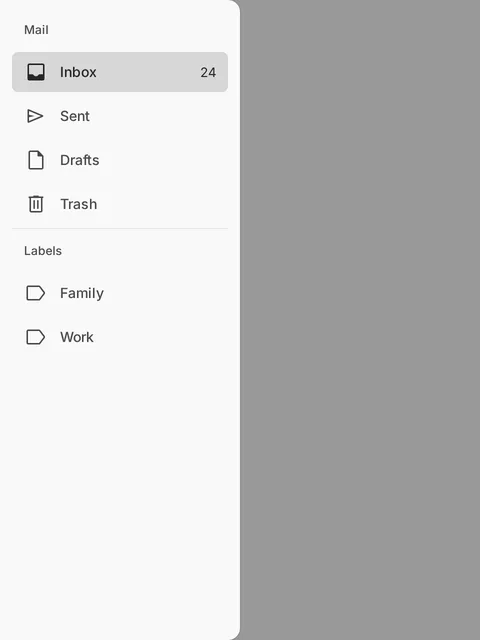
variant: modal value: inbox label: Mail items: 2 The picture is its snapshot, open, in the light scheme under the default system, taken in a window of 480 × 640. The button opens the component itself over this pagemodal-collapsible-closed
variant: modal open: false collapsible: true value: inbox label: Mail items: 5 modal-collapsible-open
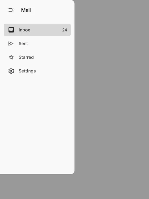
variant: modal collapsible: true value: inbox label: Mail items: 5 slots: header The picture is its snapshot, open, in the light scheme under the default system, taken in a window of 480 × 640. The button opens the component itself over this pageresized-modal
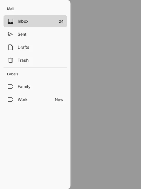
variant: modal width: 320 value: inbox label: Mail items: 2 The picture is its snapshot, open, in the light scheme under the default system, taken in a window of 480 × 640. The button opens the component itself over this pageGenerated from specs/navigation-drawer.spec.json, tokens/comp/navigation-drawer.tokens.json, design/tokens/
Use a navigation drawer when a product has more destinations than a navigation bar can hold, or when its destinations fall into groups: a mail app’s folders and labels, a project’s sections, an admin area. On a large window, a standard drawer sits beside the content as a sidebar. On a compact window, a modal drawer slides over the content from a menu button and goes away once a destination is chosen.
| Aspect | Navigation bar | Navigation drawer, collapsed | Navigation drawer, expanded |
|---|---|---|---|
| Where it sits | Along the bottom edge | A column of icons along the start edge | In a panel at the start edge |
| Window | Compact | Medium and wider | Expanded and wider (standard), or compact (modal) |
| Destinations | Three to five | Its top-level destinations and groups, one cell each | As many as the product has, in sections and groups |
| A destination | An icon over a one-line label, with a badge on the icon | The row cut after its icon: the icon alone, with a badge on it and its name in a tooltip | A row: an optional icon, a label that wraps, and trailing text or content at its end |
| It also holds | Nothing else | A header: the menu button and the main action, collapsed to its icon | A header: the menu button, a title or an account switcher, and the main action |
| On native platforms, a destination is | A tab of a tab bar | A button with a selected state | A button with a selected state |
| What it is | A layout region | A layout region, or a column in the layout that a modal drawer widens from | Standard: a layout region. Modal: a modal overlay |
- The collapsed drawer is the navigation rail. A collapsible drawer narrows to a column of icons where the content needs the width, and its menu button widens it again; every icon stays where it is. Tanrei’s separate navigation rail is retired into this form.
- Bar and drawer are one set of destinations in two places. They take the same destinations and the same selection, so a product that adapts to the window swaps the bar for the drawer at a breakpoint without touching its destinations. Show one of them at a time, never both.
- The drawer holds more. Use it expanded when the product has more destinations than a bar can hold, or when they fall into groups, such as a mail app’s folders and labels. On a large window a standard drawer sits beside the content. On a compact one a modal drawer slides over it from a menu button.
- A modal collapsible drawer keeps its column of icons in the layout and widens over the content, above a scrim, when its menu button opens it.
- On every platform, both select by a destination’s value (Compose by a per-item flag, Flutter by index) and emit
changeandreselect.
Tanrei has no navigation rail of its own: the rail is a collapsible drawer, collapsed.
| Before | Now |
|---|---|
| Navigation rail | A navigation drawer with collapsible, and expanded set to false |
| The rail’s destination, an icon over its label | A destination, drawn collapsed as its row cut after its icon: the icon alone, named in a tooltip |
| The rail’s label visibility | collapsedLabels: never (the default), selected or always. The last two draw the shortLabel under the icon |
| The rail’s badge on the icon | A destination’s badge, badgeCount and badgeLabel, drawn in both forms |
| The rail’s menu button and FAB | The drawer’s first header-button, which is its menu button, and its main-action, collapsed to its icon |
The drawer’s badge text at the row’s end |
trailingText, or the trailing slot |
| The rail’s tokens | comp.navigation-drawer.collapsed.* and the collapsed conditions |
The web implements it; SwiftUI, Compose, Flutter and React Native still ship their separate navigation rail, which these pages no longer document, until they catch up.
| Material 3 | Tanrei |
|---|---|
| Navigation rail | A collapsible navigation drawer, collapsed |
| Expanded navigation rail | A collapsible navigation drawer, expanded |
| Modal expanded navigation rail | A modal collapsible navigation drawer |
| Navigation drawer | A navigation drawer that is not collapsible |
| Variant | What it is | Use for |
|---|---|---|
| Standard (default) | A panel in the layout, with a hairline at its end edge. The content beside it resizes as it opens and closes. It draws no scrim and stays open while the person works in the content. | Wide windows, where the drawer can stay open as a sidebar. |
| Modal | A raised panel with rounded end corners that slides over the content, above a scrim. It keeps focus until it closes, and closes itself after a destination is chosen. | Compact windows, opened from a menu button in the app bar or in a collapsed drawer’s header. |
A design system may add variants. A variant it adds behaves as standard.
- Opening a standard drawer. It slides in while the content beside it makes room. When you open it in answer to the person, such as from a menu button, focus moves to the current destination, or else to the drawer’s first focusable element. A drawer that is open from the start moves no focus.
- Working beside a standard drawer. Tab moves from the drawer into the content, and the drawer stays open. Closing it while focus is inside returns focus to where it was before it opened.
- Opening a modal drawer. It slides in from the start edge while the scrim fades in over the rest of the window. Focus moves to the current destination, or else to the first focusable element, and stays in the drawer. Everything behind it is inert to pointer, touch, keyboard and assistive technology.
- Closing a modal drawer. A press on the scrim, Escape, the platform’s back action, a drag toward the start edge past half its width or a fling that way, and choosing a destination each close it once. The scrim is gone at once, the drawer slides out, and focus returns to the element that had it.
- No edge swipe to open. On iOS the start edge of the screen is the back gesture, so a drawer never opens from it. Open it from a visible menu button.
- Where motion is reduced, the drawer opens and closes at once.
collapsiblegives the drawer its collapsed form, 72 wide: the expanded drawer with its labels gone. Each top-level destination and group is its row cut after its icon, 40 by 40 with the row’s corners, and the selected one is filled exactly as its row is. The header’s buttons are stacked in the column and the main action is collapsed to its icon. Section headings keep their rows with no text, and the header slot and trailing content are not drawn.- A collapsed cell shows its name in a tooltip, toward the content: after the tooltip’s delay while a pointer rests on the cell, at once on keyboard focus, and never for touch. The label is already the cell’s accessible name, so the tooltip adds nothing to what is read.
expandedchooses the form of a standard collapsible drawer. A modal collapsible drawer keeps its column in the layout while closed, andopenwidens it over the content, above a scrim.- The menu button is the first
header-button. While the drawer is collapsible, it is exposed as expanded or collapsed, controlling the drawer except while a modal drawer is open, and activating it emitsexpandedChangewith the form asked for. The web applies it itself; elsewhere you setexpandedoropenfrom it. You choose its glyph and name. collapsedLabelschooses which cells draw a short label under the icon:never, which is the default, theselectedone, oralways. A labelled column is for a product or a design system that wants one. A cell then draws itsshortLabel, or its label if you give none, and shows no tooltip. The label stays the accessible name either way.- Every icon stays in place. The icons sit on one column and one line in both forms, and every cell keeps its height, so the change of form moves only the end edge: the labels fade out as the edge passes them, and in a labelled column the short labels fade in. An open group is the one exception: the collapsed drawer does not draw its items, so the cells below move up. The main action’s glyph stands on the same line as the destinations’ icons in both forms, at every size of the button and at either size of the drawer: the drawer places the button from its own tokens. A collapsed square wider than the column (a large main action in the default system) reaches past the column’s edge, and debug builds report it; use the small or the medium one, and the small one in a compact drawer, where the medium square fills the column.
- The selection changes color in place. A new selection recolors the rows where they stand, expanded or collapsed. Nothing grows, shrinks or slides to show it.
medium, the default, has rows at the control height (40 in the default system) with 24 glyphs, the height of a menu’s item and of the Buttons and fields beside it, for a product used by touch as well as by pointer.smallhas a tree view’s small rows: 36 high (the small step, held at the minimum target) with 16 glyphs, 8 inside each row, 2 between rows and 28 for a heading, and a column of icons 56 wide when collapsed. Use it for a tool used with a pointer whose drawer lists many places, such as a file browser or an editor’s sidebar.- Nested icons line up at both sizes. Each level’s content starts one indent further in, and the indent is the size’s icon and gap, so a nested destination’s icon stands where its group’s label starts and the icons of one level stand in one column.
- Touch keeps its target. For touch a small row is drawn at least the touch target high. For a pointer its hit area is the row and half the gap around it: below the pointer target, still above the 24 of WCAG 2.5.8.
- A design system changes what small means, or adds a size, through the drawer’s
.smalltokens, such ascomp.navigation-drawer.item.container.height.small.
- The same parameters as the tree view, with the same names and meanings:
chevron,guides,indent,highlight,iconSpace,expandable,labelWrapandsupportingWrap, a row’ssupportingTextandsupportingPosition, andstickyParentswithstickyMax. chevron:start, the default, draws a group’s chevron before its icon and keeps its room on every row, so the icons of a level line up;enddraws it at the very end of the row, after the trailing content;nonedraws none, and a press on a group’s icon opens and closes it, itsopenIconshown while it is open. A collapsible drawer drawsstartasend, so every icon keeps its place in both forms, and a drawer without groups keeps no room for one.indent:autolines a row’s first part up with where its group’s label begins, and steps by the level’s indent where the group draws nothing before its label; a number steps by that many pixels, and 0 by none. A row’s label never begins past half of the drawer’s width.highlight:indented, the default, starts a nested row’s fill and state layers where the row begins;fulldraws them across the whole width at every level.iconSpacekeeps an icon’s room on a row without one, so that the labels of a level line up:autowhere another row of the level has an icon,alwaysornever.expandablefalse shows every group open, with no chevron; a group’s row then names its items and is not a control.guides:showndraws a line beside an open group’s items, under its chevron, else its icon, else its label’s start;hoverdraws it only while the pointer is over the drawer or focus is in it.- One line. Labels and supporting text are one line, cut with an ellipsis, and a row that is cut shows its whole text in a tooltip on hover and on keyboard focus;
labelWrapandsupportingWraplet them wrap. The accessible name is always the whole label. - Supporting text stands under the label (
below) or after it (inline), and is read as the row’s description. - A group takes trailing text or content before an end chevron, an
openIcon, andloading, which draws a loading row under its items, named by the drawer’sloadingLabel. stickyParents, off by default in the drawer and on in the tree view, pins the rows of the open groups the top rows belong to, at moststickyMax(2) of them, the innermost first, as an editor’s sticky scroll does. It does not apply while the drawer is collapsed.
responsive lets the window’s width choose how the drawer is presented, from the two breakpoints of its design system (1024 and 600 in the default system). variant is then ignored.
| Window | Presentation | What the drawer is |
|---|---|---|
| At least the wider breakpoint | standard |
A standard drawer beside the content, shown unless an app shell’s menu button hid it there (standardHidden), and collapsible in the form expanded chooses |
At least the narrower one, while collapsible |
column |
A modal collapsible drawer: its column of icons in the layout, widening over the content while open |
| Narrower than that | modal |
A modal drawer that is not collapsible |
- The presentation is derived, never stored. It follows the width alone: the drawer does not write it to
variant,open,standardHiddenorexpanded.presentationChangesays what it is, the first time and whenever the width changes it. openis kept across presentations. A change of width fires noclose. A drawer open over the content stands beside it when the window widens, its scrim gone at once and nothing inert, and is over the content again, still open, when the window narrows; focus that was in what is then behind it moves to the menu button.expanded,valueand each group’sopenare kept too, so the standard presentation comes back in the form it was left in.- An app shell’s menu button hides the standard presentation. Pressed while the drawer stands beside the content, it hides the drawer, in whichever form it has, and the content takes its width:
standardHiddenbecomes true andopenfalse. Pressed again, it shows the drawer:standardHiddenbecomes false andopentrue, so the drawer is over the content if the window narrows. The drawer slides out and in, firesstandardHiddenChange, and leaves focus on the button. A drawer hidden so is closed in a narrower window and hidden again when the window widens. - In the
modalpresentation, the menu button is yours. Show a menu button of your own, in the app bar for example, while the presentation ismodal, and setopenfrom it. The drawer’s own menu button only closes it there. - The drawer remembers nothing between visits. To keep a person’s choices, store what
expandedChangeandstandardHiddenChangecarry and setexpandedandstandardHiddenfrom them.
Give every destination an href and the drawer the page’s own address as its value, and the drawer is the sidebar of a site of documents.
- The page says where it is. A press never selects a link. Each page sets
valueto its own destination: to that destination’svalue, or to itshrefas written where it has none. revealSelectedopens the groups that hold the selected destination when the drawer first appears, in its first frame and without motion, and again whenevervaluechanges. A group the person closes afterwards stays closed untilvaluechanges.- The selection is in view on arrival. When the drawer appears, and whenever
valuechanges, the row that shows the selection is brought to the middle of the scrolling rows if it was not wholly in view, and is not moved at all if it was. So a sidebar whose current page is already in view stays where it is from page to page. Focus does not move. scrollOffsetreads and sets how far the rows are scrolled. The drawer stores nothing. A site that wants a long tree to stay where the reader left it keeps the offset and each group’sopenitself, in the session’s storage for example, and gives them back before the first frame. A group that holds the current page opens all the same, and the selection wins over an offset that would leave it out of view.- A link that leaves the site takes
targetnew. It opens in a new tab, its expanded row ends with the icon set’sopen_in_newunless you put trailing content there, andtargetLabelis read after its name. The words are yours (“opens in a new tab”): Tanrei ships none. - A router listens to
change. It fires before the browser follows a link, for a plain activation only: the primary button without a modifier key, a touch or Enter, on a link whosetargetissame. Cancel it and go to thehrefit carries. A link opened in another tab fires nothing, and leaves a modal drawer open.
A filter narrows the drawer in place; it is not a search. The search looks through the content of every page and shows what it found in a view of its own. The filter looks only at the labels of the places the drawer already lists and leaves them where they are, so that a reader who knows a page’s name reaches it in two keys, “/” and its first letters, and sees it among its neighbours. Give each its own key: “/” for the filter, as documentation sites with a sidebar filter do, and ⌘K or Ctrl+K for the search.
- What matches. A row matches while its label holds every word typed, each anywhere in it and in any order, without regard to case, to the width of a character or to the marks on a letter: “nav dr” finds “Navigation drawer”, and “resume” finds “Résumé”. Only the label is compared — not the supporting text, the trailing text or the address. Nothing is fetched, ranked or reordered: a product that matches on a server, by a ranking or by more than the label leaves
filterableoff and gives the drawer the rows that match, as before. - What is left. The rows that do not match are hidden. The groups that hold a match stay, and a group found by its own name stays whole; a section left with no row is hidden with its heading.
- Groups open for the time being. A closed group that holds a match is drawn open for the filter. Its
opendoes not change and notogglefires, so emptying the field closes it again. A group the person opens or closes while filtering is theirs: it stays as they left it. - The first match is ready to take. While focus is in the field, the first row that matches is drawn as the focused row. Enter takes it, as Enter on that row would, and Down Arrow moves focus to it; typing goes on in the field. Escape empties the field, and pressed again returns focus to where “/” came from.
- “/” reaches the field from anywhere on the page, except where focus is in a text field, where it types a slash. A collapsed drawer expands first.
filterShortcutchanges the key, and an empty list binds none, for a product that already uses “/”. A narrow window’s app shell opens a closed drawer for the key and puts focus in its field. - The count. While a filter is applied, a quiet line at the top of the results says how many rows match (
filterCountText), orfilterEmptyTextwhere none does.filterCountHiddendraws no count; it is still said to assistive technology. - Matches are not marked. The rows the filter leaves are the answer, so each row looks as it does without a filter, as in the file tree of a code review or the sidebar of a documentation site.
- Nothing is stored. The drawer forgets the text when it is gone. Keep
filterValuefromfilterChangeand give it back on the next page if the filter should follow the reader.
- Rows are at least as tall as the control height (40 in the default system), the height of a menu’s item, with its corners. A label is one line, cut, unless
labelWraplets it wrap and the row grow with it. - Give every destination an icon, or none, so the labels line up. A collapsible drawer draws each top-level destination and group by its icon while collapsed, so give each one an icon.
trailingTextis short text at the row’s end, quieter than the label: a count (“24”) or a word (“New”). A count goes here, as text, not in a Badge: a Badge marks an anchor, and the end of a row has none to mark; mark the icon withbadgeinstead. Thetrailingslot holds anything else, such as a glyph; it wins overtrailingTextand is never interactive. A link withtargetnewends its row withopen_in_newby itself, so you do not place that glyph. Trailing content is read after the label, and is not drawn while collapsed.badgedraws a Badge on the icon, in both forms: a dot, orbadgeCount, named bybadgeLabel.- A group’s row opens and closes the destinations and groups inside it, by its chevron where
chevronputs it (above). A closed group that holds the selected destination is drawn selected, and so is a top-level group while collapsed; activating a group while collapsed expands the drawer and opens it. Keep to three levels. - A group that is a destination (
selectableGroups, and avalueor anhrefon the group) splits its row as a tree view does: its chevron opens and closes it, the rest of the row chooses it, and one press never does both. The chevron is its own control, after the row in the focus order, with a hit area at least the pointer target wide. Collapsed, unlike another group, its cell chooses it and leaves the drawer collapsed; its items are reached by expanding the drawer.revealSelectedalso opens such a group when it is the current page, so a site’s sidebar shows the pages of the section shown. - A section’s heading names the destinations under it. It is a heading, not a control. A section may have no heading, as a divided group without a title.
- A section’s
dividerdraws a divider before it, to set it apart from what is above. You never place a divider yourself. - The header holds the header buttons, stacked in the icon column, and the main action below them. The header slot sits beside the menu button while expanded, for a title or an account switcher, and is not drawn while collapsed. Plain text placed there is drawn in the drawer’s title style (
comp.navigation-drawer.header.typescaleandcomp.navigation-drawer.header.color); an element of yours that sets its own style keeps it. - When the rows are taller than the space below the header, they scroll and the header stays in place. A scroll that reaches either end does not go on to scroll the page behind the drawer.
Do
Don’t
Do
Don’t
Do
Don’t
Do
Don’t
- Put the most used destinations first, outside or in the first section.
- Give a destination an
hrefwhen it has an address of its own, so that it is a real link: it can be opened in a new tab, copied and followed by a crawler. - Name sections for what their destinations have in common: “Labels”, “Admin”.
- Use the same destinations and values in the modal and standard forms, so a product switches between them by window width alone.
- Don’t use the drawer for actions such as “Sign out” or “Compose”. Its rows are places.
- Don’t nest a section in a section, or put a section in a group. Debug builds report it and draw the inner section’s destinations in its place.
- Don’t give a group a
valueor anhrefwhileselectableGroupsis off and expect its row to choose it. It only opens and closes, and debug builds report it. - Don’t use a modal drawer on a window wide enough for a standard one.
- Don’t make the filter stand in for the site’s search. It finds places by their names; a reader who looks for a word in the content needs the search.
- Role
navigation- Labeling
- Each destination is named by its label in both forms, drawn or not, as a button or as a link; its icon is decorative; its badge's description and then its trailing content are part of its description. A group's row and the list of its items are named by the group's label. A section's heading is a heading. The drawer's label names the navigation landmark and, while the drawer is modal and open, the dialog. The menu button is named by its own label and carries the drawer's expanded state; the main action is named by its label in both forms. A collapsed drawer that draws no labels shows each cell's name where the platform shows a name for an icon alone (a tooltip on the web). The filter field is a search field named by filterLabel, the product's words, controlling the drawer's list; its clear button is named by filterClearLabel; its key hint is hidden and its chord is the field's keyboard shortcut. How many rows match is drawn at the top of the results, hidden from assistive technology, and said by a status of the drawer's own, in the product's filterCountText or filterEmptyText. The resize handle is a focusable separator named by resizeLabel or else by the drawer's label, valued in units of the layout between its least and greatest width (from the column's width while collapsible), and controlling the navigation.
- Minimum target
- The hit area meets the minimum target size even when the visual size is smaller. minimum 36px · pointer 36px · spacing 8px · touch 36px
Keyboard
| Keys | Action |
|---|---|
| | Moves focus through the header's content, then the destinations and group rows that are shown and not disabled, and after the row of a group that is a destination its chevron; inside an open modal drawer it wraps around and never leaves the drawer; from an open standard drawer, expanded or collapsed, it moves on to the resize handle while the drawer is resizable (NVD-102), then to the content, and the drawer stays as it is. |
| | Activates the focused destination (Enter only for a destination that is a link: it follows the link, and Space is left to the platform), and a modal drawer then closes; on a group's row, opens or closes the group, or, for a group that is a destination (NVD-66), activates it as a destination and leaves it as it is; on that group's chevron, opens or closes the group; on a group's cell in the collapsed drawer, expands the drawer with the group open; on the menu button, changes the drawer's form. |
| | What the browser does with a link: another tab or window, a download. The drawer emits nothing, selects nothing and stays as it is (NVD-60). |
| | On a closed group's row, the arrow toward the end of the line opens it; on an open group's row, the arrow toward the start closes it; on an item inside an open group, the arrow toward the start moves focus to the group's row. Elsewhere the keys do nothing. |
| | Closes an open modal drawer (a collapsible one narrows back to its column) and returns focus to where it was. |
| | WHILE filterable is true and the drawer is shown: moves focus to the filter field, expanding a collapsed drawer first. It types "/" while focus is in a text field. |
| | Takes the first row that matches — the active match, drawn as a focused row while focus stays in the field — as Enter on that row would: a destination is activated, a group's row opens or closes. |
| | Moves focus to the active match. |
| | With text: empties the field and keeps focus there. Empty: returns focus to where it was before "/", or passes on (a modal drawer closes). |
| | A standard drawer: empties the filter and keeps focus on the row, which stays in view among its neighbours. A modal drawer: closes, as without a filter. |
| | The arrow that points away from the drawer widens it by 10 and the other narrows it, never below its least width; with Shift, by 100. On the collapsed column the widening arrow expands it at its least width (NVD-100). |
| | As Shift with the widening and the narrowing arrow. |
| | Give the drawer its least or its greatest width, as a window splitter does. |
| | A collapsible drawer: collapse it to its column, or expand it again at its width. Otherwise: give it its default width, and back to the width it had (NVD-101). |
Notes
- The drawer is a list of places, not a tab bar, in both forms: on native platforms its destinations are buttons (or links) with the selected state (as iPadOS sidebars and Android's drawer items are read), and on the web links or buttons with aria-current in a navigation landmark. The collapsed form keeps these semantics; it does not become a tab bar.
- Selected and the current page are one thing. The drawer lists the product's places and the selected one is the place being shown, which the web exposes as aria-current="page" on a button and on a link alike. A site of separate pages changes who says which it is — the page, through value, not a press — and nothing else: no destination is ever selected and another current, so a second state would have no case to draw.
- A drawer of links is a navigation landmark holding lists of links and disclosure buttons, the pattern assistive technology users know from site navigation: every link and every group's row is its own Tab stop, and the arrow keys only open, close and leave a group. It is deliberately not a choice per use. One Tab stop with roving arrow keys is a tree's or a menu's model, would hide links from the browser's own ways of listing and following them, and would make the same component answer the keyboard in two ways. A long tree is passed by the landmark, by the headings of its sections, by closing its groups, and by the page's skip link.
- Showing the selection (NVD-57, NVD-58) scrolls the drawer and opens groups without moving focus and without an announcement: the page's own title and heading say where the user is, and the current destination carries its state for whoever reaches it.
- Groups are disclosures, not a tree: a group's row is a button with an expanded state that shows or hides a named list, and every shown destination stays its own tab stop, as the links of a navigation region are. A tree's single tab stop and arrow-key roving would make the drawer's keyboard model depend on whether it has groups; the arrow keys here only open, close and leave a group.
- A group that is a destination (selectableGroups, NVD-66) is the WAI-ARIA Authoring Practices' disclosure navigation menu with top-level links: its row is the link or button of its own page, with the current-page state, and its chevron a separate disclosure button for its items, each a Tab stop. The two are never one control: a row that both navigates and toggles would announce one action and do two, and a keyboard user could not open the group without leaving the page. The chevron is named by the group's label, as Tanrei ships no words of its own; its role and its expanded state tell it from the row.
- Collapsing hides the header slot, the headings' text, trailing content and the items inside groups from assistive technology and focus; it changes no destination's role, name or state, and the menu button announces the change as its expanded state.
- A responsive drawer (NVD-53 to NVD-55) changes what it is with the window's width — a layout region where the window is wide, a modal overlay where it is narrow — and each presentation has the semantics of the drawer it stands for. A change of presentation closes an open overlay, releases focus that was kept inside it and announces nothing by itself; the presentation is never the only way to reach a destination, because the product's menu button opens the modal presentation.
- The standard form is a layout region, not an overlay, expanded or collapsed: opening it moves focus in, to the selected destination or else the first, closing it returns focus to where it was, and focus leaving it never closes it. The modal form is a modal overlay: it keeps focus in and draws a scrim; a collapsible modal drawer's column is a layout region while the drawer is closed. The web presents the open modal drawer with a modal <dialog> element (showModal gives inertness and Escape); Compose draws it in a window of its own (a Dialog, as TanreiDialog is) and Flutter as a controlled overlay in a Stack over the page, each with a scrim, trapping focus and answering back; SwiftUI, which has no side presentation, overlays it with the modal trait and the escape gesture; React Native presents it in a transparent Modal.
- Opening a modal drawer by a swipe from the screen edge is left out: on iOS the same edge is the back gesture. The product opens it from a menu button.
- How a state looks is a value decision of the active design system; components read the state's tokens and never compute the effect themselves.
- A filter narrows the drawer in place; it is not a search. The site's search (the Search component, opened with ⌘K or Ctrl+K) looks through the content of every page and offers results in a view of its own; the filter looks only at the labels of the places the drawer already lists and leaves them where they are, so that a person who knows a page's name reaches it in two keys ("/" and its first letters) and sees it among its neighbours. The two keep separate keys: "/" for the filter, as documentation sites with a sidebar filter do, and the search's own chord.
- Hidden rows are removed from what assistive technology is told, not only from view, so that every list position and size a person hears is the filter's (WCAG 1.3.1). The count is a status message (WCAG 4.1.3): said politely through a status of the drawer's own once typing pauses, never by moving focus, and drawn quietly at the top of the results unless the product hides it. The rows that match are not marked: what the filter leaves is the answer, as in a file tree's filter and a documentation site's sidebar, and the row Enter takes is drawn as a focused row (NVD-85, NVD-86), so that nothing is told by color alone (WCAG 1.4.1).
- The field is a separate stop before the items, as a search field above a list is. As in a search, the first row that matches is active as soon as there is one while focus stays in the field: Enter takes it, as Enter on its row would, and Down Arrow moves focus to it, so that a keyboard user neither Tabs through every row the filter left nor leaves the field to reach the place they typed for. The active match is drawn as a focused row; it is not the field's active descendant, because a destination is a link or a button, which an input's active descendant is not (a search's results are not either), and a screen reader user meets it by Down Arrow, the count telling how many rows are left.
- The resize handle follows the window splitter pattern of the ARIA Authoring Practices: a focusable separator whose value is the navigation's width, which names the navigation as what it controls and takes its name from it unless the product gives another; the arrow keys move the edge the way they point, Enter folds a collapsible drawer to its column and restores it, Home and End give the least and the greatest width. Folding is Enter's alone among the keys, so that a key held down never folds the drawer by accident. F6 between panes, which the pattern lists as optional, is not taken: web browsers give F6 to their own toolbar.
- Dragging movements (WCAG 2.5.7): a press on the edge without a drag folds and restores a collapsible drawer, or switches a drawer that has no column between its default width and the width before, and the keys reach every width.
- The width belongs to the drawer beside the content. Over the content — a narrow window's drawer, a medium window's column widened over the page — the drawer keeps the width the system gives it, so that a width chosen beside a wide page never covers a narrow one.
Generated from specs/navigation-drawer.spec.json, tokens/sys/measure.tokens.json
- On the web, the drawer is a navigation landmark named by
label. Each destination is a link (withhref) or a button, and the current one carriesaria-current="page". A modal drawer is also a modal<dialog>named bylabel. - On iOS, Android, Flutter and React Native, each destination is a button with its selected state and its position among the destinations, as sidebars and drawer items are read on those platforms. A modal drawer is a modal container named by
label: the modal trait, or a pane title. - A destination is one element named by its label, in both forms. Its icon is hidden; its icon badge’s description and then its trailing content are read after its name and state.
- A link destination is drawn exactly as a button destination, in every state, with no visited look. It keeps everything a browser gives a link: its context menu, opening in a new tab, dragging and the address on hover. One that opens a new tab reads its
targetLabelat the end of its description. - A collapsed cell’s tooltip is for sighted pointer and keyboard users. It is hidden from assistive technology, which already reads the label as the cell’s name.
- A group’s row is a button with an expanded state that controls its nested list while the list is shown. While the group is closed, or the drawer collapsed, the list is not exposed, and the row names nothing as what it controls. Right (in a left-to-right layout) opens a closed group, Left closes an open one, and Left inside a group moves to its row. Tab moves through every shown row.
- A group that is a destination is the WAI-ARIA Authoring Practices’ disclosure navigation menu with top-level links: its row is a link or a button, with
aria-current="page"while it is the current page, and its chevron a separate button named by the group’s label, with the expanded state, controlling the nested list while it is shown. Each is a Tab stop, and Right and Left still open and close the group from its row. - While the drawer is collapsible, its menu button is exposed as expanded or collapsed, controlling the drawer. While a modal drawer is open, the menu button names nothing as what it controls, so that it never names an element that is not exposed. Focus stays on the cell it was on when the form changes.
- A section’s heading is exposed as a heading and is not focusable.
- Tab moves through the header’s content and every destination that is not disabled. Enter and Space activate the focused destination (Enter only, for a link on the web). Disabled destinations take no focus and are announced as disabled.
- In a standard drawer, focus moves in when you open it and returns when you close it, and Tab moves on to the content without closing it. In a modal drawer, Tab and Shift+Tab wrap inside the drawer, and Escape and the platform’s back close it and return focus.
- The focus ring is drawn around the row, for keyboard focus only. Keyboard focus on a row that is not wholly in view scrolls it into view by the least distance.
- The hit area is the whole cell, in both forms, and never less than the minimum target.
- Larger text keeps both forms’ widths and makes rows and headings taller. Labels wrap; short labels are cut. Icons are not scaled.
- The filter field is a search field named by
filterLabel, before the rows, and it says that it controls the drawer’s list. Its clear button is named byfilterClearLabel, and its “/” is exposed as its keyboard shortcut (aria-keyshortcutson the web) while the key hint is hidden from assistive technology. - The rows a filter hides are gone for assistive technology too, so every position and size a person hears is the filter’s. Once typing pauses for a second, a status of the drawer’s own says how many rows match, or that none does, politely and without moving focus. The count drawn at the top of the results is hidden from assistive technology, which hears the status instead.
- A row that matches is not marked, so nothing is told by color alone; the row Enter takes is drawn as the focused row, and a row’s name stays its whole label.
- Debug builds report a destination without a label, a modal drawer without a
label, a value that names no destination, a value used twice, a nested section, a section in a group, nesting deeper than three levels, a variant the design system does not have, a collapsible drawer without a menu button, a focusable element in thetrailingslot, anhrefthat is ajavascript:address or cannot be read, an unknowntarget, and a link withtargetnewand notargetLabel. They also report a size the design system does not have, and a group with avalueor anhrefwhileselectableGroupsis off. With a filter, they report a field withoutfilterLabel, a clear button without a name, afilterShortcutof more than one chord, and a chord another drawer or search already holds.
Known platform gaps:
- Web: Firefox cannot animate an element leaving the top layer, so there a modal drawer disappears at once instead of sliding out.
- Web: every size follows
rem, so a larger browser text size also grows the icons, though never the drawer’s width. Enlarging Tanrei’s type alone does not. - Web: that Tab leaves an open standard drawer is tested, but not yet where it lands in the content, which was unstable under load.
- SwiftUI cannot tell which view had focus, so closing a drawer returns keyboard focus to no element: the platform puts it where it does by default. Opening one focuses the current destination, or else the first enabled destination, never a control in the header. On a Mac, a modal drawer covers and disables only the view it is attached to, so attach it to the window’s root.
- SwiftUI: Escape, the accessibility escape gesture and focus moving in on opening have not yet been tested end to end. A destination carries its position as its value text (“2 of 6”), in English only.
- Compose presents the modal drawer in a
Dialogwindow of its own, asTanreiDialogis, rather than inside the app’s window as Material’s drawer does. It looks the same, and the window keeps focus in, answers back and hides what is behind it. - Compose has no drawer-level value, so a value that names no destination has nothing to report.
- Flutter’s modal drawer is not a
Scaffold.drawer. You place it as the last child of aStackthat fills the window and control it withopen. Its destinations carry no position in the set. - Flutter: where a row and its gap are shorter than the touch target, as in a design system with a short row, the rows move apart instead of only the hit area growing.
- React Native cannot tell which element had focus, so closing the drawer does not return focus to the element that opened it. A modal drawer leaves focus where the platform puts it, and a standard drawer does nothing.
- React Native’s drawer has no
insetsprop of its own yet: it reads onlyTanreiProvider’s insets. A destination carries its position as its value text, in English unless you passpositionText. - React Native: the modal drawer’s drag and fling, its focus move and the escape gesture have not yet been checked on a device.
- SwiftUI, Compose, Flutter and React Native, which ship the previous revision: the first row sits half a gap below the drawer’s padding, and a row with a wrapped label does not grow the same way on each (SwiftUI and Compose keep the row’s minimum height until the text no longer fits in it). Each measures the padding to the first cell and treats the row’s height as a minimum when it catches up.
- Web: the first match the field makes ready is drawn as a focused row, but it is not the field’s active descendant: a destination is a link or a button, which an input’s active descendant cannot be. A screen reader user reaches it with Down Arrow.
- SwiftUI, Compose, Flutter and React Native do not have the filter yet.
- Web: a modal collapsible drawer returns focus only once it has narrowed back to its column, a drag moves the whole panel, and its dialog is placed on the column’s box as measured when it opened.
- Give every destination a label. Where the collapsed column draws labels (
collapsedLabels), give ashortLabelwhere the label is too long for it. - Give a link with
targetnewatargetLabelin your product’s language. - On a site, set
valueon each page to that page’s own destination. - While a responsive drawer’s presentation is
modal, show a menu button of your own that opens it. - Give the menu button a name, such as “Menu”, and on the platforms other than the web, set
expandedoropenfromexpandedChange. - Give the drawer a
label, such as “Mail”. A modal drawer is a dialog, and the label is its name. - Open a modal drawer from a visible menu button with its own label, such as “Menu”.
- Keep
openin step: set it to false when a modal drawer closes (fromonClose, the binding or the drawer state, depending on the platform). - On SwiftUI, give keyboard focus back to the menu button yourself after the drawer closes.
- On React Native, move focus back to the menu button yourself after the drawer closes, pass
positionTextin your product’s language, and giveTanreiProviderthe window’s insets. - Keep each destination’s value unique and stable across the standard and modal forms.
- With
filterable, give the field afilterLabelthat says what it narrows (“Filter navigation”), and give your words forfilterCountText,filterEmptyText,filterClearLabelandfilterPlaceholder, on the drawer or once in your product’s words.